Review of “Eyeless in Gaza” by Aldous Huxley

This was a difficult review.
Gaza is never mentioned in the book, but apparently (according to ChatGPT) it is taken from rom Milton’s Samson Agonistes. How appropriate. I never read Milton, but its fundamental influence supports the theory that this book is a pseudo-autobiography. I admit to bias when I saw Huxley’s picture, in his thirties (maybe?) on the back cover. He looks like the central character … let’s get to it.
This is a troubling story about a young man who is a member of the British elite in the 1930s. Anthony Beavis is an intellectual who finds hedonistic pleasure in reading and seducing women. He is not pleased with his lifestyle, but it satisfies his urges, so he sees no reason to change. The conflict arises as he recognizes the dissatisfaction he feels from this lifestyle. That’s where the story begins to fall apart.
The story of Anthony’s self-realization is one of disillusionment in his social status. The story is told, not in actions, but rather by inaction. He can never act, not because he doesn’t know the proper response to events, but because he is encased in concrete — social and personal. The entire novel is about his struggle with recognizing other people as being human and not objects to be avoided or exploited. This makes the author’s job more difficult because he must try to change Anthony without invoking supernatural effects.
He fails in this primary objective, in my humble opinion. The protagonist (Anthony) never truly confronts the obvious problems with his social behavior.
Anthony himself says that divine intervention caused him to meet Dr. James Miller, a physician who just happened to be approaching the hamlet where Mark was dying of gangrene. I have seen this kind of writing time and again. How do I transform this incorrigible person into the saint I want them to be? No problem. Invoke a miracle. Voila! Anthony is a new man, except …
The story ends with the same old Anthony, but with a slight adjustment: he is willing to risk his life for something he doesn’t really believe in.
The grammar is okay but relies, to an excessive level, on commas. I think Huxley lost track of some of his prepositionally dominated sentences. I’ve seen that before.
This is a story that follows a meandering path through the past to lead to a present that is no different from the past. Maybe that was the author’s intent. We struggle with our thoughts but fail to control them, barely managing, if we’re lucky, to nudge them in a slightly different direction.
I recommend this novel to anyone who has ever wondered if other people are as confused and misinformed as them.
A Quick Visit to the Lemay Family Collection
I visited the Lemay Family Collection of automobiles. It is affiliated with the Lemay America’s Auto Museum, but it more low key. Nevertheless, it contains a lot more than antique cars; this post is sharing some of the more mundane aspects of the development of automobiles as a major form of transportation.

The lower shelf of motor oil contains many familiar products; but the upper shelf will probably get your attention. How about putting some skunk oil in your motor? I wonder about their marketing campaign. Note that there are no plastic bottles here; every container is 100% recyclable, heavy cardboard (not corrugated) and metal rings.

I discovered the motometer recently. These devices are thermometers mounted to the radiator cap, which was exposed until the late 1920s. This is an assortment of these important gauges but, unfortunately, they aren’t labeled.

The major oil companies started adding tetraethyl lead to gasoline to prevent premature detonation in the 1920s, but they knew lead was dangerous, so they formed a new company called the Ethyl Gasoline Corporation; the word “lead” never appeared in advertising, but people loved the new gas, even though they had no idea what was in it. They thought it was high octane. You gotta love mass marketing in the twentieth century.

They don’t make BMWs like this anymore. Note the door on the front.

This is a horse-drawn road grader. Th operator stood on a missing platform and turned the wheels to adjust the blade. Some of them were adapted to be pulled by tractors. Not a very satisfactory solution …

This is a motorized road grader from 1925-1930. The gasoline engine is beneath the large tank in front of the cab. It was basically a tractor with an extra axle behind, and a long frame in front. This was before hydraulics were available, so the controls are all manual.

This is a Fordson road roller circa 1930-38. Note the smooth engine, reflecting the art-deco design craze sweeping the country.

ChatGPT and I agree that this is probably a road oiler (for asphalt surfaces) from the 1930-50s. We’ve all seen trucks with large tanks spraying oil on asphalt roads.

I recently posted about hood ornaments over the decades after a visit to the Lemay auto museum. This one, from a 1937 Packard 120 Coupe, caught my eye because the winged, female figure seems to be holding a wheel and tire assembly or maybe a disk. This is one of two optional ornaments, the Goddess of Speed; the other was a cormorant. Optional hood ornaments! Who would have believed it.
Final Thoughts
I always enjoy looking at old automobiles because they reflect the non-military development of a new technology, unlike aircraft. Part of this evolution was progress in road machinery — cars need good roads, unlike horses and buggies.
Disarray Along Commencement Bay
This morning we went for a walk along the western shoreline of Commencement Bay, which was home to many sawmills, even a smelter, between the 19th and late 20th centuries. Rather than removing all of the industrial debris, the city has left the remaining infrastructure as a kind of museum. There are signs explaining a lot of the history and even a piece of sculpture integrated with an original saw.
The shoreline is a dynamic environment where plants struggle to keep up with the sea and weather. Thus, pioneer plants dominate the flora.
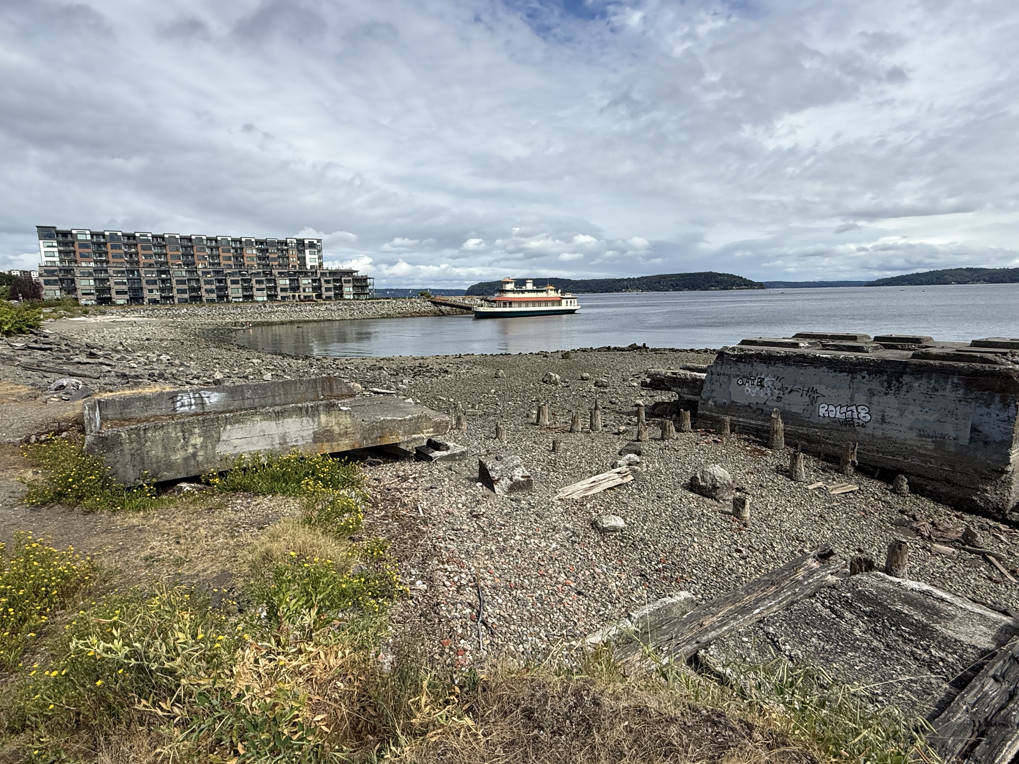
This view is looking to the NE. This is the last sawmill site along the bay, but it doesn’t have any signage explaining its history. Nevertheless, this image, taken at low tide, says a lot: The large concrete structure was the foundation for a piece of heavy equipment like a saw or winch; the piling stubs reveal where it was connected to land, where a receiving platform (left of image) was constructed. The remnants of a dock are in the lower right. There are a line of pilings further seaward that demarcate a dock that would have served as a wharf for ships.
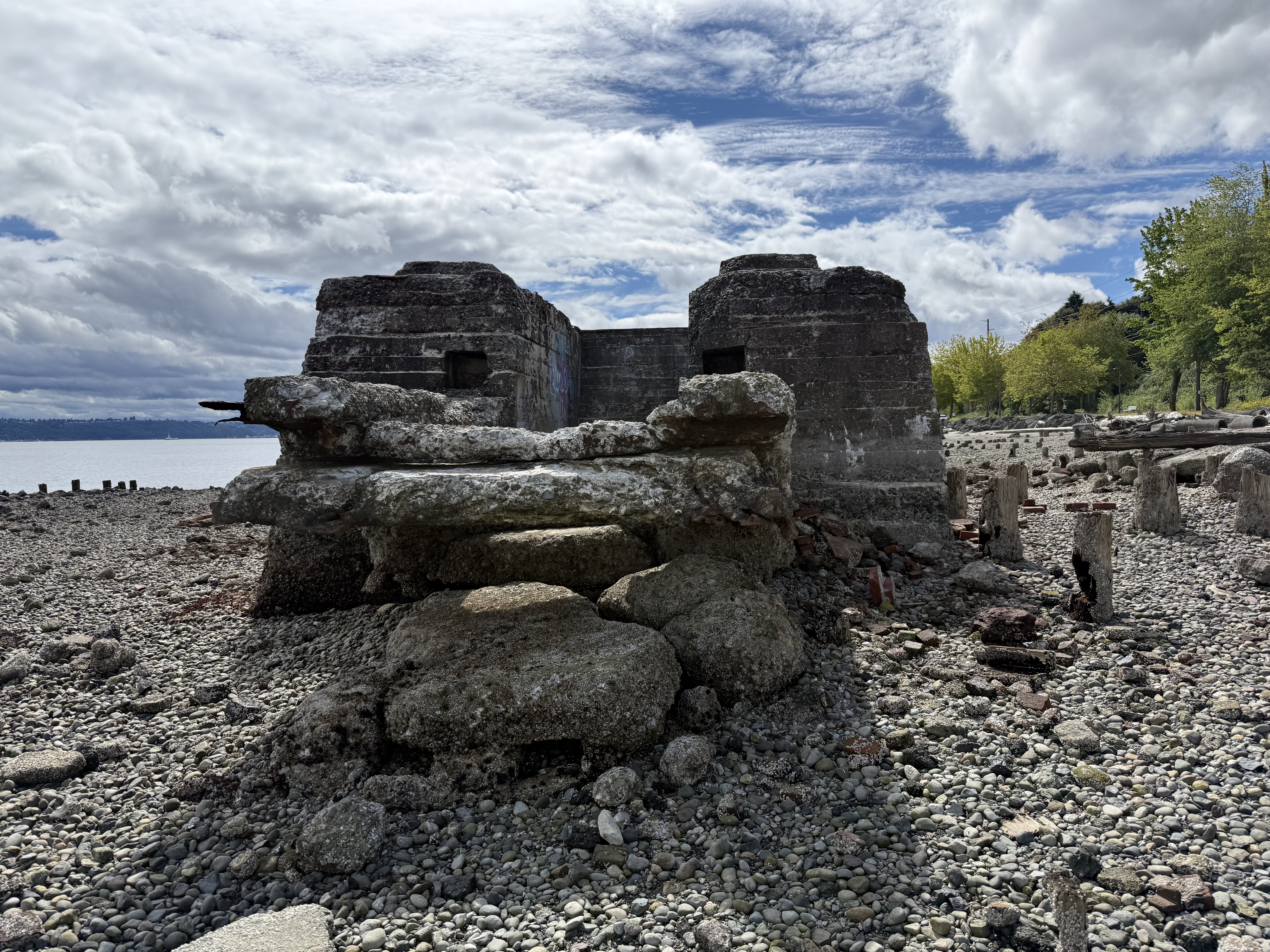
Most of this structure would have been submerged at high tide (7-10 feet, twice a day). This reinforced concrete structure probably was the base for the saw, the channel likely designed for pulleys, chains, etc, that ran the saw or pulled trees (up to 14 feet in diameter) into it. The sawmills often located their saw heads offshore to make processing logs, which arrived by raft, easier.
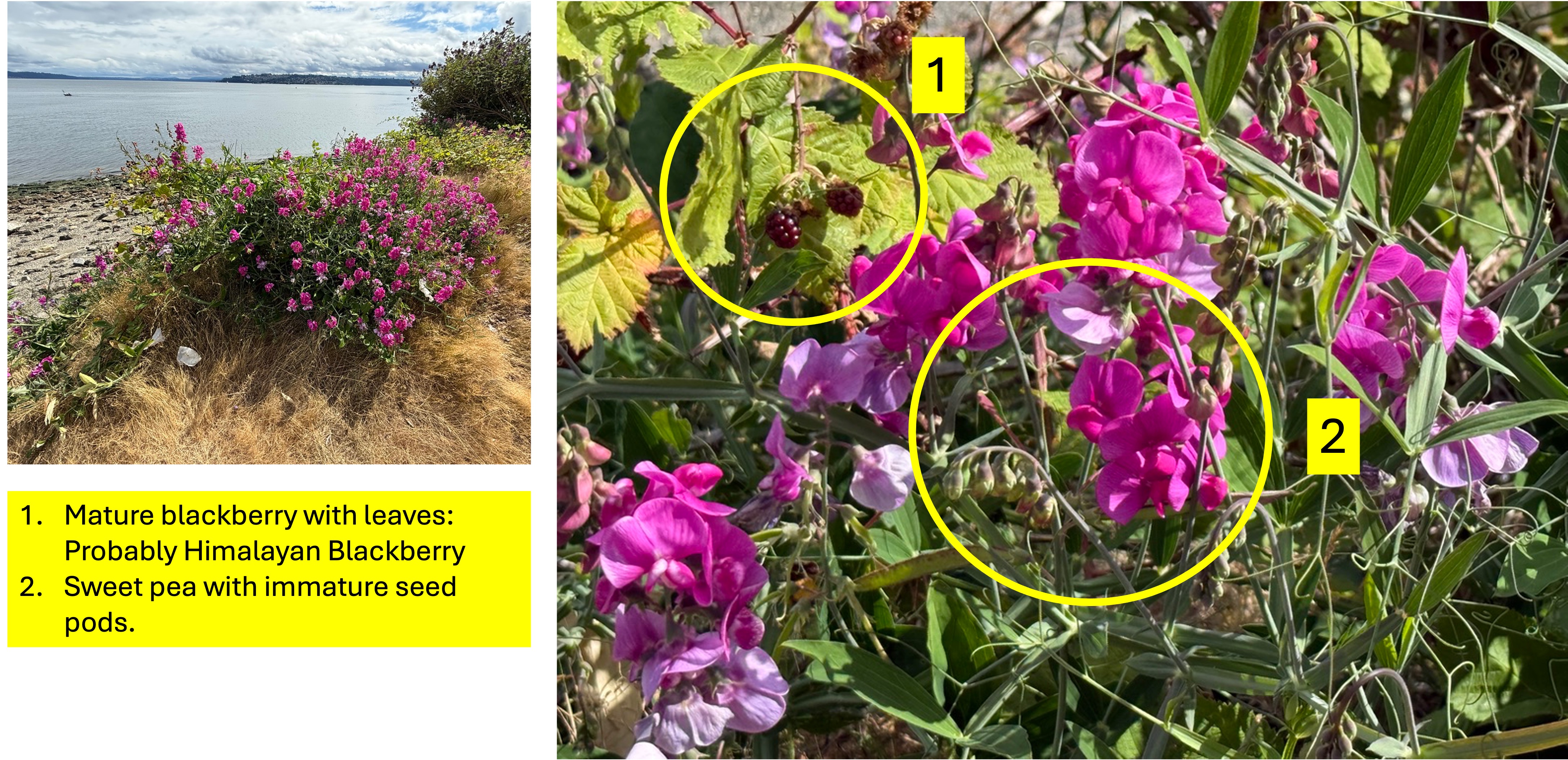
This bramble caught my eye, so I took a closer look. It is a mixture of two pioneer plants. Sweet peas of different species are native to the PNW (I don’t know which exactly this is), but Himalayan blackberry is invasive and threatens ecosystems across the region. They are fighting it out, so I’m cheering for the sweet pea — to fend off the foreign invader.
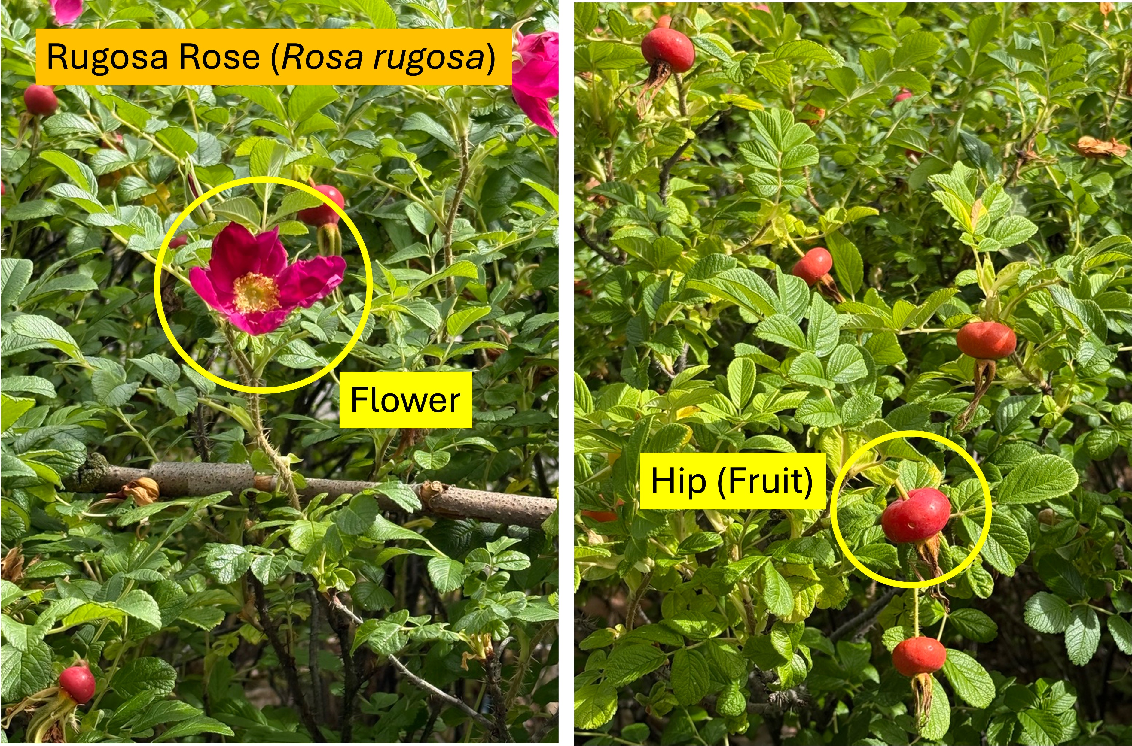
This wild rose species caught my eye because of the huge fruit (golfball sized), which is apparently edible. Just put enough gravy on it and it’ll taste fine.
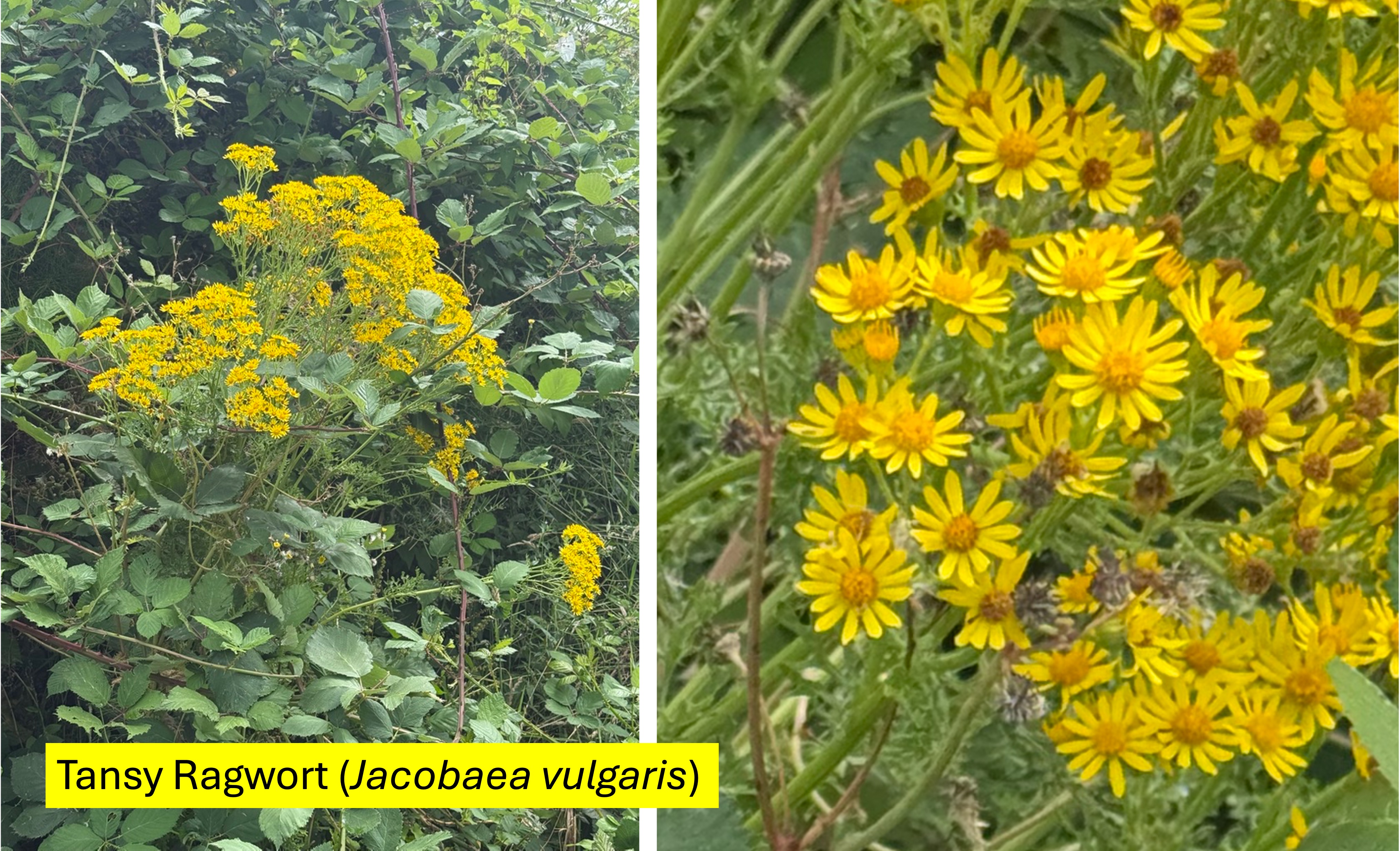
I thought these bright, yellow flowers looked familiar. I checked a previous post to discover that the flowers are not common tansy. The flowers are curved upward and the centers are large, orange domes. It is invasive and toxic to animals (and people), so it is actively monitored. This example is growing in a thicket along with Rugosa Rose, which is also invasive; and yes, there are native plants that thrive in a coastal environment but they have natural controls that are lacking for these alien species.
Final Thoughts
I didn’t mean to photograph anything today, but the flowers are so eye-catching. And I love old industrial sites.
The Northwest Native Garden
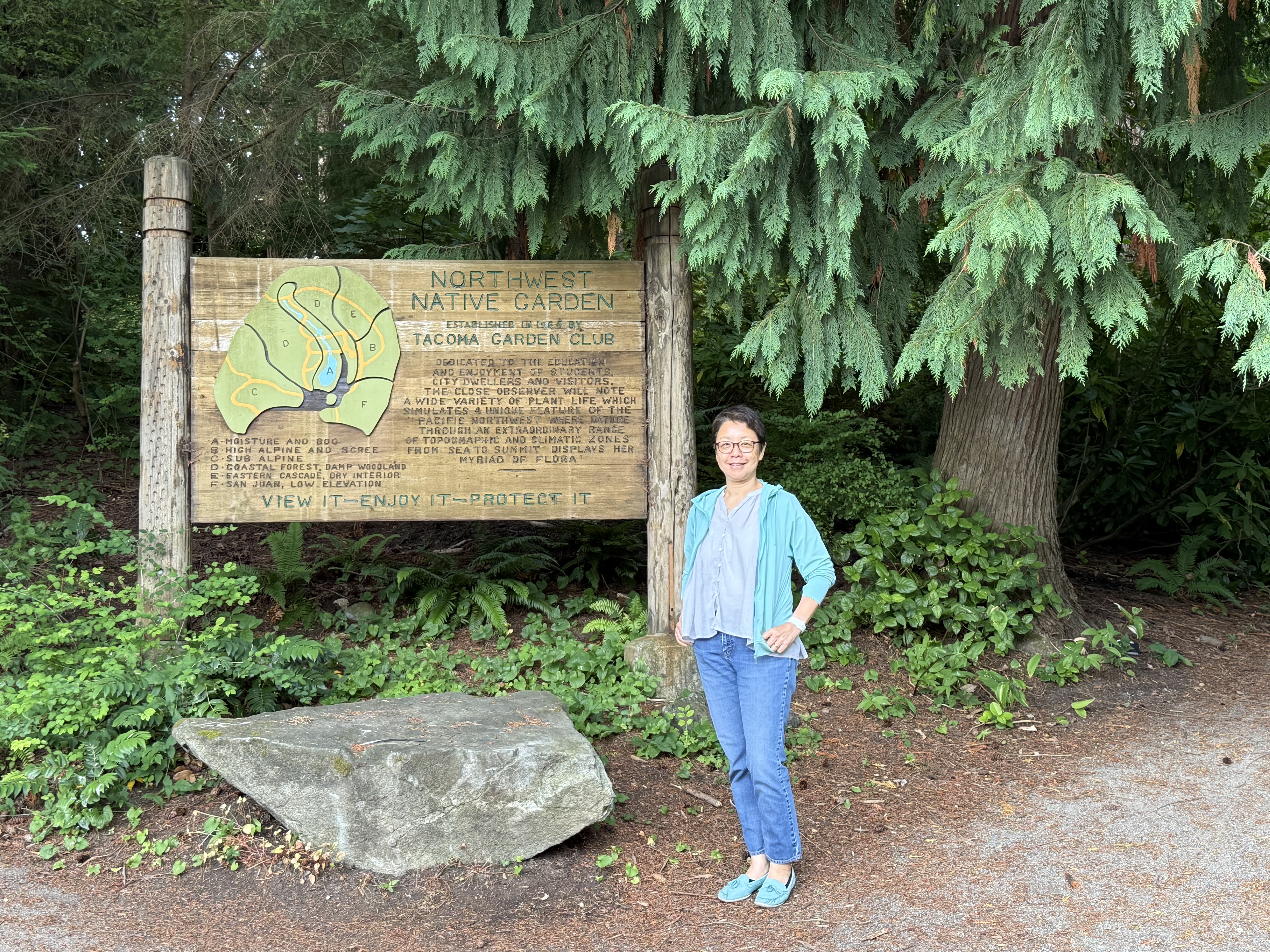
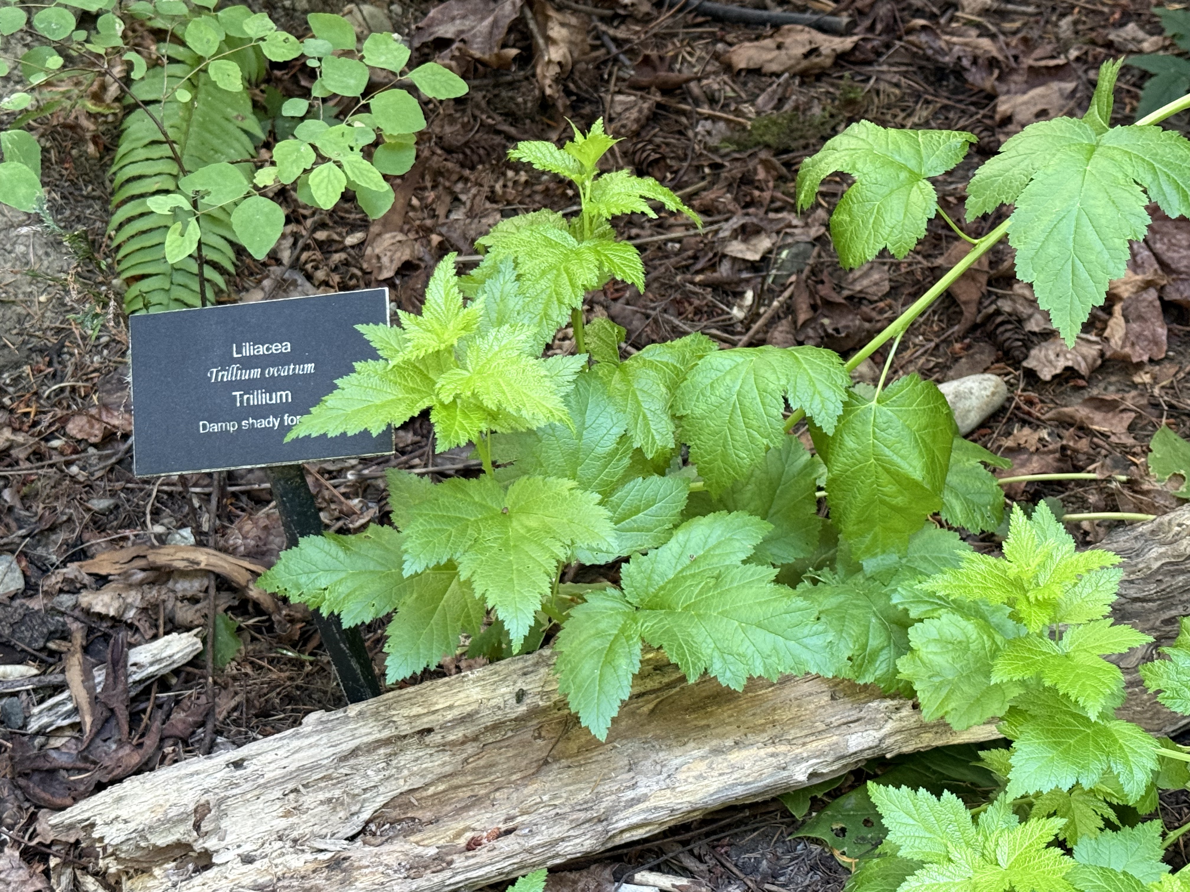
Like the (rare) sign says: Trillium likes moist coastal forests.
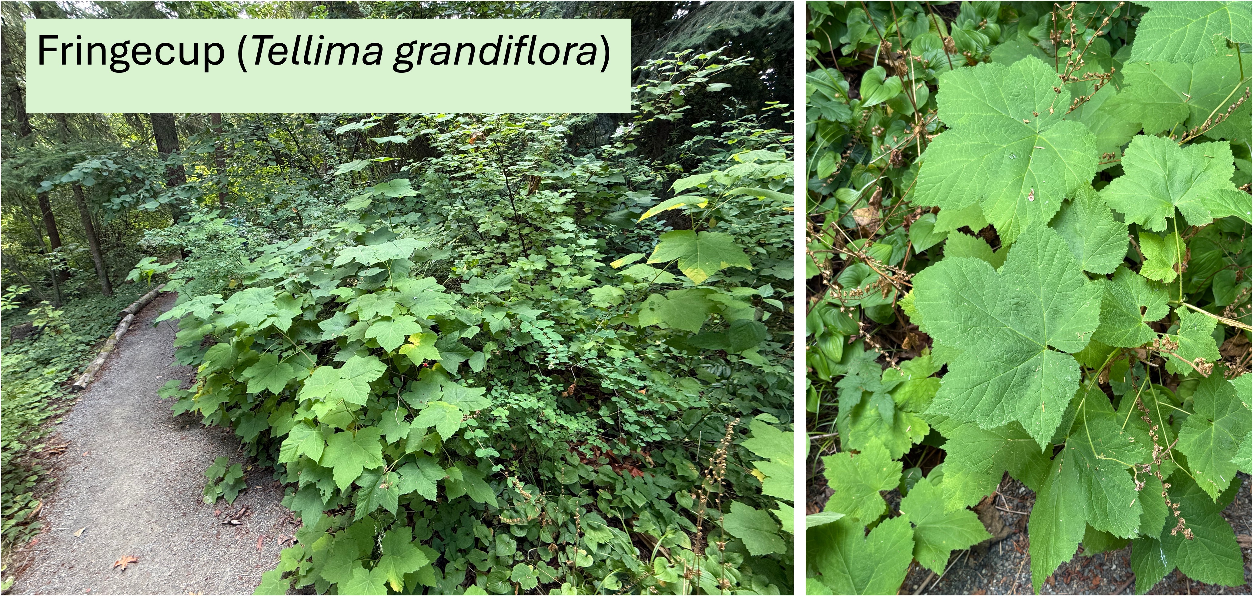
This common PNW shrub thrives in moist coastal forest environments.
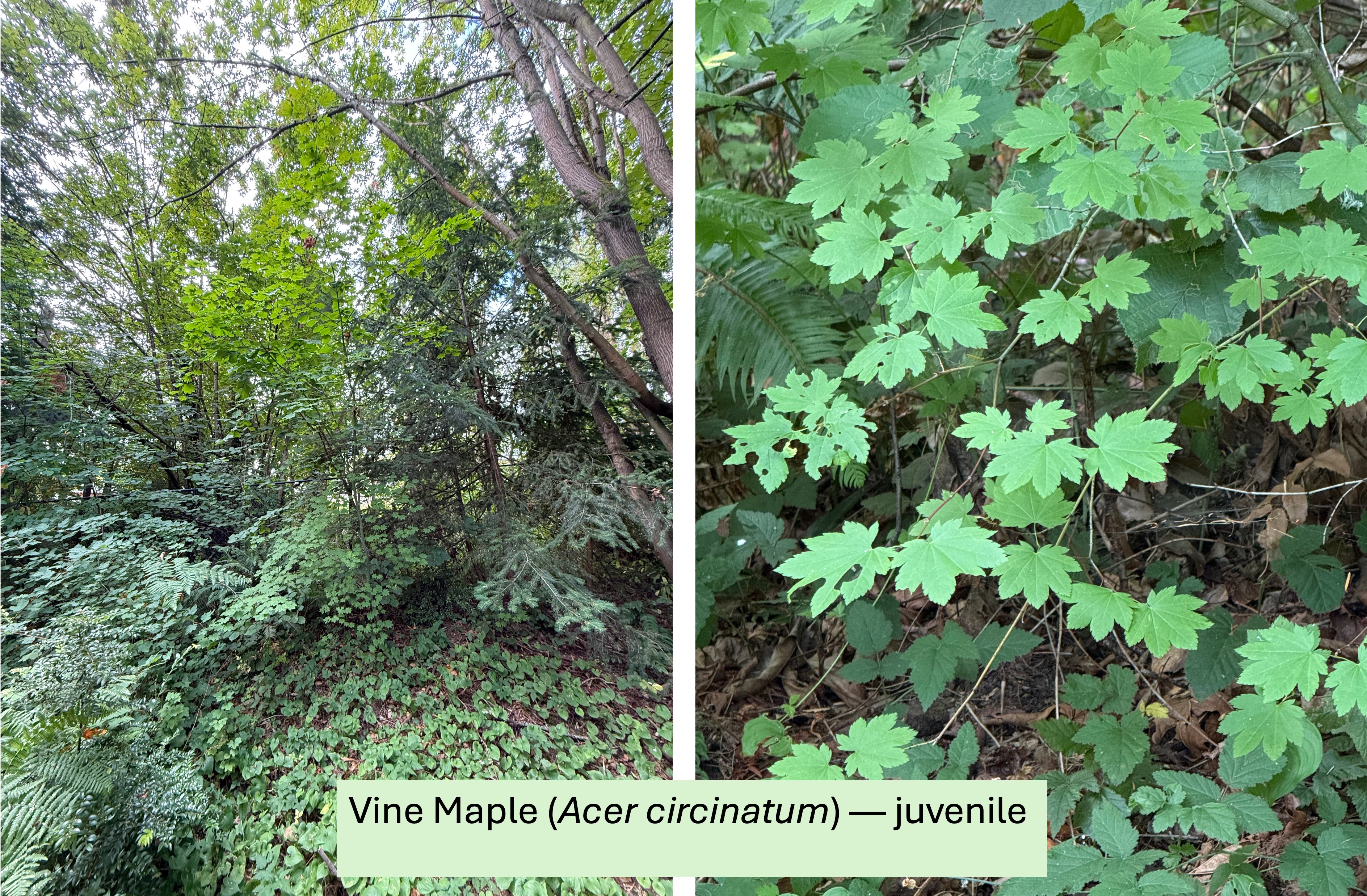
Vine Maple is an understory tree, which doesn’t grow high enough to compete for full sun; instead, it grows beneath the conifers and gives even more shade to the shrubs. This sapling is just starting to get some height. Moist coastal forest.
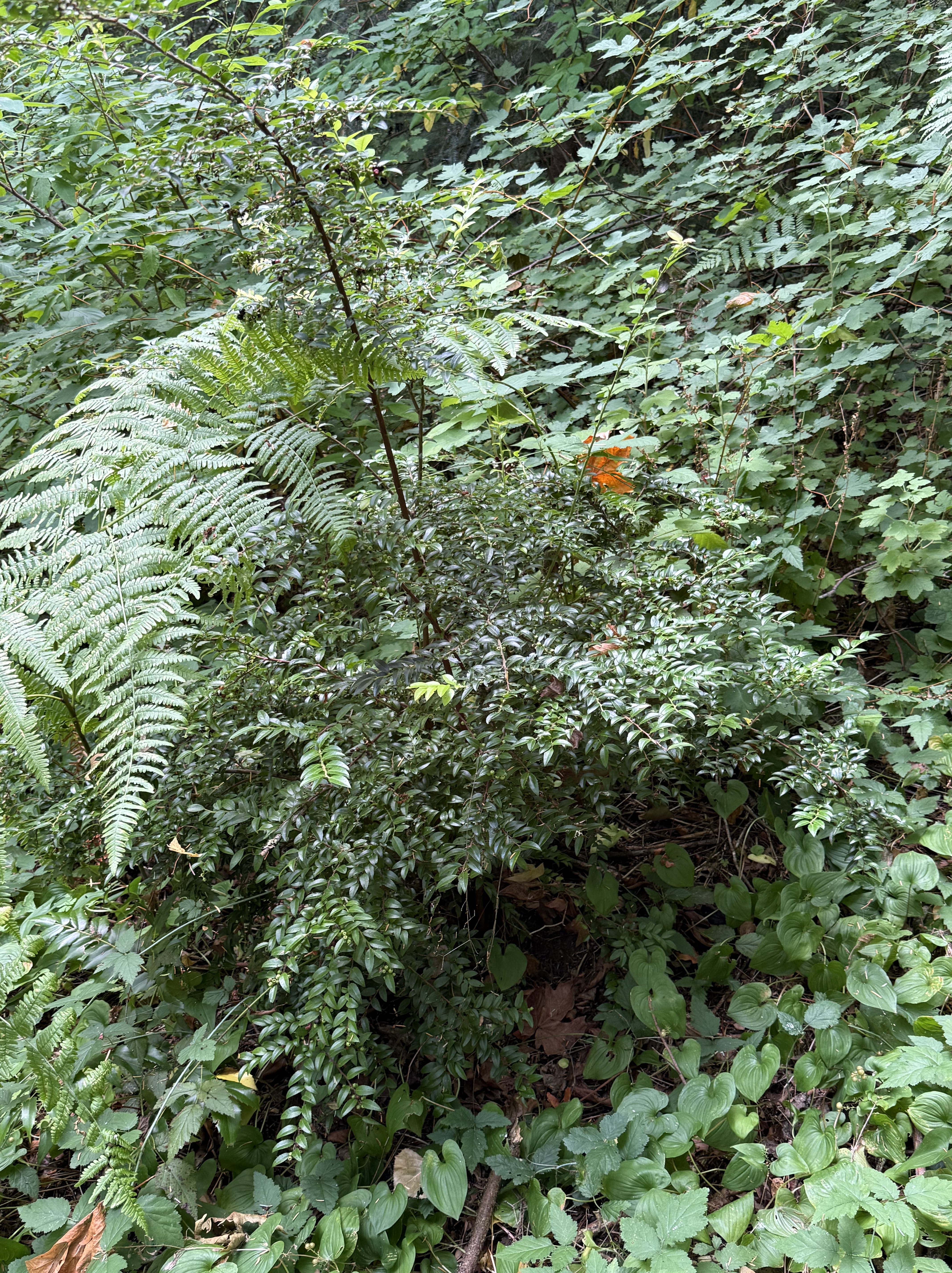
This is Salal (Gaultheria shallon). It grows in an environment similar to Vine Maple, in nutrient-rich, well-drained soils, often near water. Moist coastal forest.
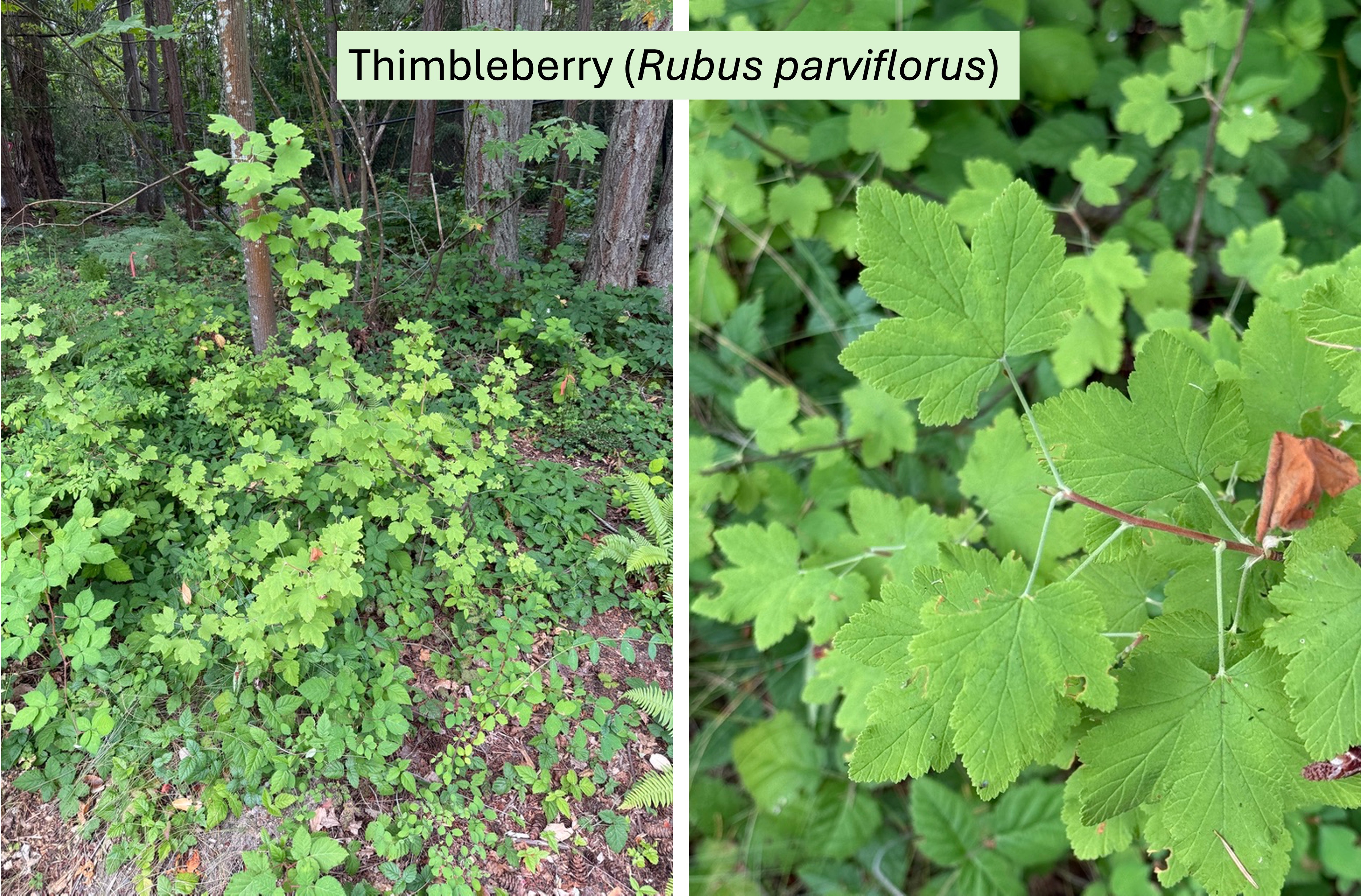
This shrub forms colonies in mesic forest patches, where partial sun is available although it is shade tolerant. The identification is difficult because of so many plants with similar leaf shapes, but I agree with CoPilot. A denizen of moist coastal forests.
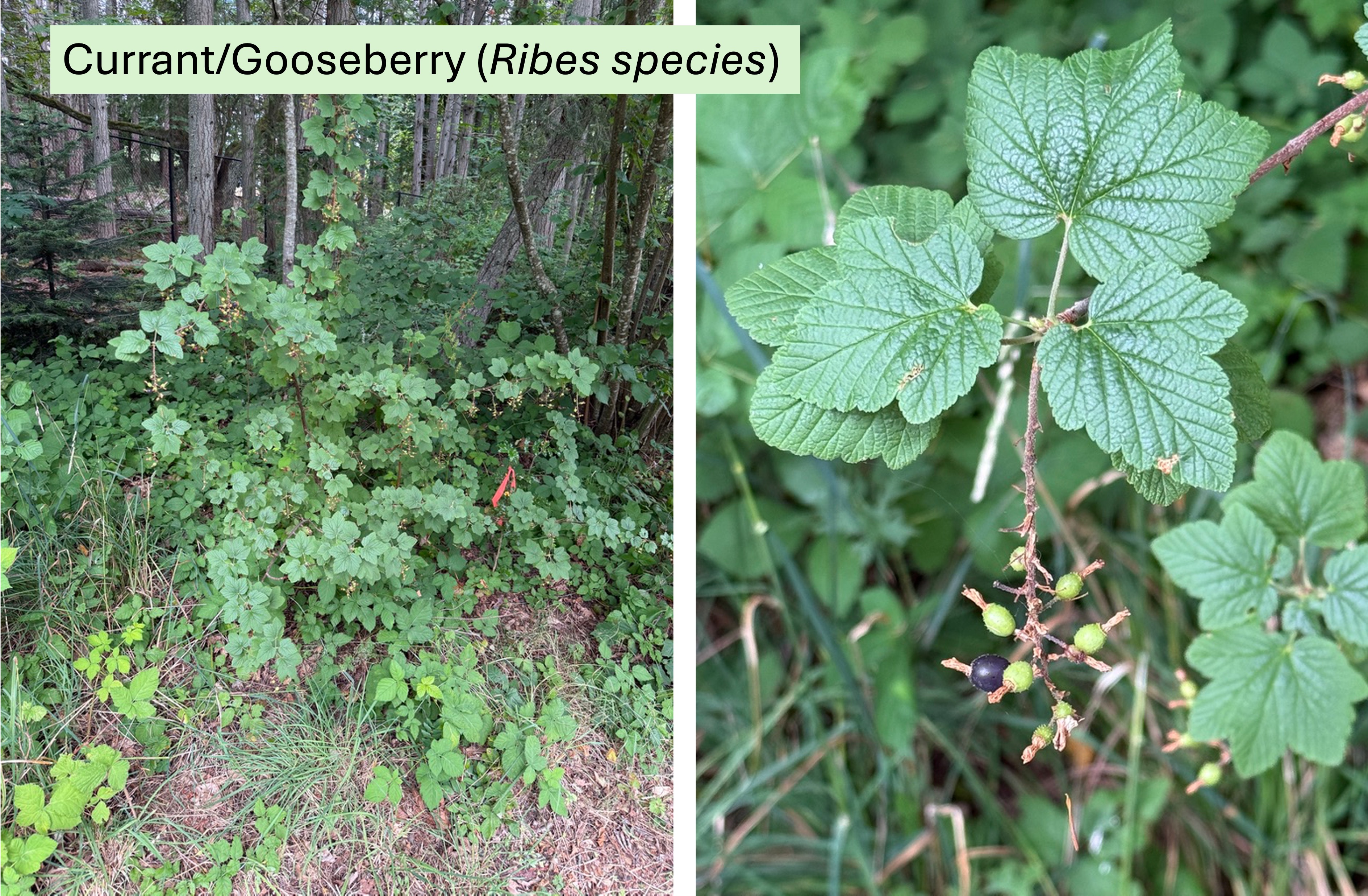
This plant is common to shrub thickets and riparian edge habitats.
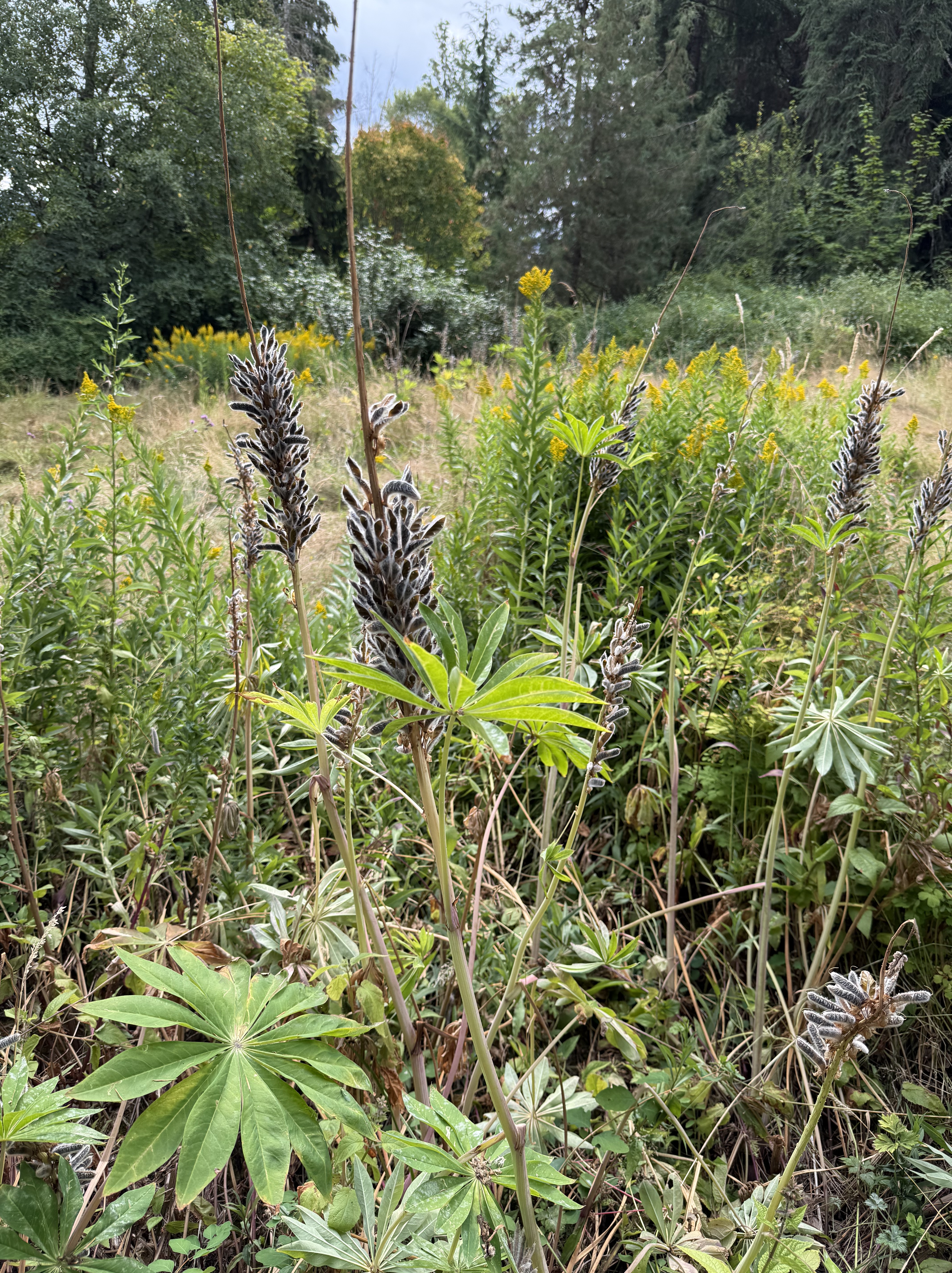
This distinctive plant is Bigleaf Lupine (Lupinus polphyllus). It thrives at the edges of meadows in a full-sun environment with moist to dry soil. Those lovely appendages are seed pods, so I don’t know what the flowers look like. This plant thrives in prairie/oak woodland habitats.
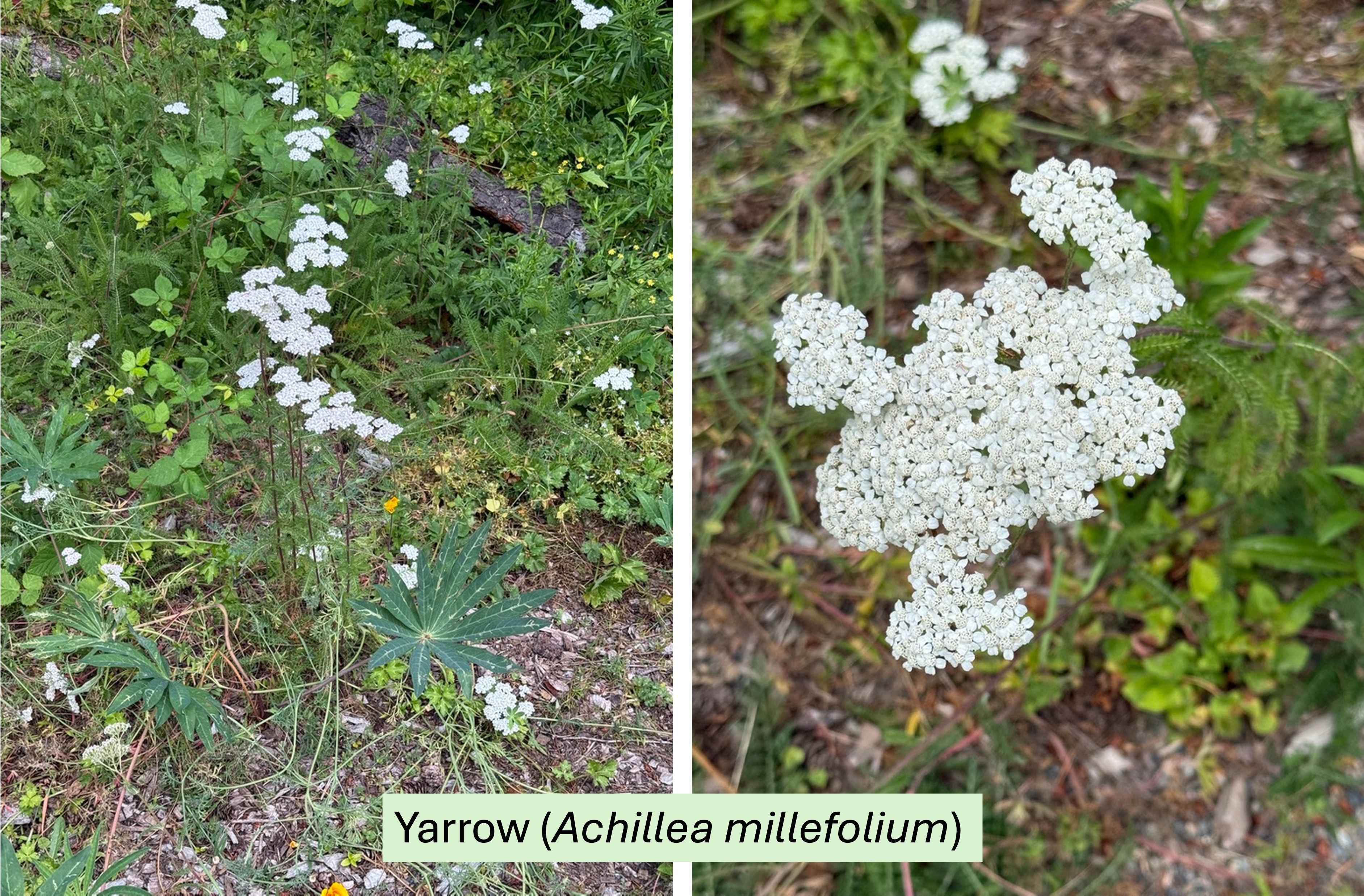
This slender, flowering plant is thriving in the prairie section of the garden. Prairie/oak woodland environments.
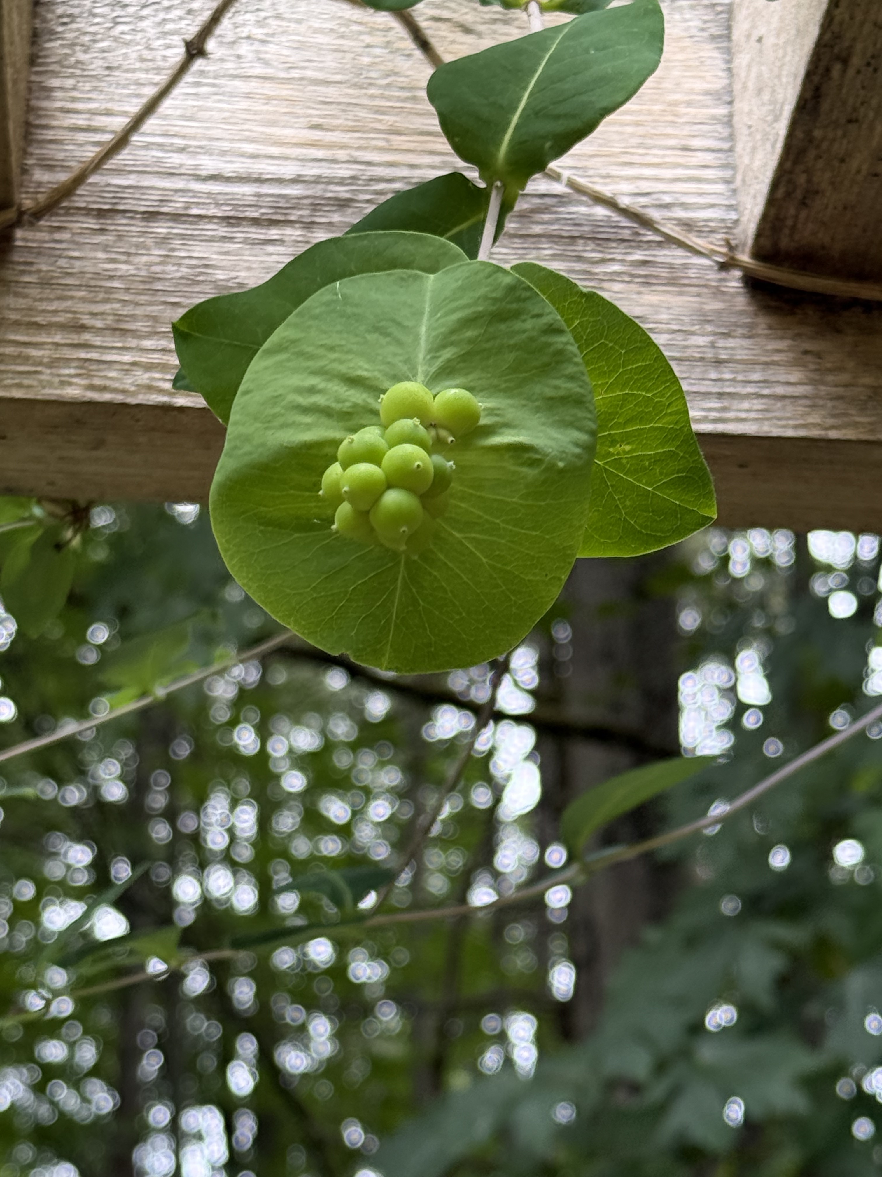
This vine is Perfoliate Honeysuckle (Lonicera caprifolium). It is a non-native variety that is commonly planted on trellises and fences. This one was hard to identify; CoPilot failed completely but, with help from Claude (Anthropic’s AI), we finally figured it out. We could still be wrong, however.
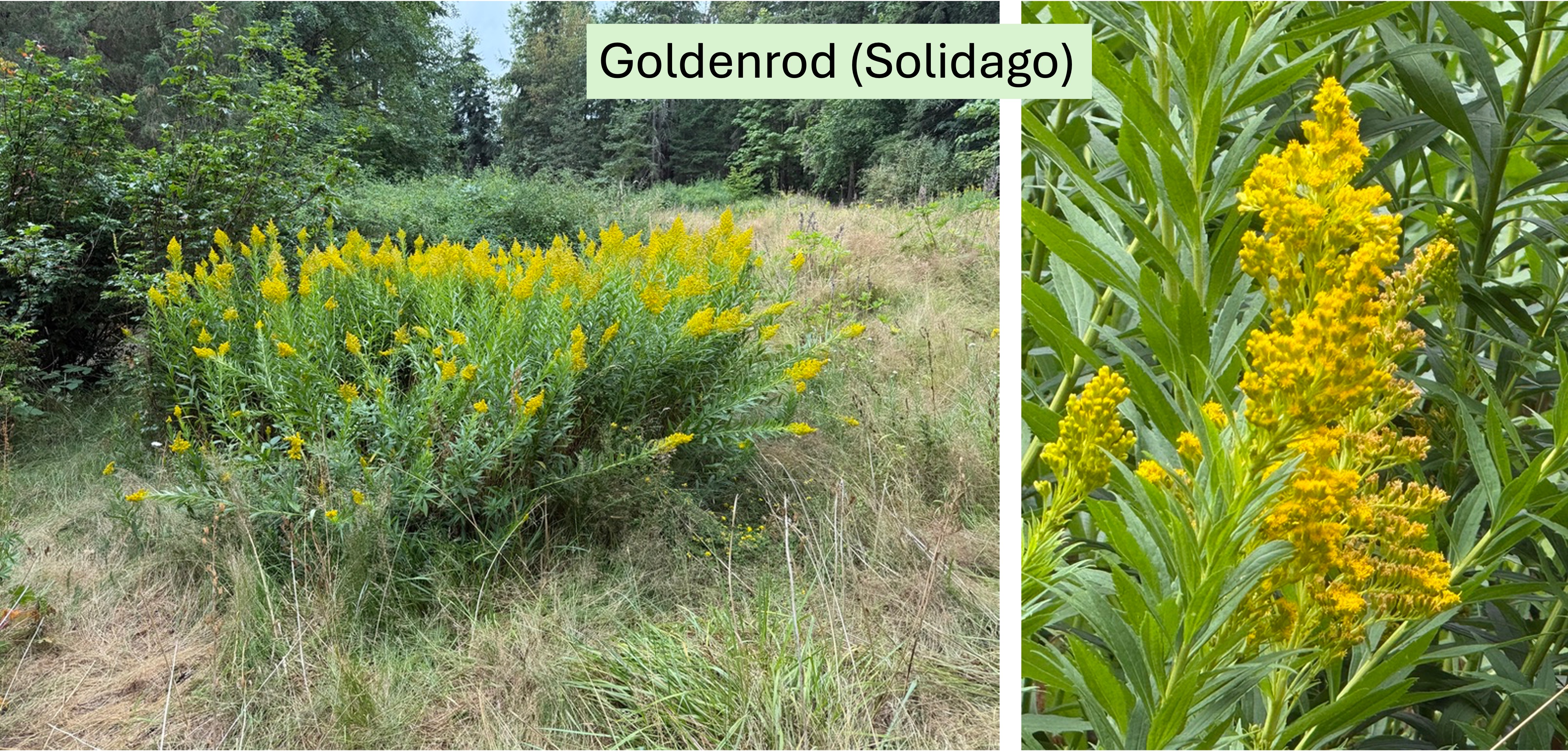
This flowery shrub grows in meadows like the micro-environment at the Northwest Native Garden. Prairie/oak woodland habitats.
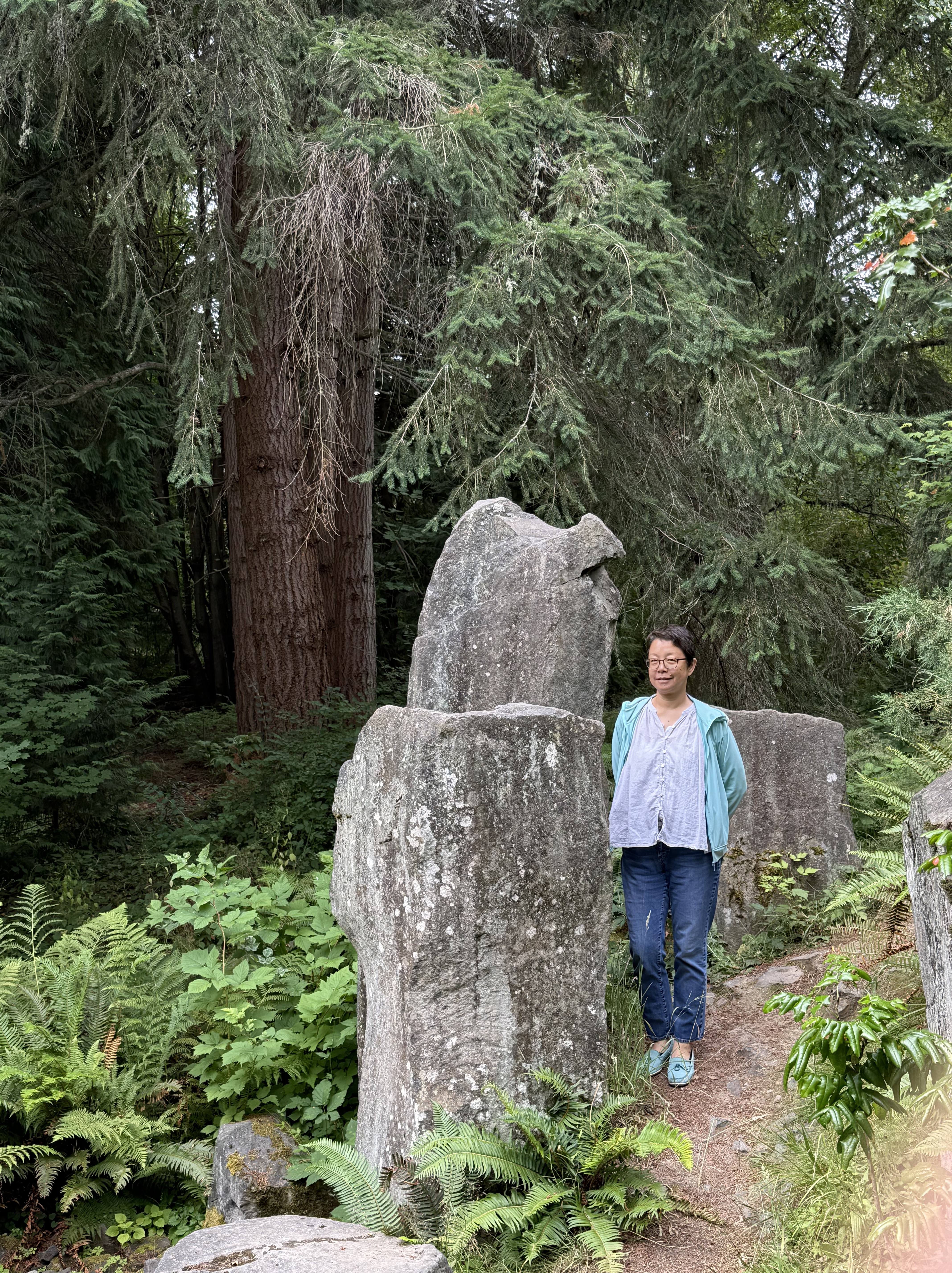
These non-native (to Tacoma) columns of volcanic rock show up everywhere in the PNW. They originate within the Cascades Range, near volcanic vents and volcanoes.
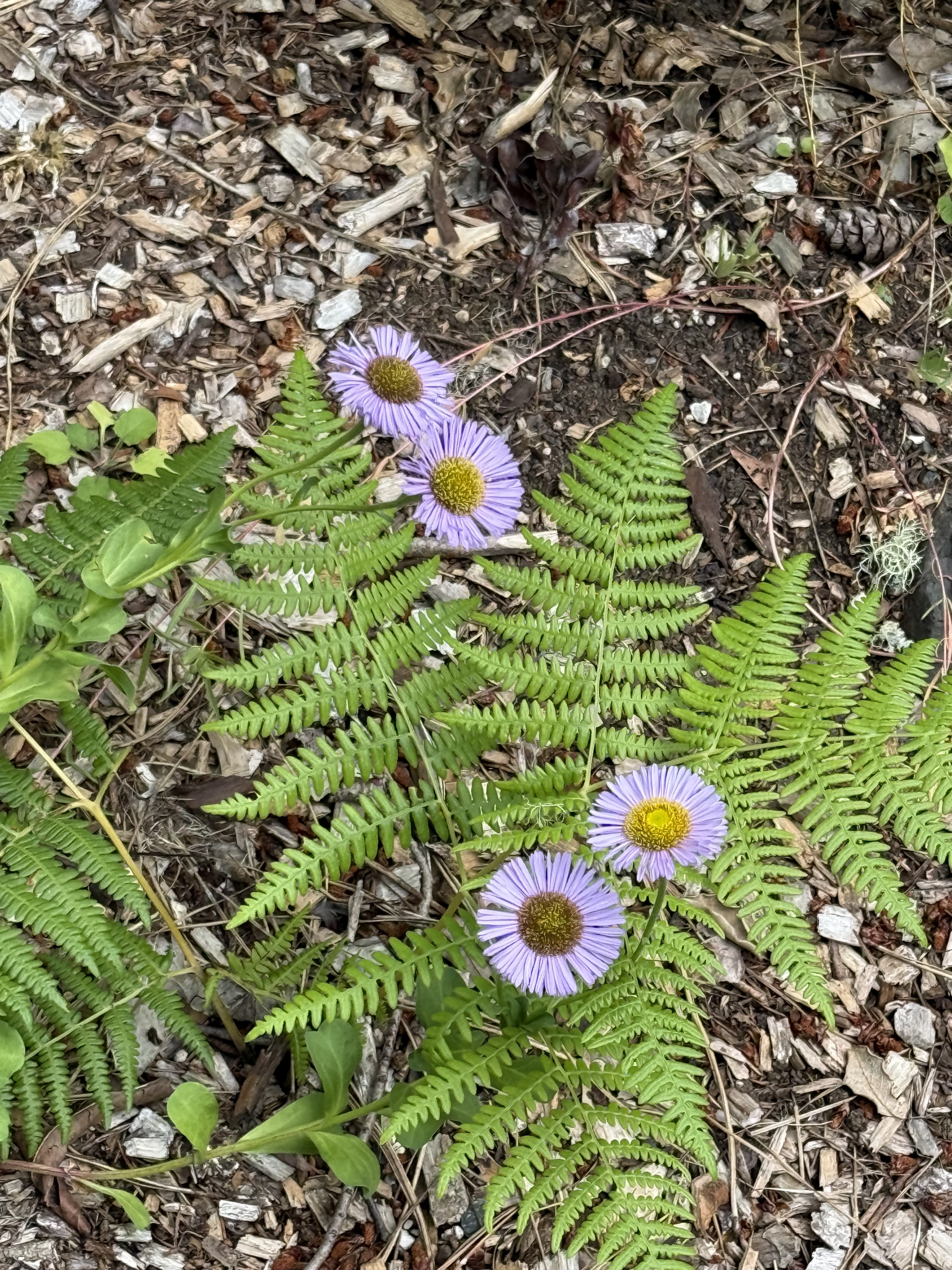
This lovely flower, growing through some ferns, is Douglas Aster (Symphyotrichum subspicatum). It is common in moist meadows and forest edges. I verified the identification from CoPilot. Common in moist woodland/forest edge habitats.
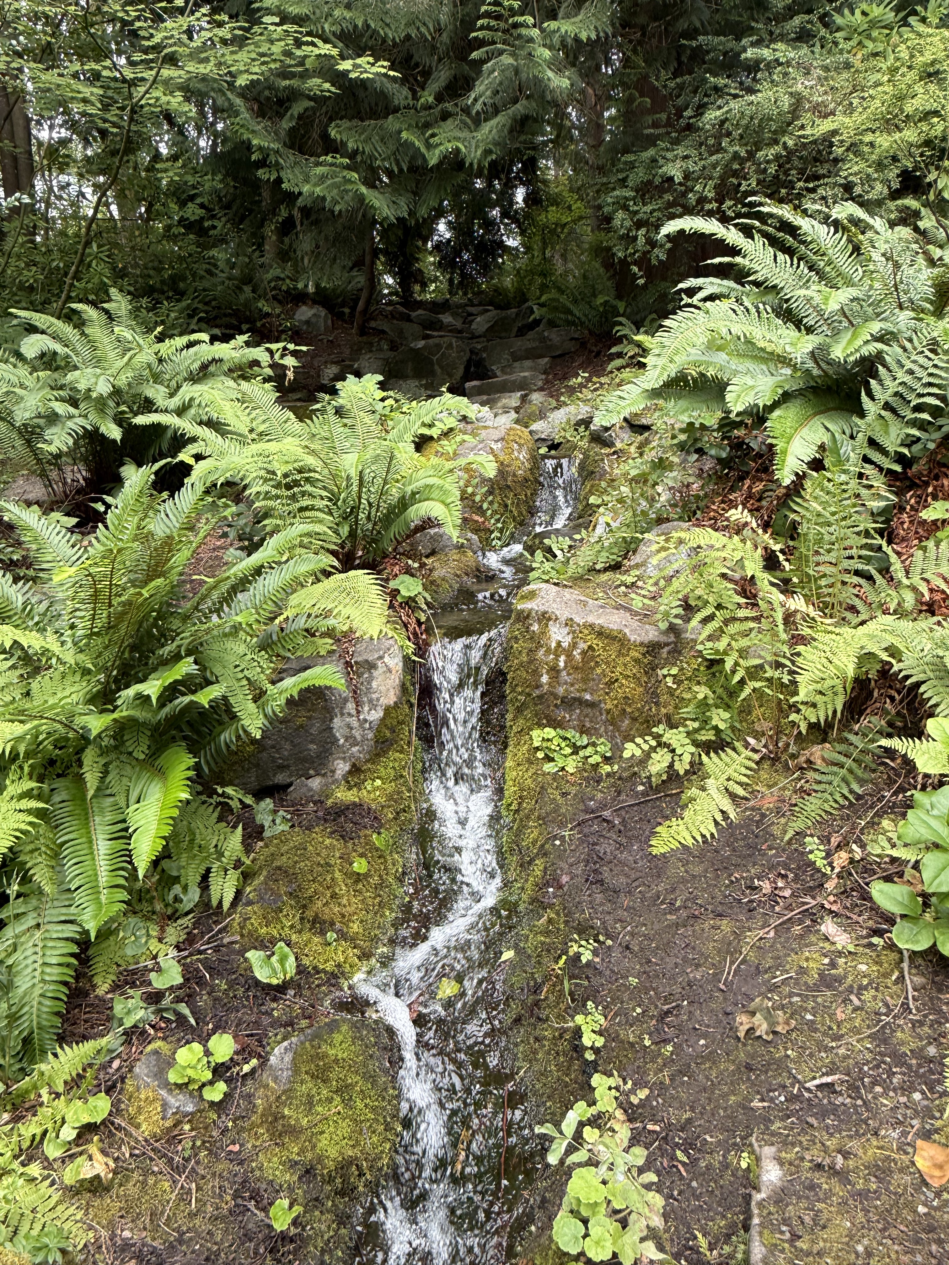
There is a small, articficial stream flowing through the garden and feeding a small pond. I don’t know where the water comes from … is it natural or recycled? No idea.
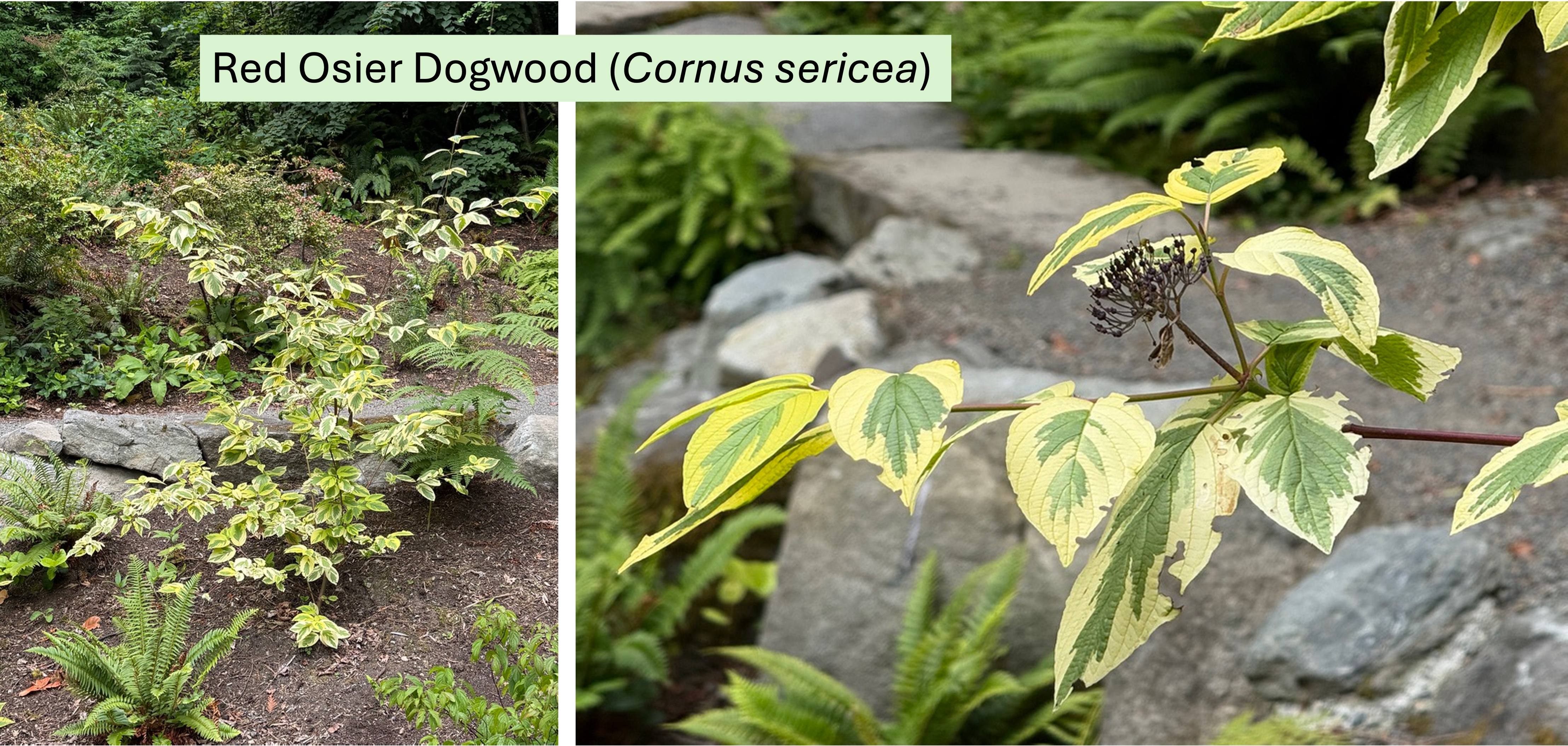
This is a rare non-native species planted in the garden for contrast. I checked this myself, and this variety is variegated.
Final Thoughts
The Northwest Native Garden is a great place to see many of the ecosystems in the PNW in one place. However, the lack of identification is a problem, which I addressed using CoPilot. But I had to check it a lot because it is a Large Language Model, not a specific plant-identification model. Nevertheless, it always got me into the ballpark; and it is easy to work with, like collaborating with a human who knows a lot but tends to jump the gun sometimes.
We spent about an hour strolling through four PNW environments, which was a lot easier than driving around. It reminded me of a Japanese garden, like the one in Portland. Very peaceful and colorful.
I hope that anyone who got this far enjoyed my trip through the Northwest Native Garden as much as I did. I plan to revisit it and learn about some more native PNW flora.
The Foothills Trail along Carbon River, Pierce County, Washington
This post is a humorous (I hope) addendum to my posts on the geology and flora of Carbon River. I have noticed a lot of quirky, regional trends, both in decoration and signage, here in the Pacific Northwest (PNW) during our nature walks. The Foothills Trail was no exception.
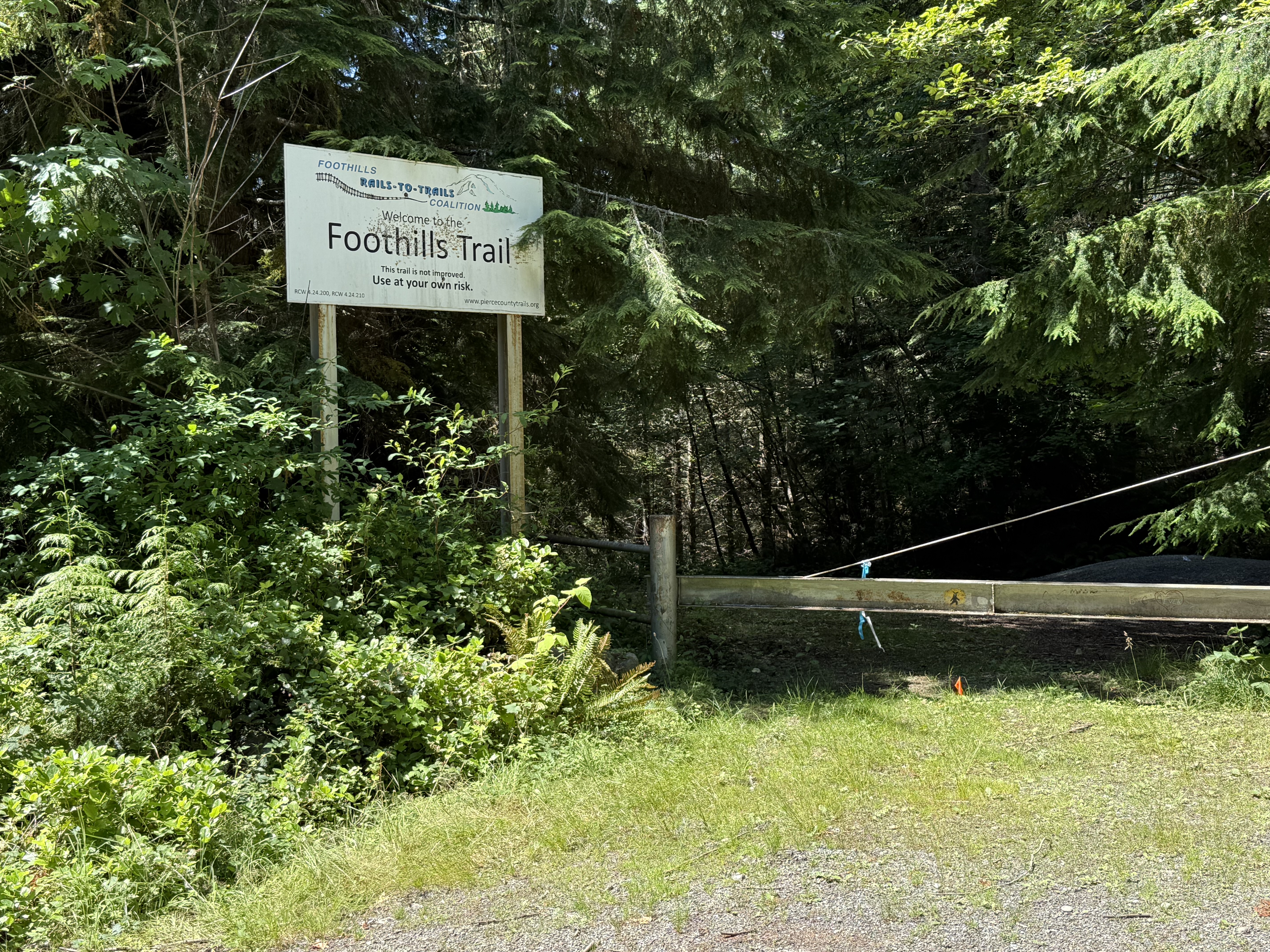
There are several access points to the trail, but this was the only sign. It ends with a serious warning: Use at your own risk. What lies ahead in that darkness?
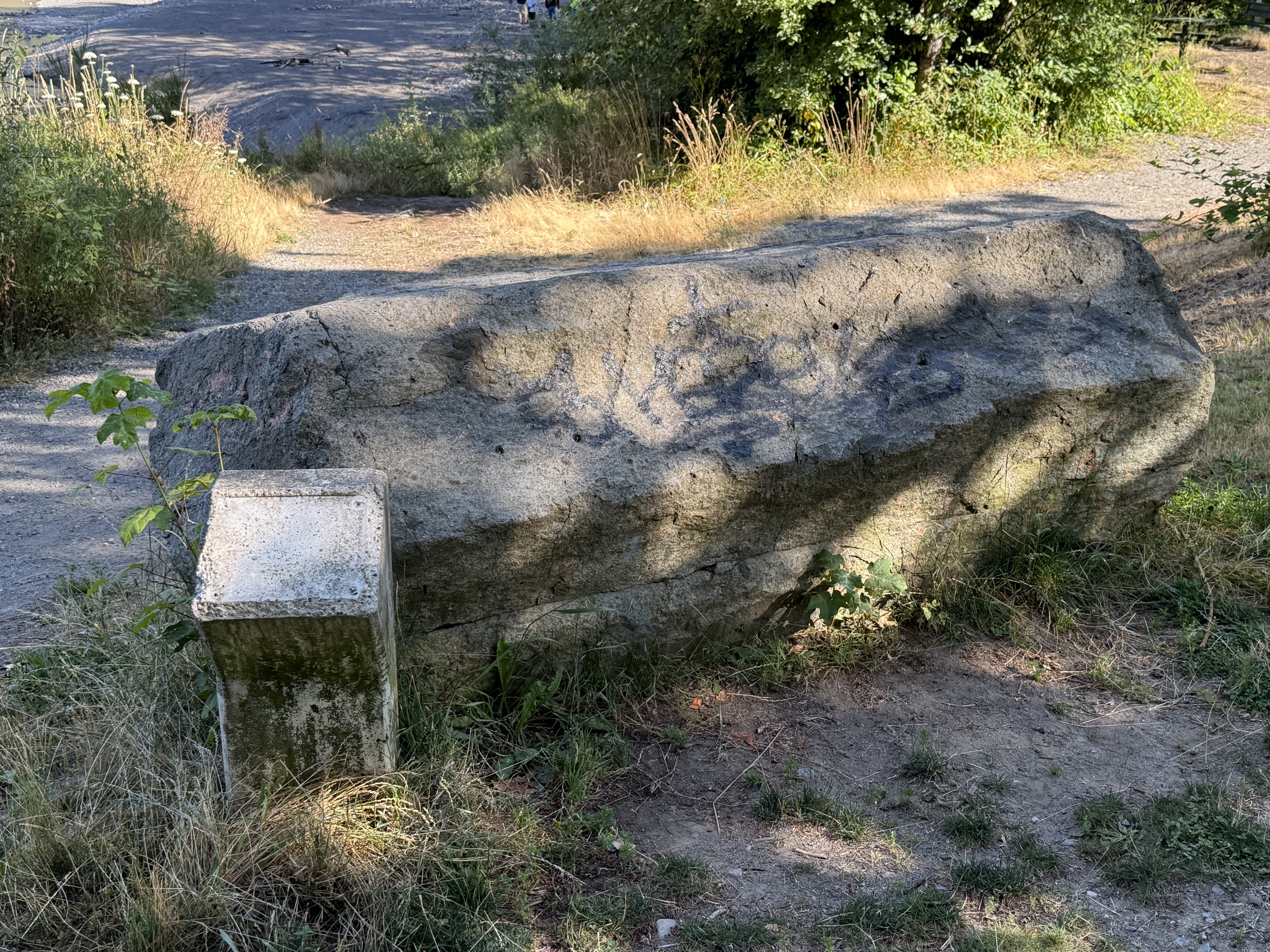
A couple miles downstream from the “official” trailhead, we stopped along the Carbon River. This is a piece of ubiquitous columnar andesite that was apparently placed here as a decorative piece. Unfortunately the sign is long gone.
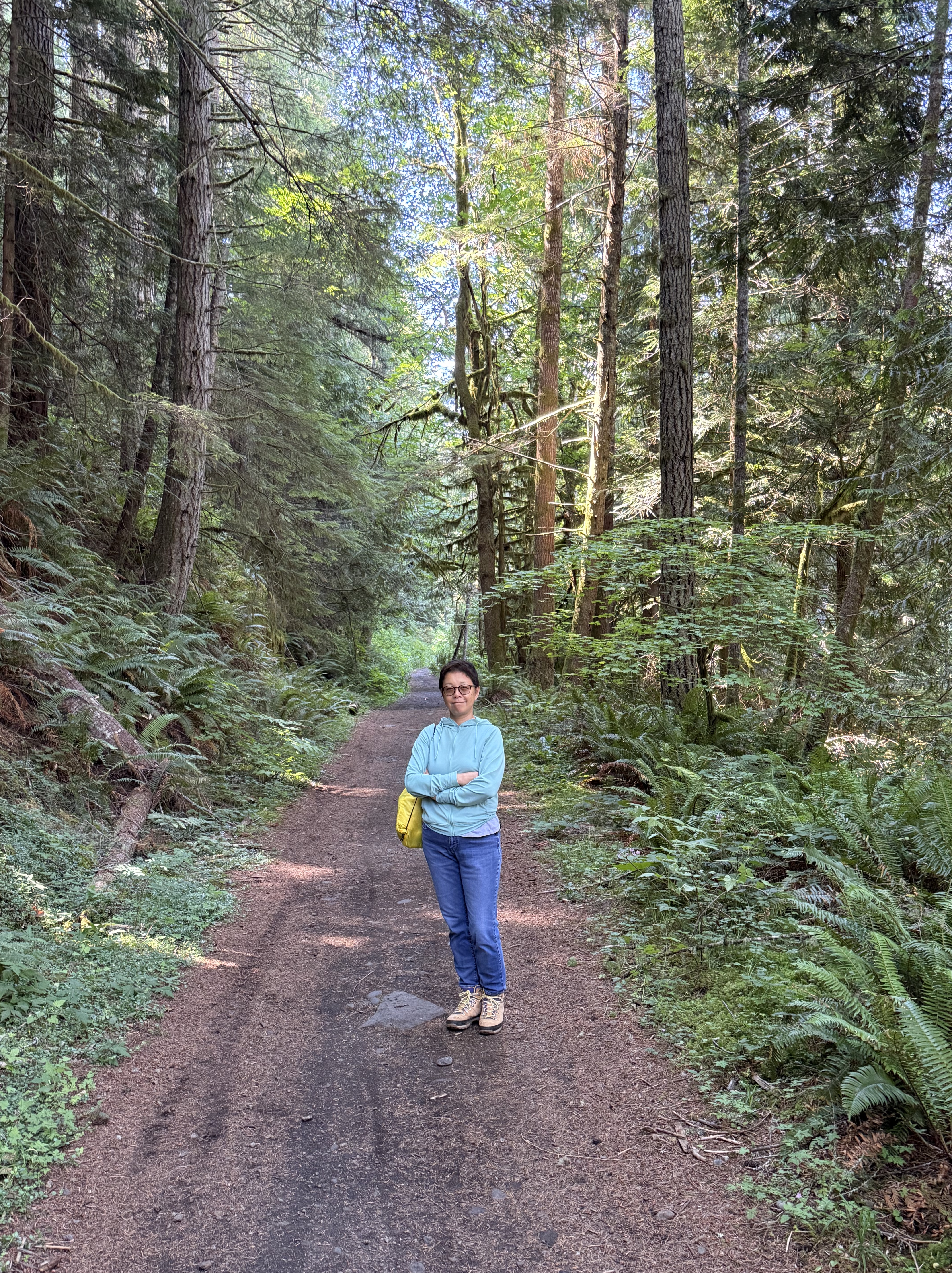
The trail is wide and easy to access on foot. I don’t know about a wheel chair although it is flat all the way.
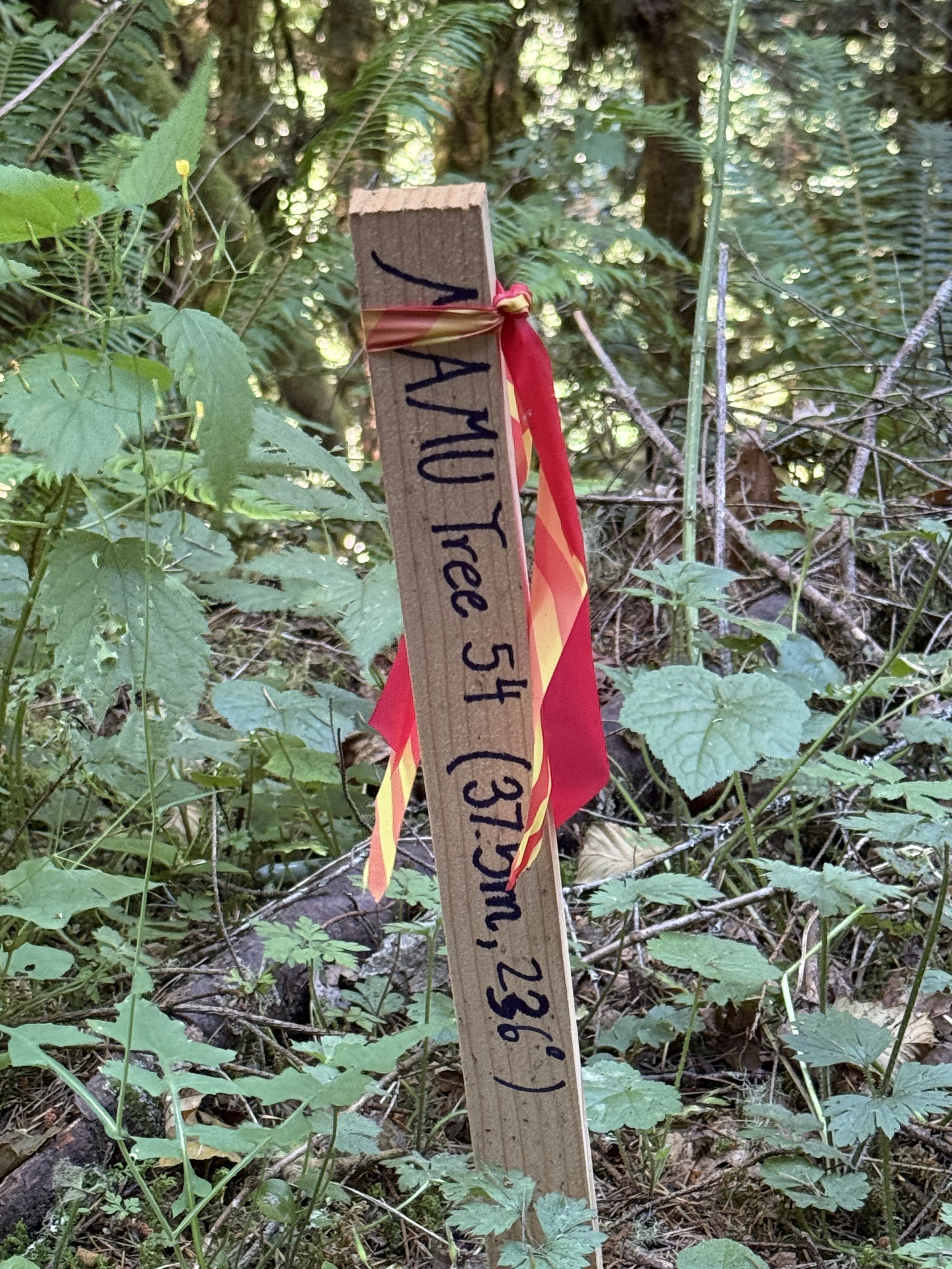
We saw several of these marker stakes along the trail. I looked it up and, to the best of my knowledge, this is indicating a tree where a pair of Marbled Murrelets are nesting. They are an endangered species and extremely difficult to locate, but there is an ongoing survey program. That sounds reasonable to me; the sign gives both a distance and compass heading to the tree.
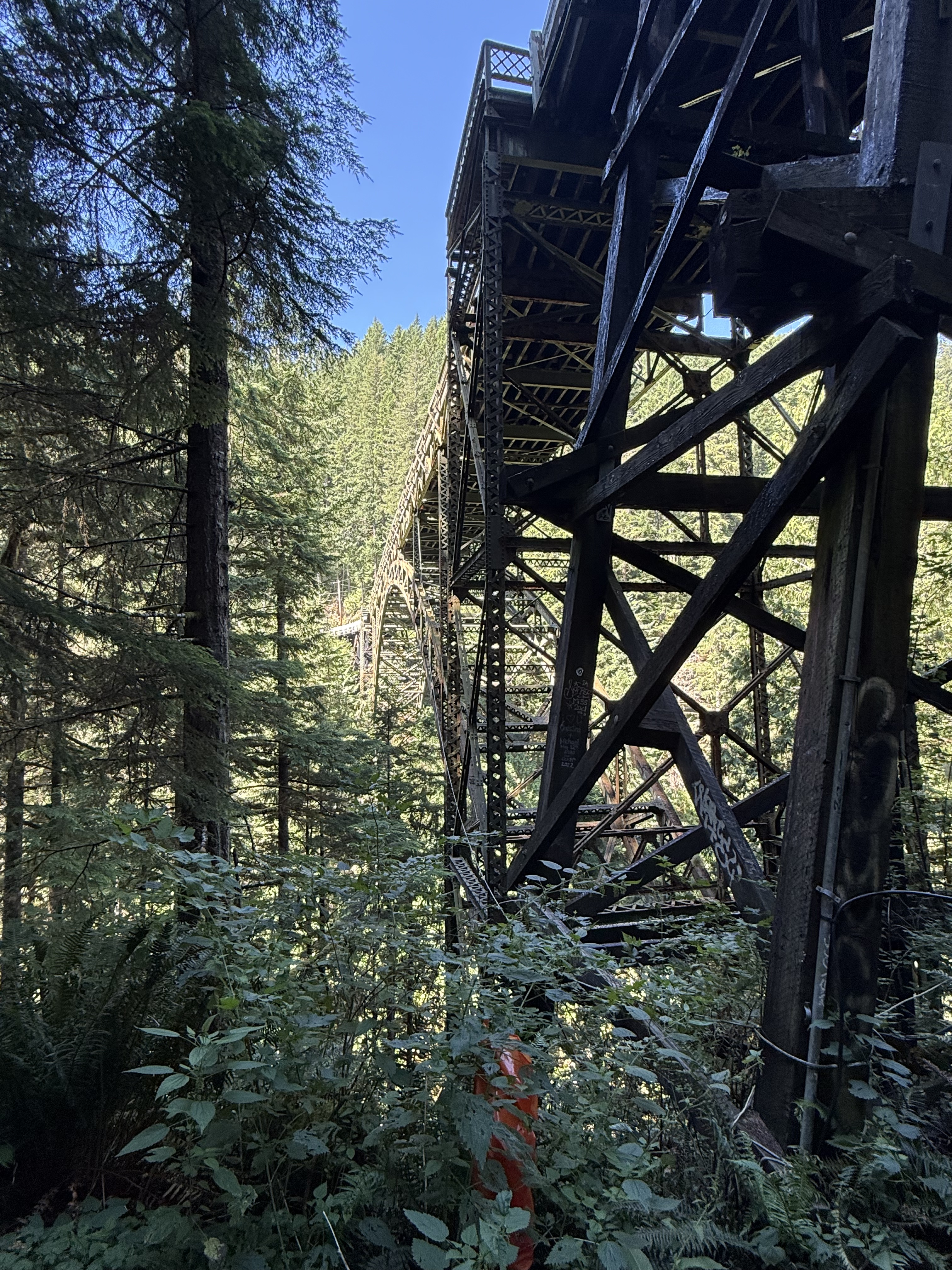
The trail intersected the Franklin Bridge, which is indefinitely closed to traffic.

We climbed a steep slope, with the help of sturdy handles attached to wire rope, and took some photos on the bridge.
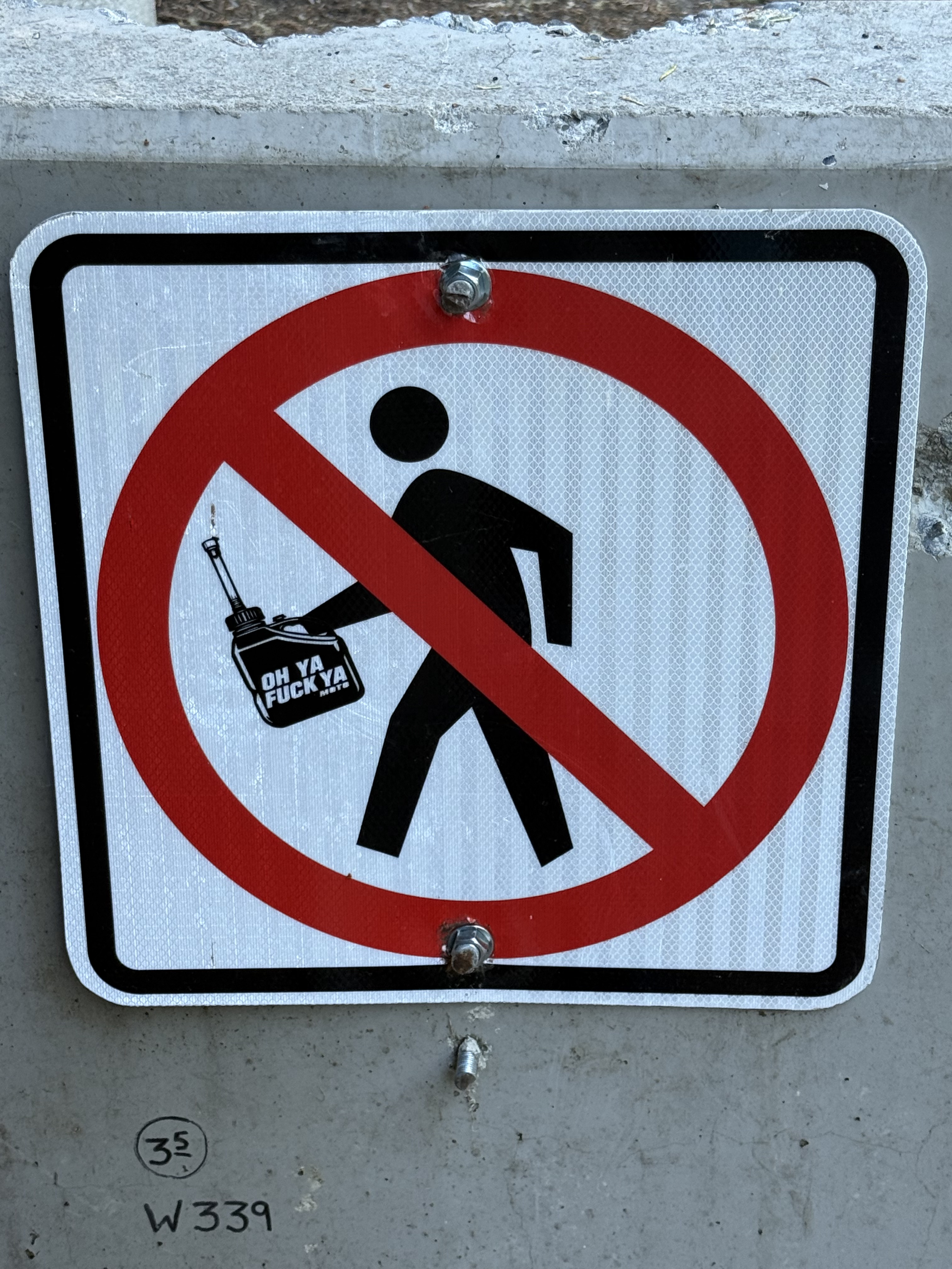
After we finished on the bridge, we passed the concrete blocks obstructing the road. Several signs made it clear that the bridge is closed to cars, bicycles, and pedestrians. Apparently someone disagreed with the DOT restrictions, and modified the sign. Don’t ask me why the figure is carrying a gas can that says, “Oh ya fuck ya.” I guess they’re thumbing their nose at anyone who would dare condemn what looks like a perfectly useful bridge — at least for people and wild animals.
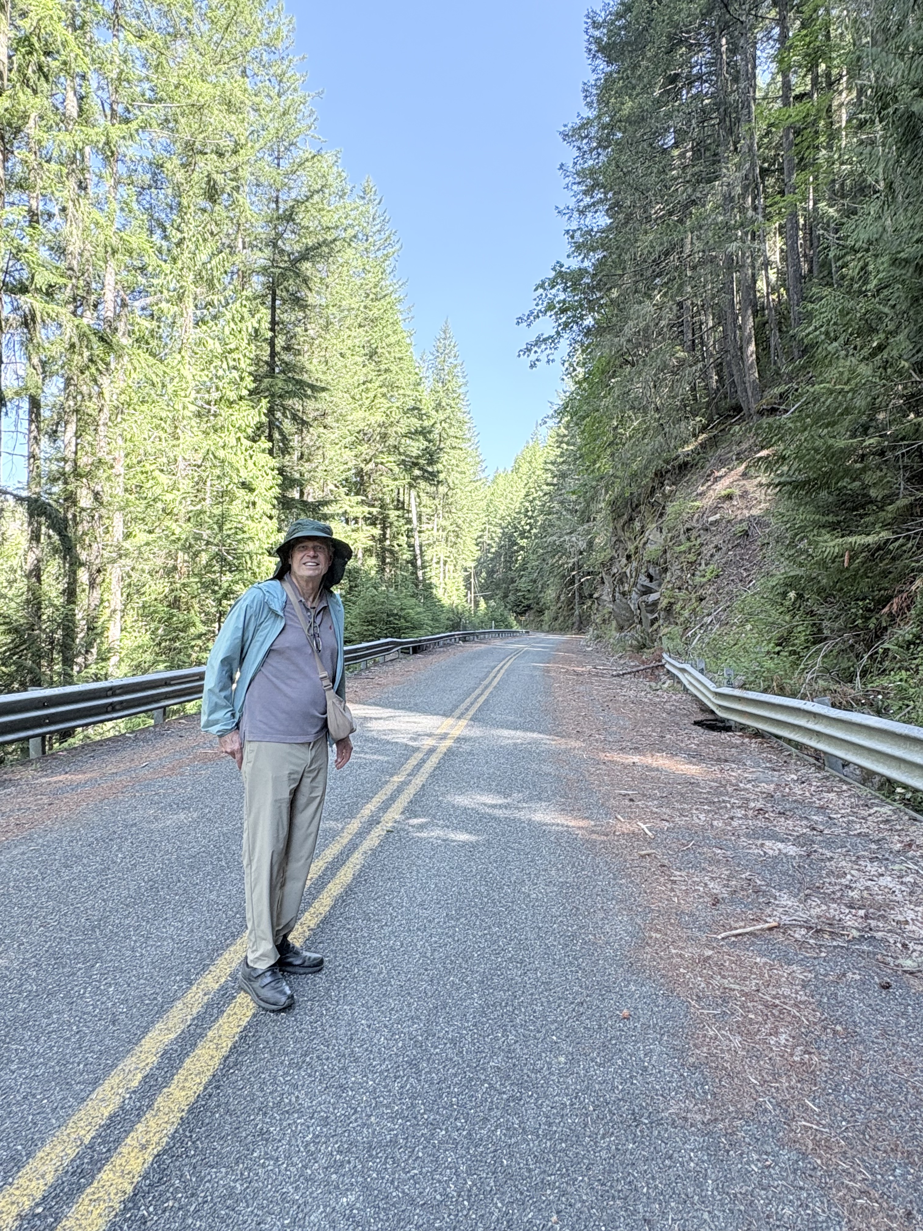
We walked the three miles back to our car along the abandoned road. There were several rock falls and damage to the guardrails. In this image, a large boulder smashed through the eroded roadbed. It was like a post-apocalypse movie. Pretty cool … and quiet.
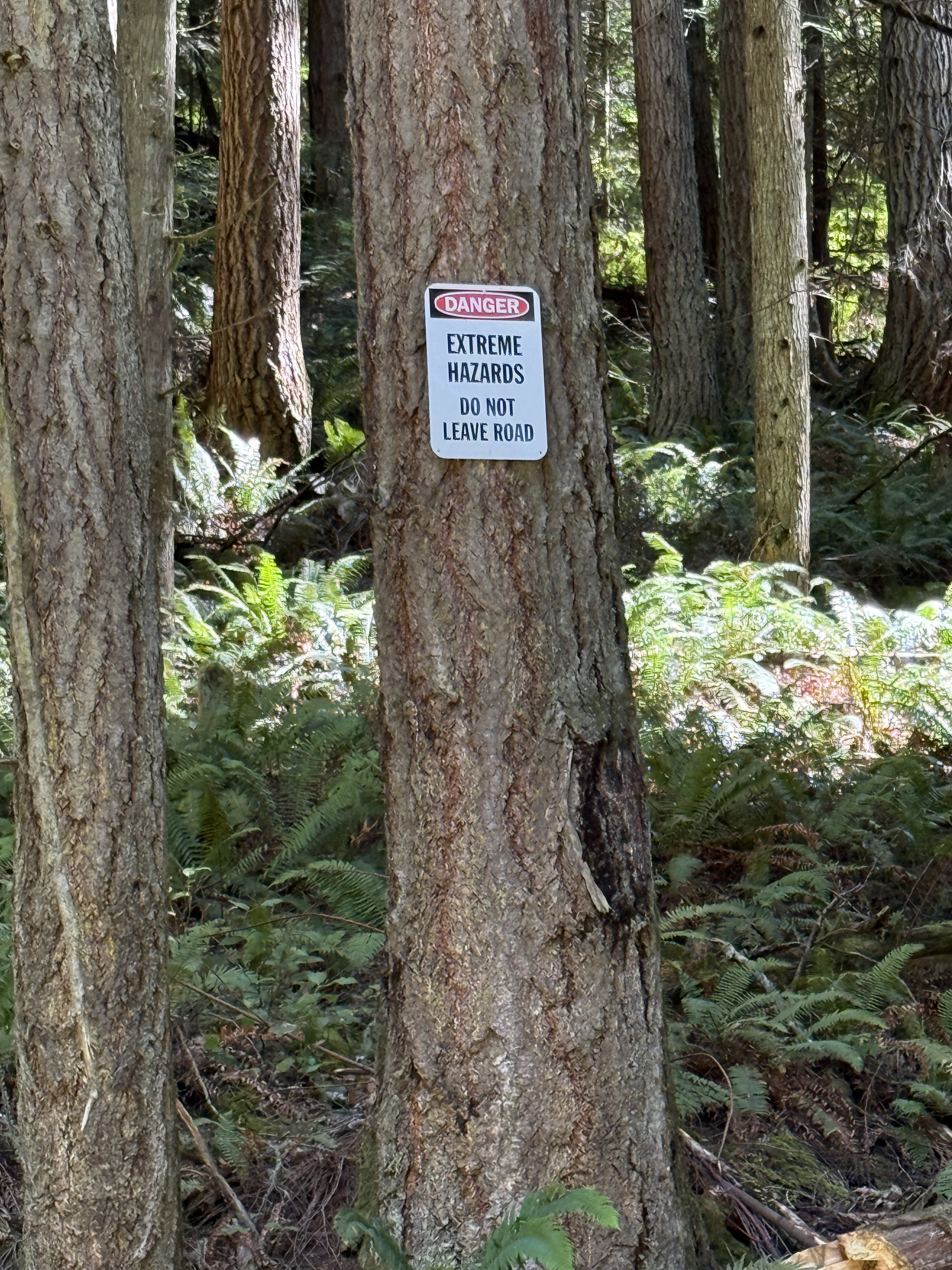
These relatively new signs were posted randomly on trees on the hill of the road. Hazards. Not hazard. Maybe Western Rattlesnakes, poison ivy or … dare I say it? Bigfoot. Stay out of the woods. But we just walked three miles through the woods. Damn!
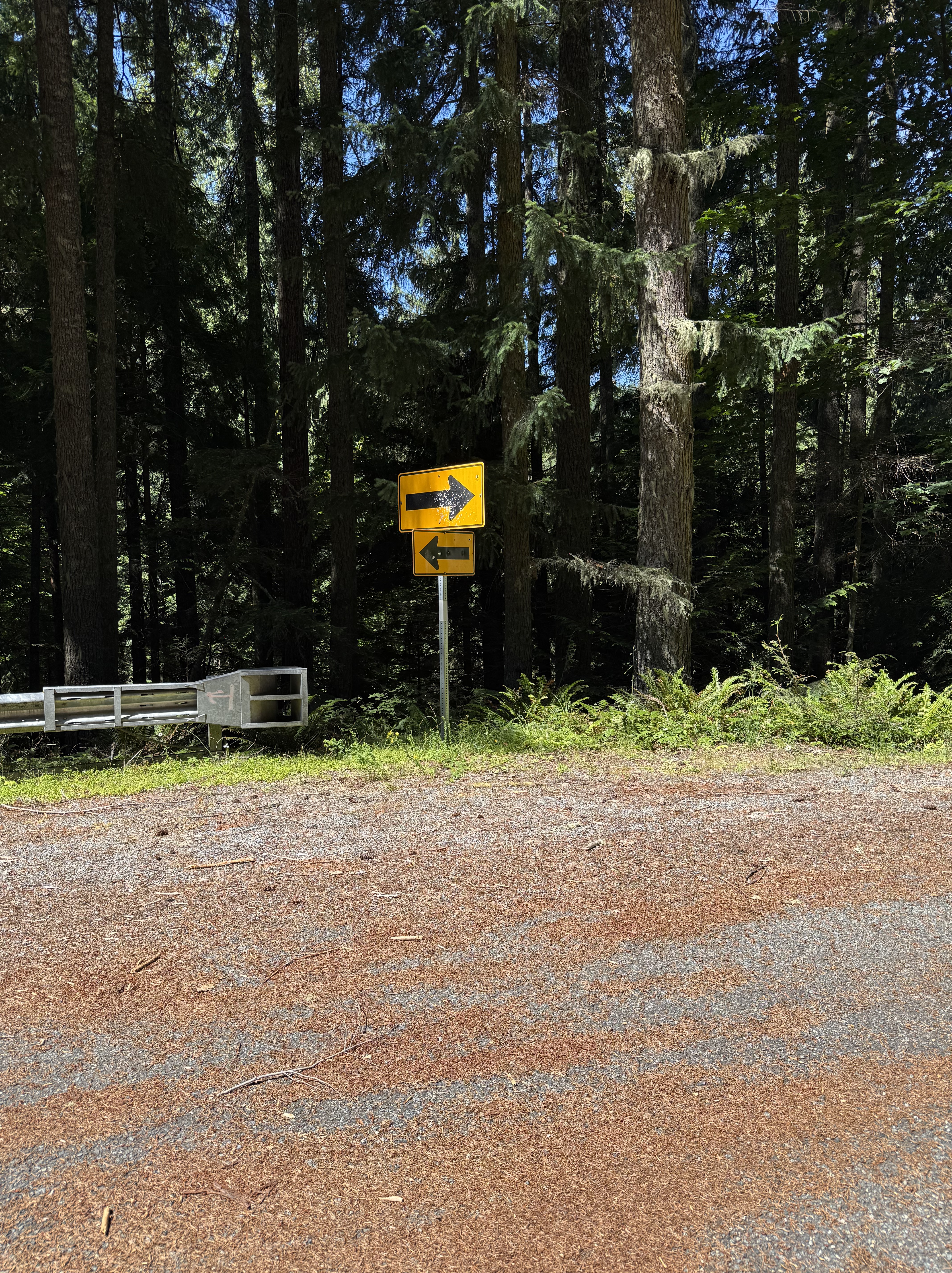
These opposite-pointing signs were on a curve. Nevertheless, I have to wonder why the guardrail stops in the middle of the curve, but reflective signs were felt necessary. Short sightedness? Budget constraints? Stupidity?
The Flora of Carbon River, Pierce County, Washington

Plate 1. Our first stop was at Carbonado, where the Carbon River exits the canyon that has constrained it from its origin on Mt. Rainier. It immediately forms multiple channels as it cuts through glacial till on its circuitous path to Commencement Bay.
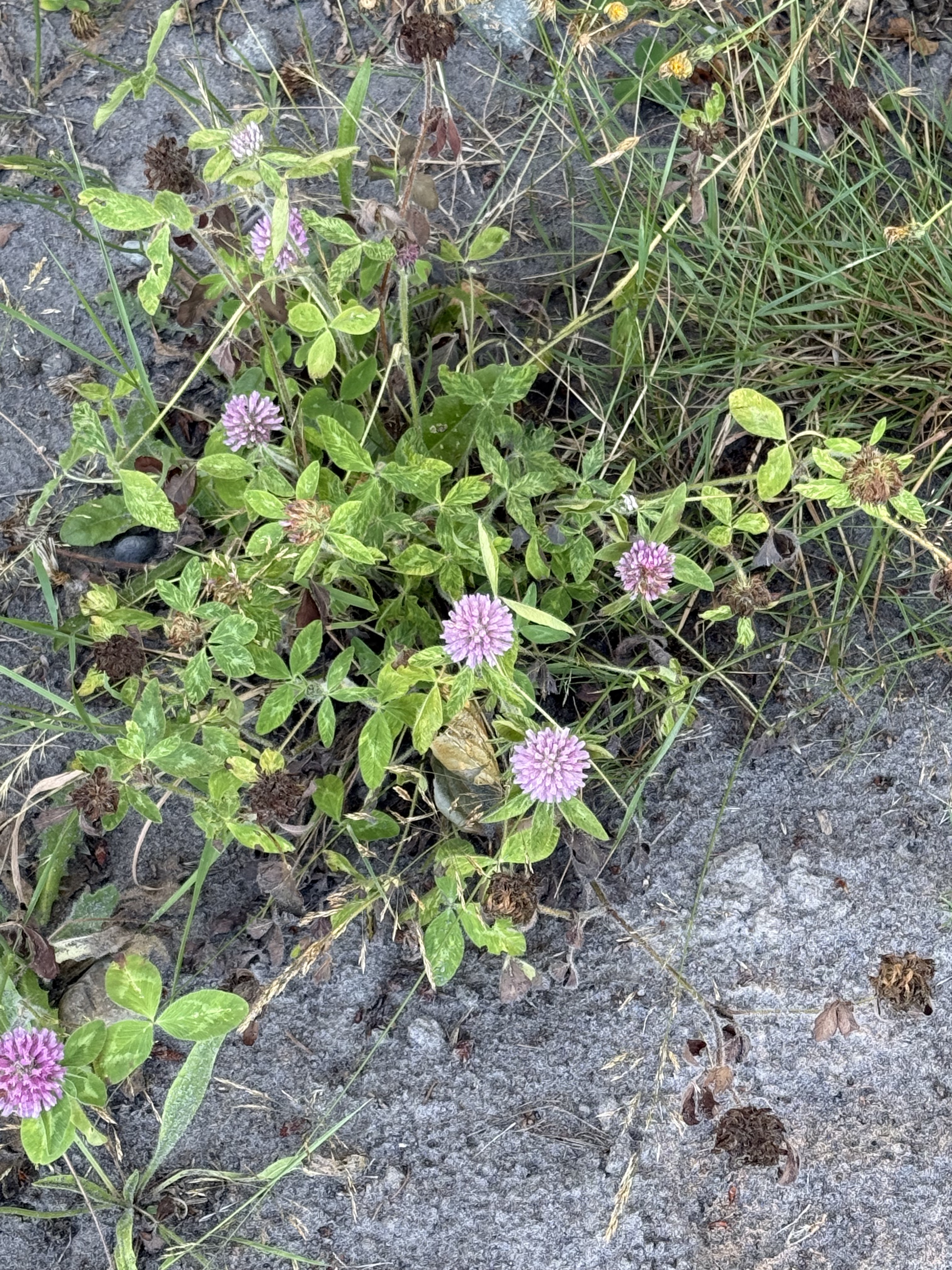
Plate 2. This lovely flower is red clover (Trifolium pratense), a common wildflower along rivers.
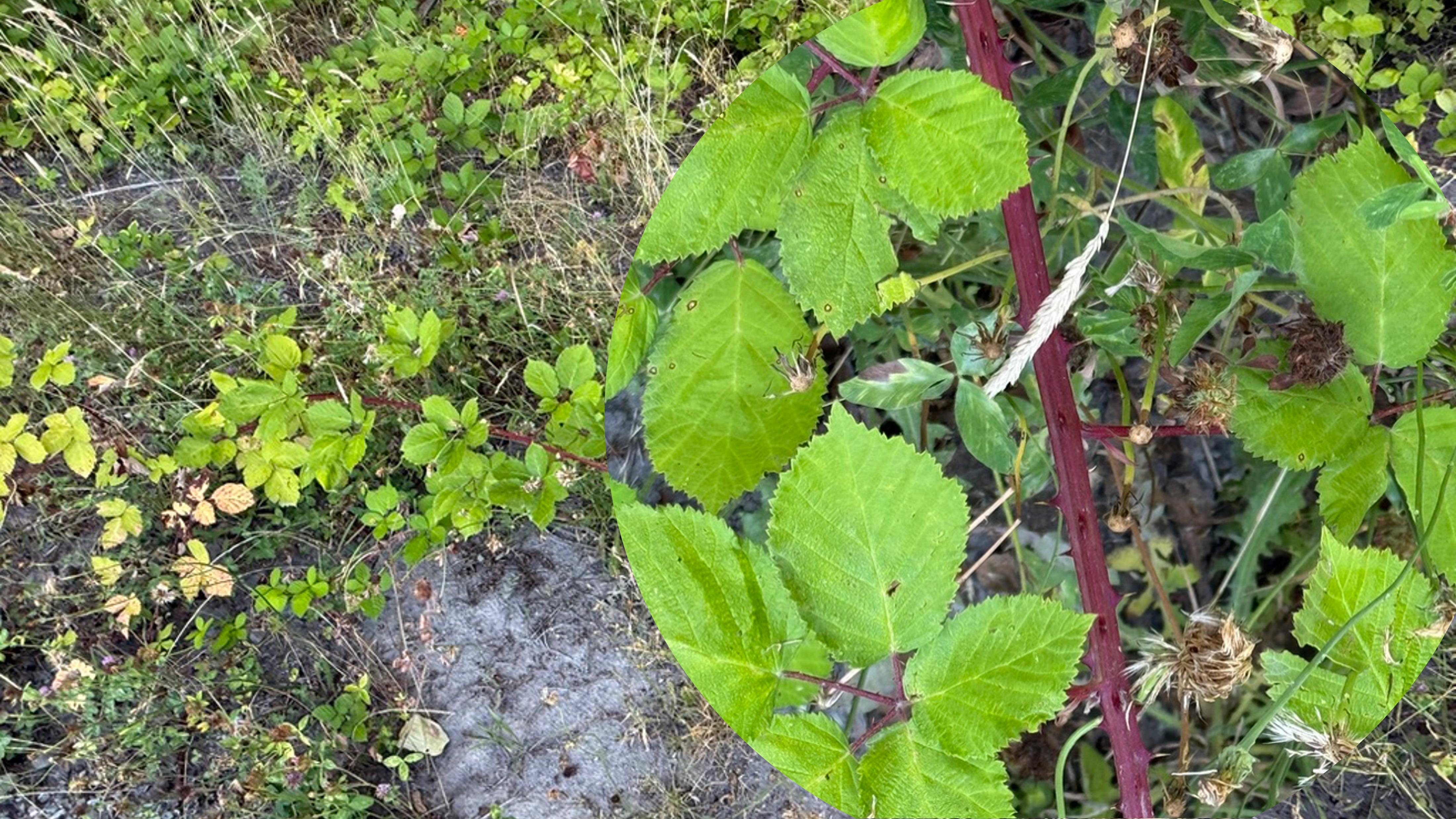
Plate 3. CoPilot and I argued too long about this one, but, after some back and forth, I decided it might be a genus of Spiraea. They are another common shrub in this ecosystem, but they aren’t in flower in July. Note the shriveled flowers in the right image. Too late to be sure. That’s why I’ve always ignored these bushes.
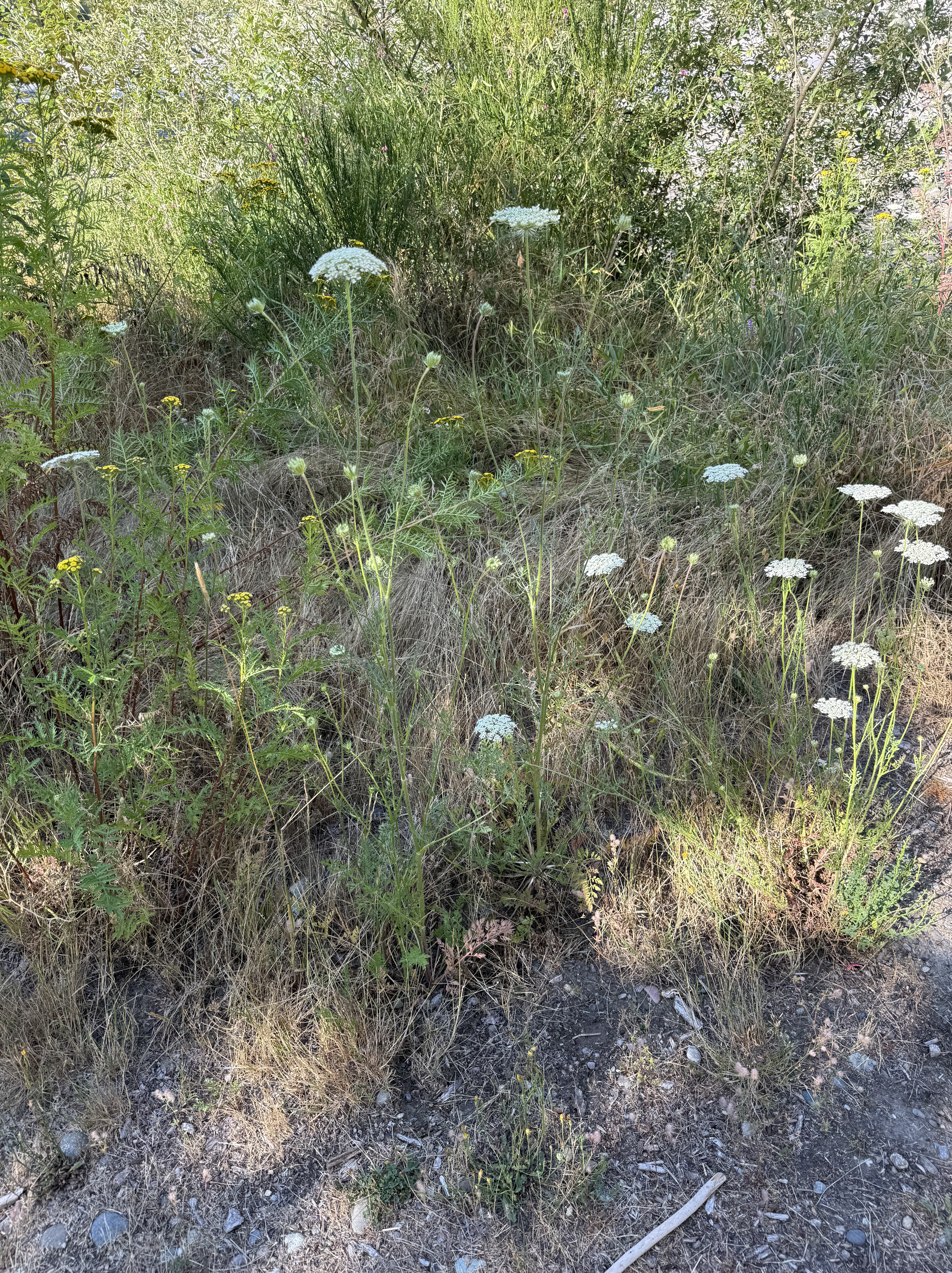
Plate 4. Cow parsnip (Heracleum maximus) is a common wildflower in meadows and roadsides in Washington.
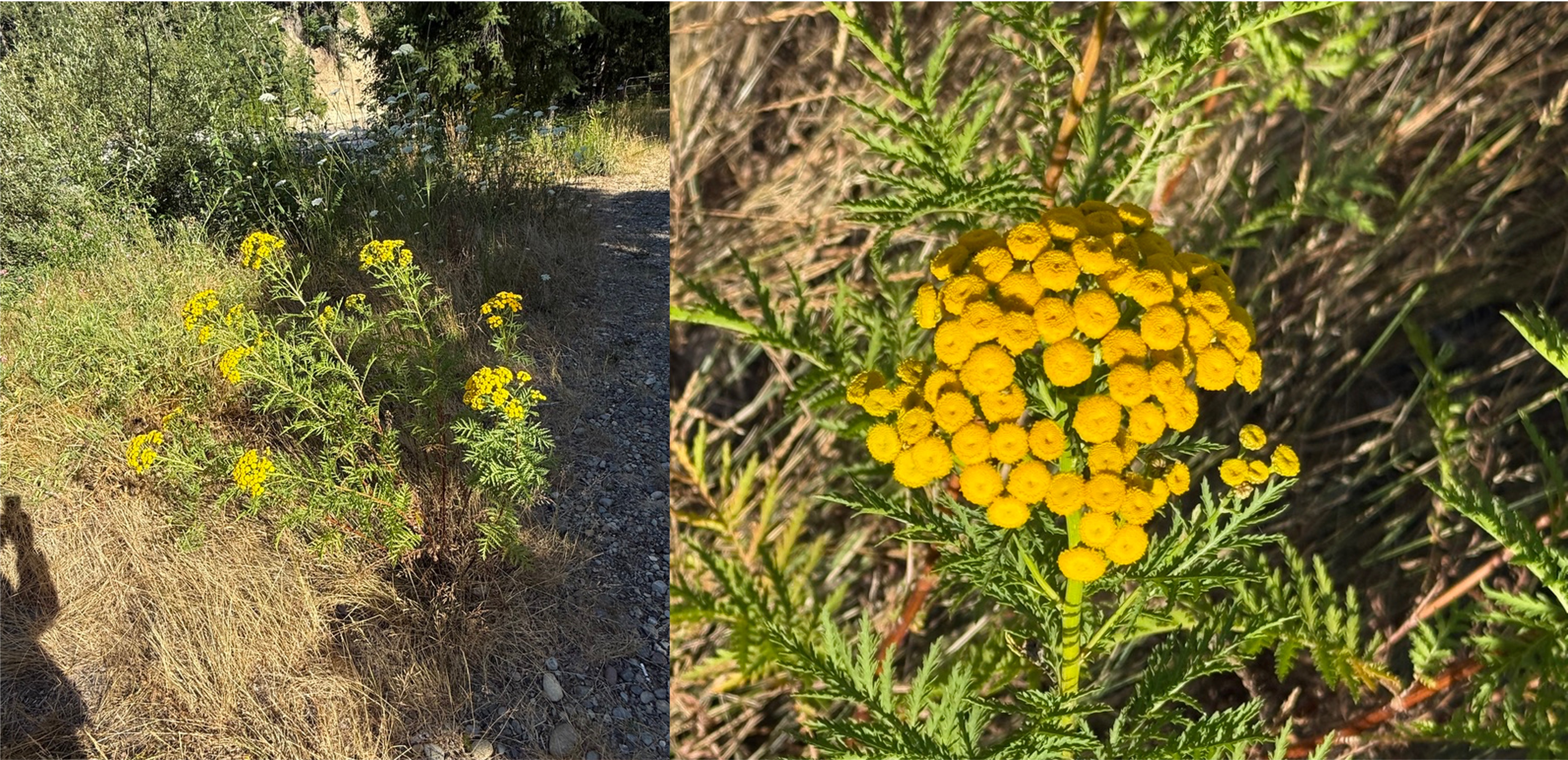
Plate 5. Tansy (Tanacetum vulgare) is a common wildflower along the Carbon River corridor.
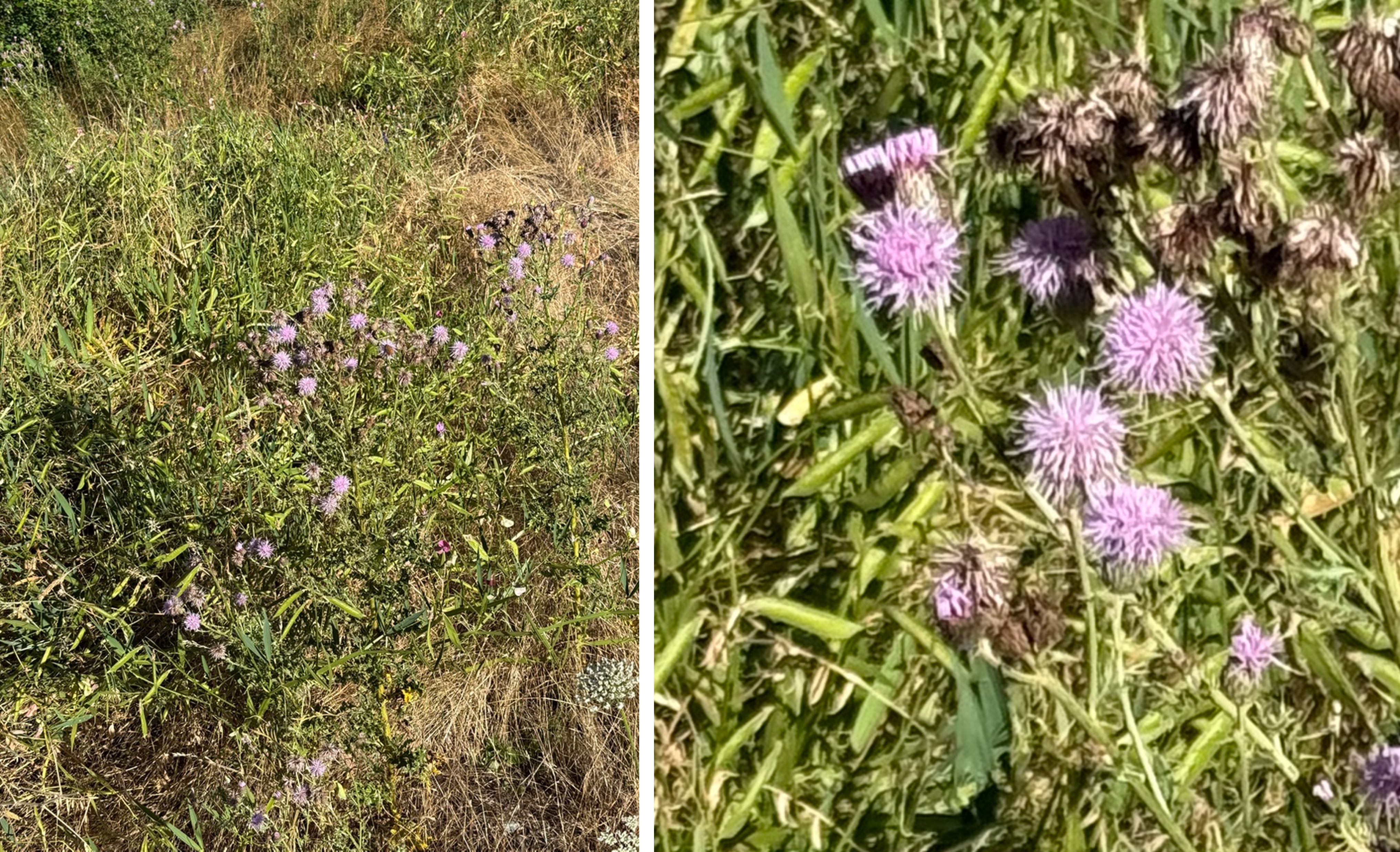
Plate 6. I thought, when putting this post together, that this was red clover (Plate 2), but CoPilot identified it as Canada thistle (Cirsium arvense). It loves disturbed areas like river edges. I did detect some spines when I zoomed in on the second photo. Why am I not surprised? If it’s pretty it will have spikes ready to draw blood from any inquisitive passers by.
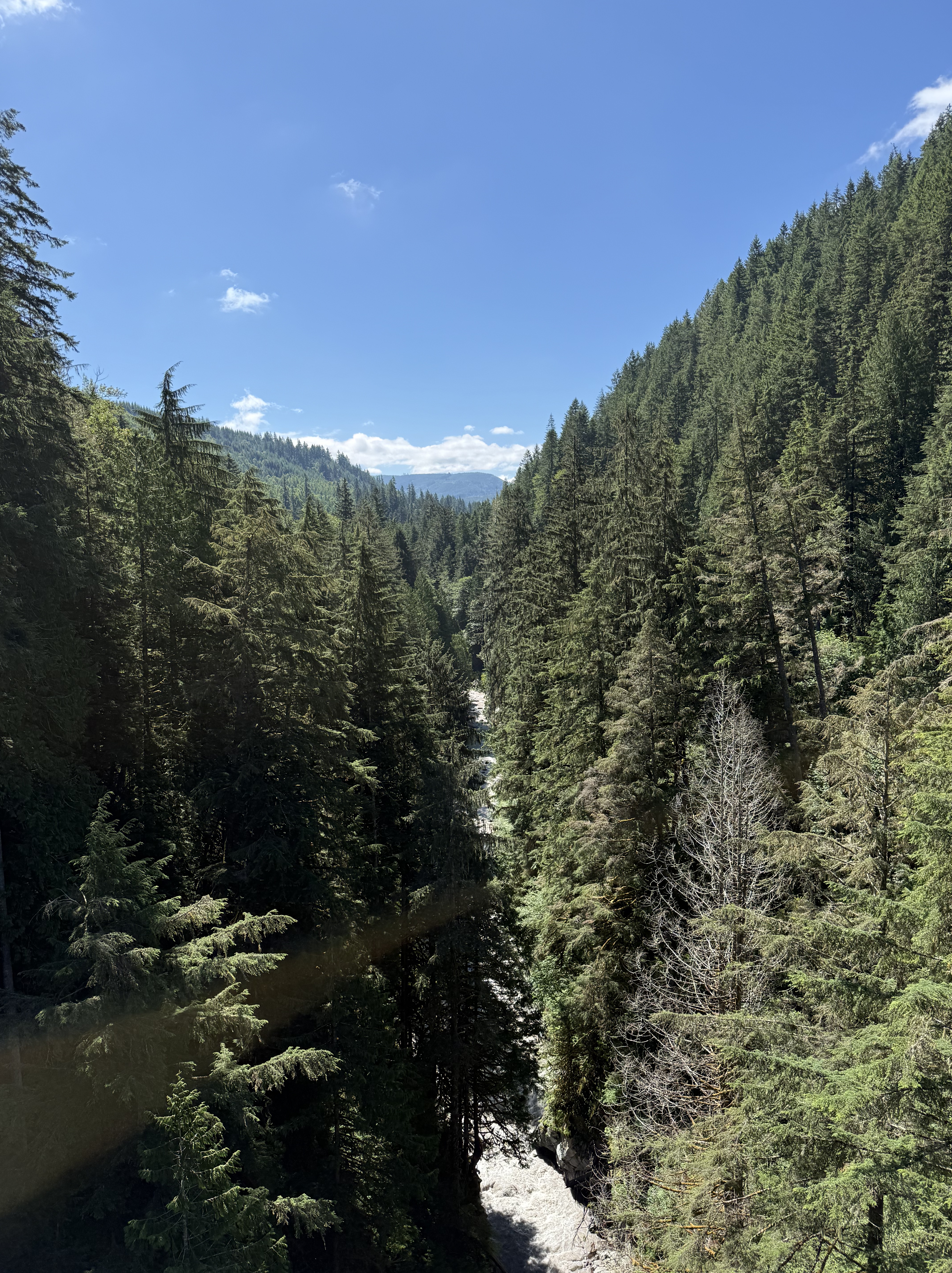
Plate 7. This view is looking downriver from Franklin bridge, which is permanently closed. I’ll now describe some of the flora we encountered as we followed the river along a steep slope.
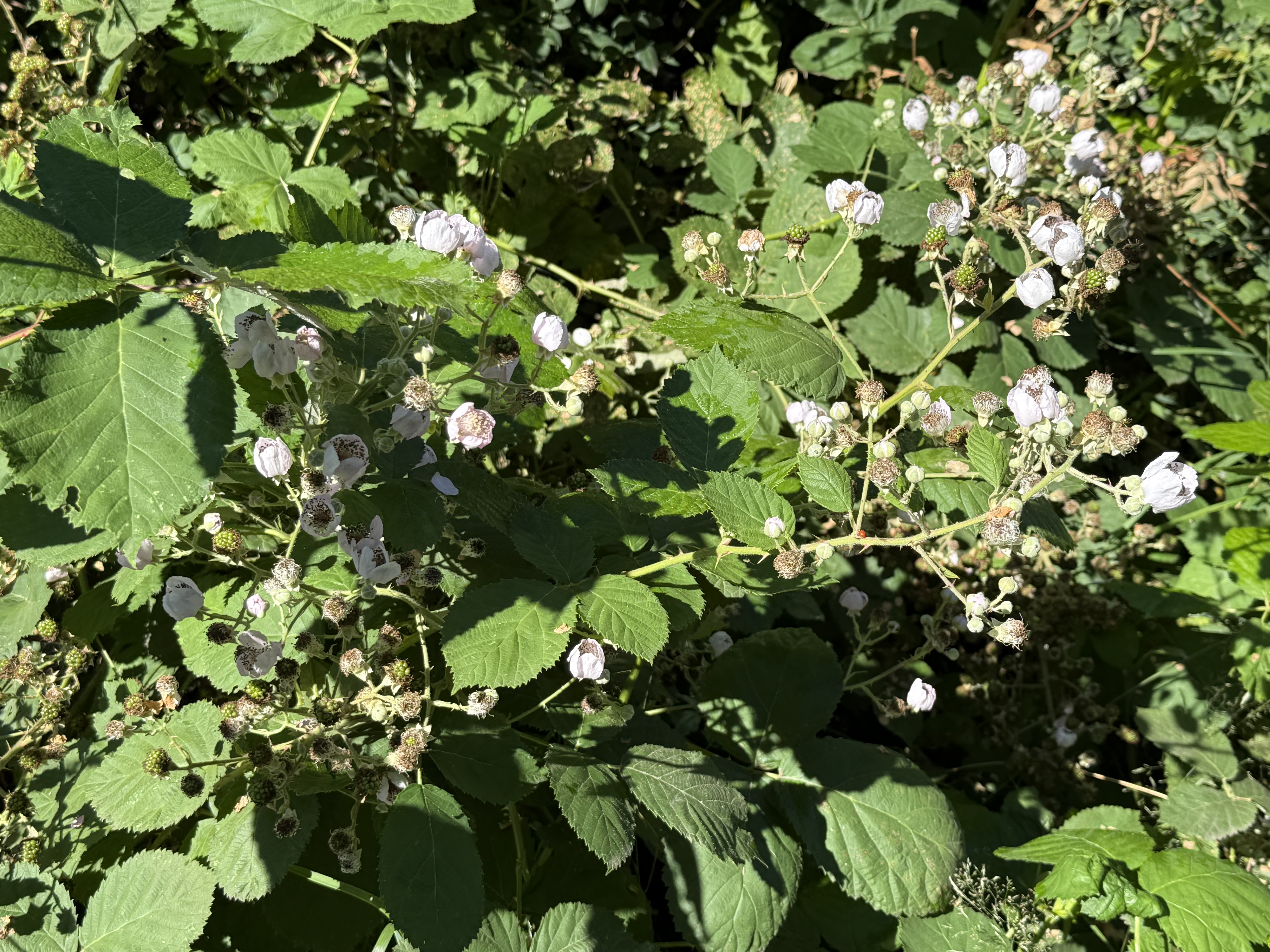
Plate 8. I (kinda) got this one right. This is a wild rose, Nootka rose (Rosa nutkana). This is another plant that waits for an opening in the forest canopy to grow, and then it colonizes like crazy — until the forest canopy catches up with it. Moist but well-drained soil pretty much sums up Carbon River canyon.
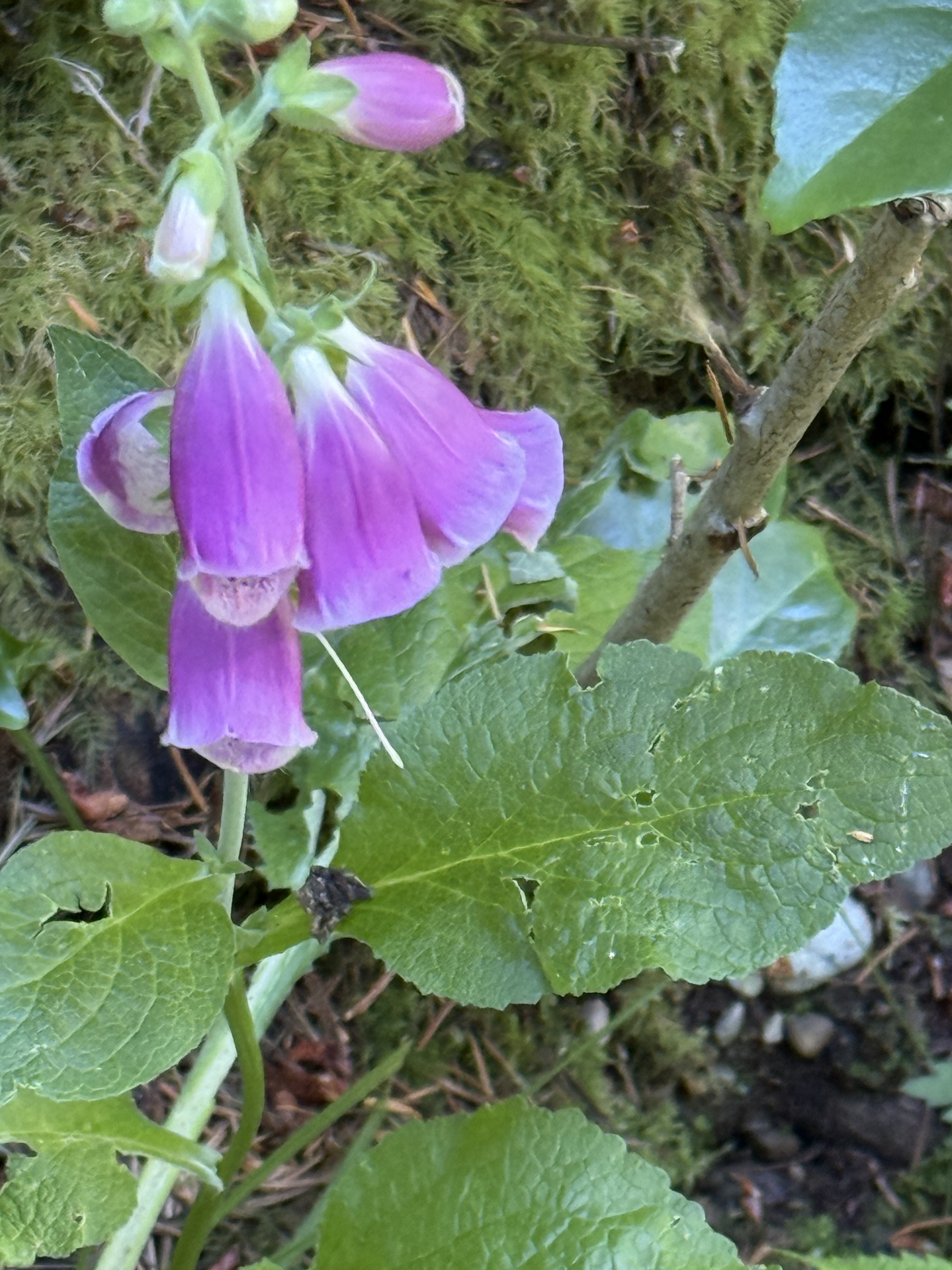
Plate 9. This familiar flower is foxglove (Digitalis purpurea), introduced from Europe; but it is so naturalized that it behaves like a native plant, similar to Cascade penstemon (see Plate 11), thriving in disturbed ground at the edge of conifer forests and in temporarily sunny areas.
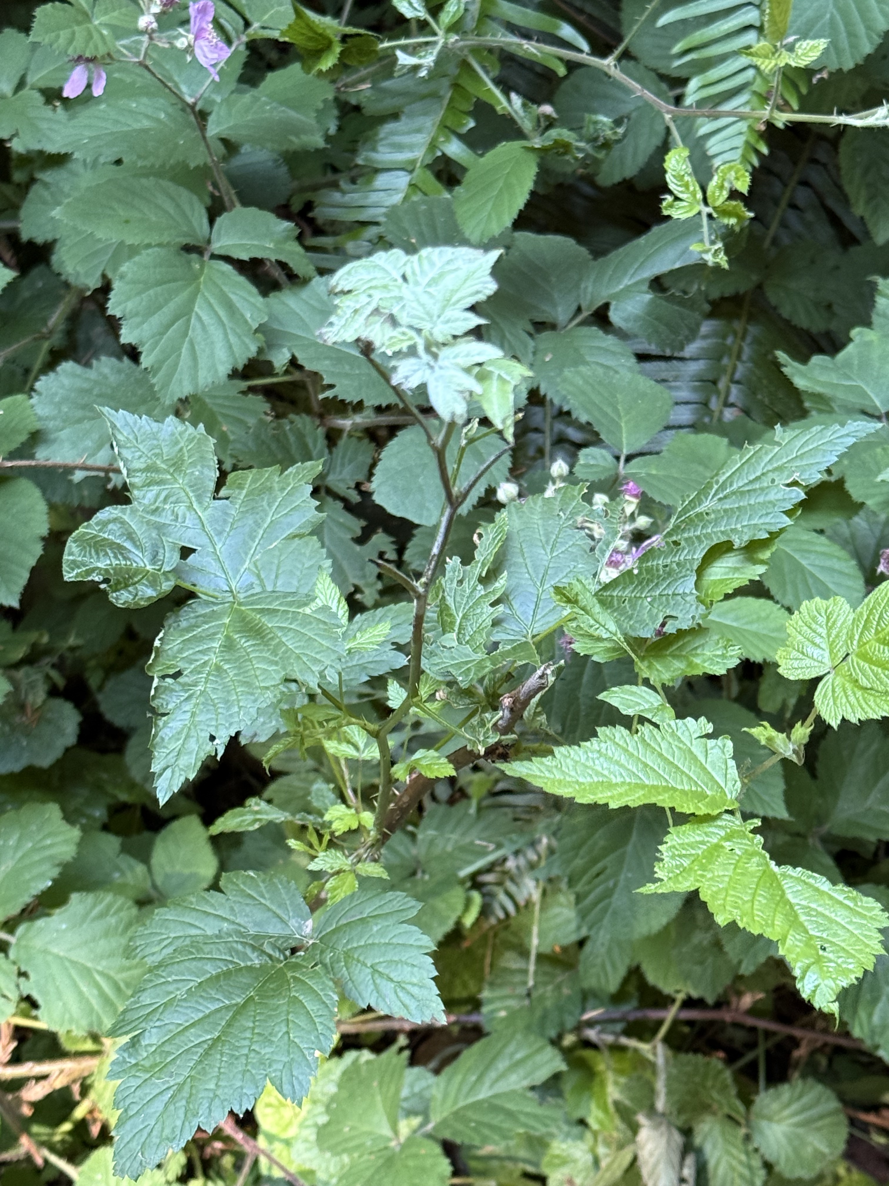
Plate 10. Besides white flowers, I am also fixated on thorns; however, I don’t know anything about thorns except that roses have them, as well as many of the shrubs I’ve encountered on my nature walks. This is probably Himalayan blackberry (Rubus armeniacus), an invasive species to Pierce County. I guess that’s why it isn’t called Washington blackberry, or some such. I checked a previous post from Point Defiance, and there it was! Invasion of the forest snatchers.
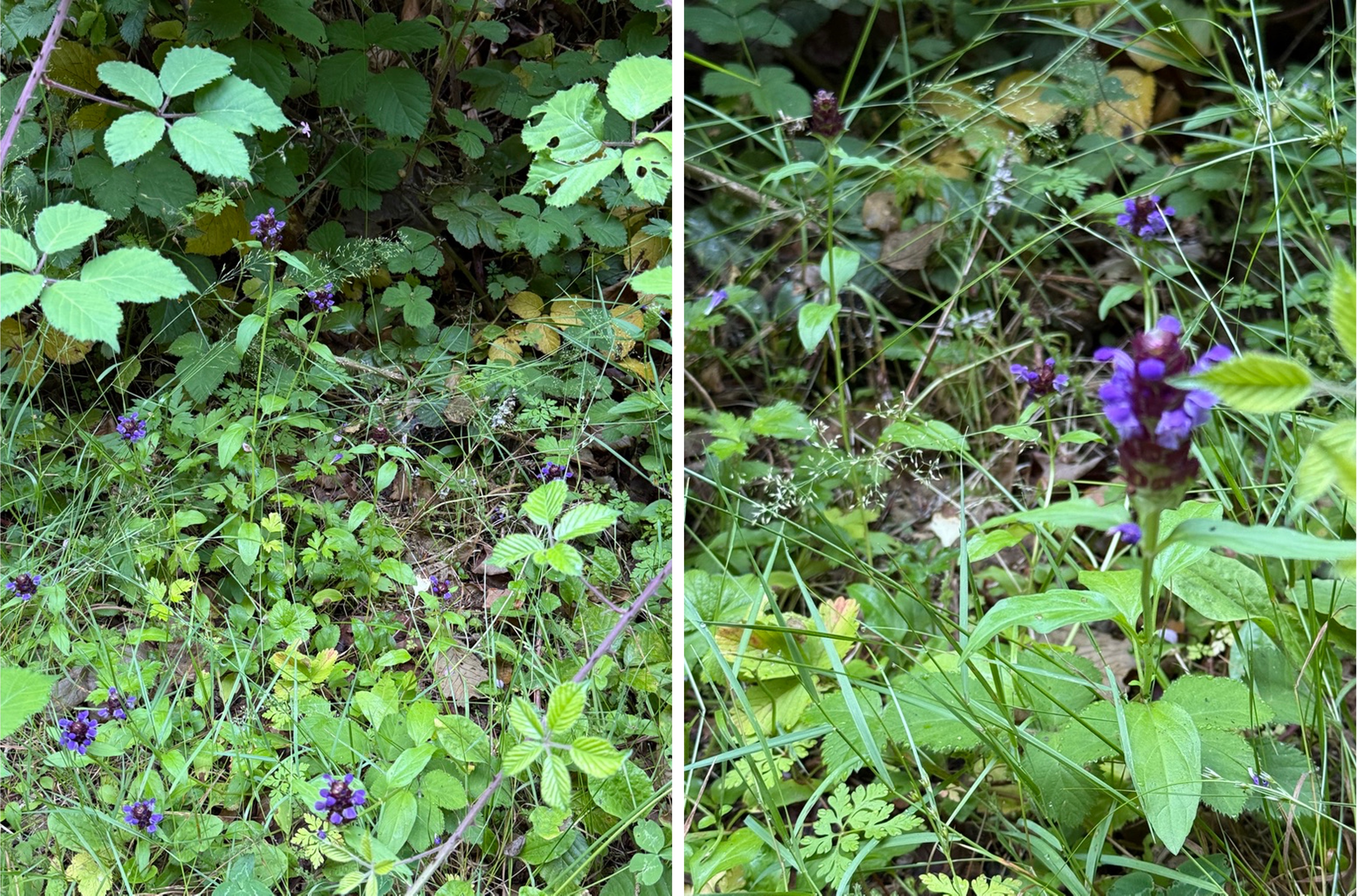
Plate 11. This purple wildflower is probably Cascade penstemon (Penstemon serrulatus), a native to the PNW. It is what CoPilot calls an ecotone plant — one that thrives where a conifer forest is encroaching on a prairie environment. We encountered it where the conifers hadn’t yet blocked out the sun along the trail.
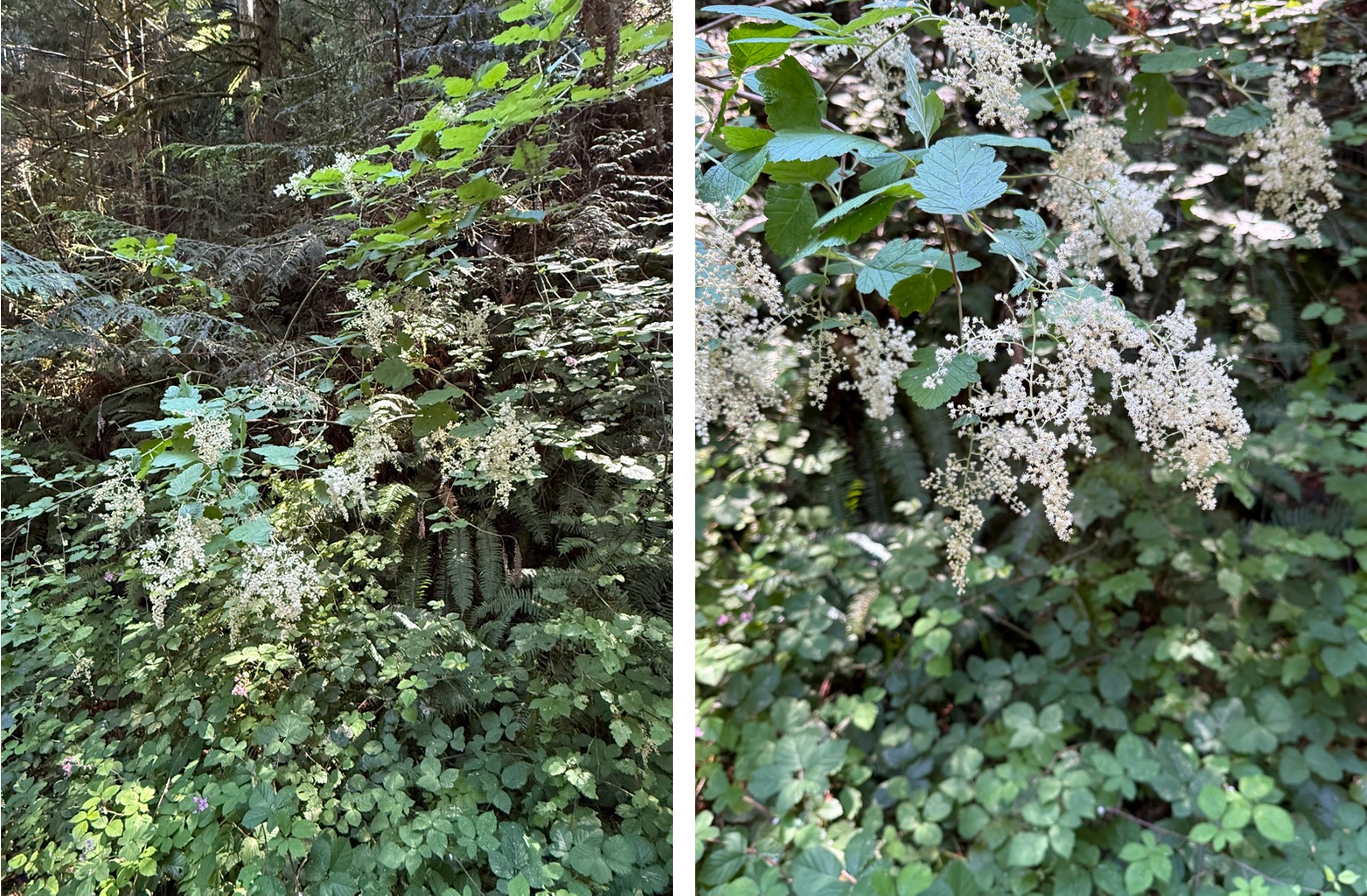
Plate 12. I’m easily fooled by white flowers. This non-woody shrub is False Solomon’s seal (Maianthemum racemosum). It grows in the understory of a conifer forest, which is a good description of Carbon River canyon.
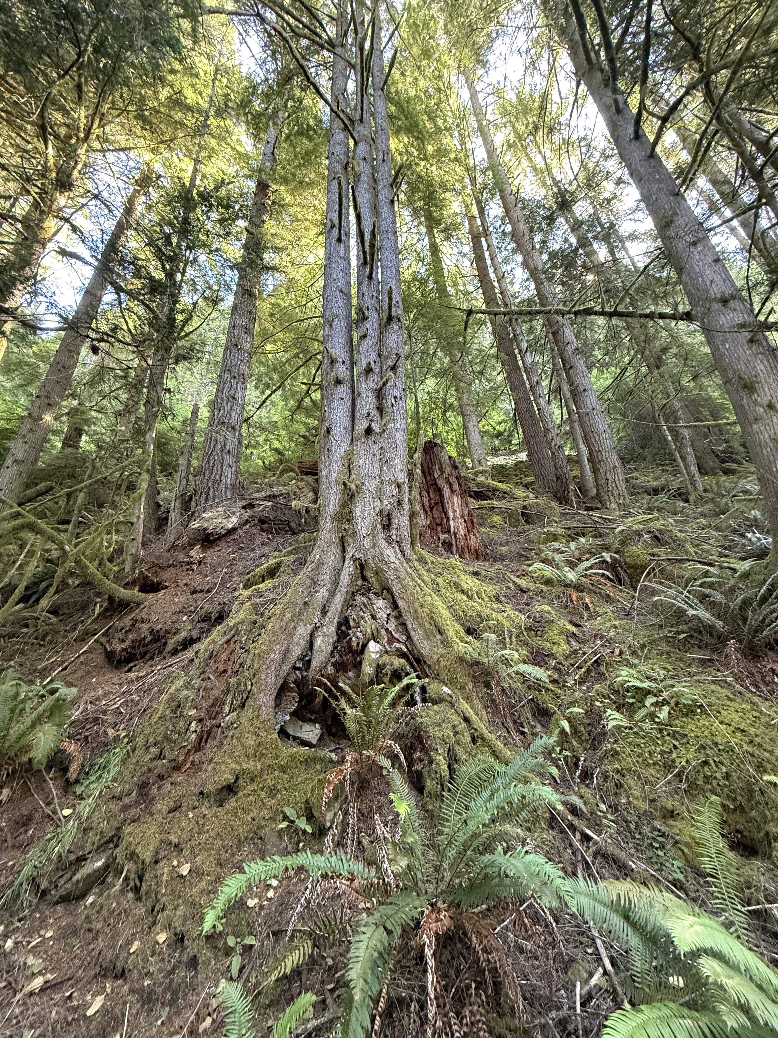
Plate 13. This is the first triplet I’ve seen from a nurse log. These young hemlocks will certainly compete for sun and nutrients. There can be only one survivor.
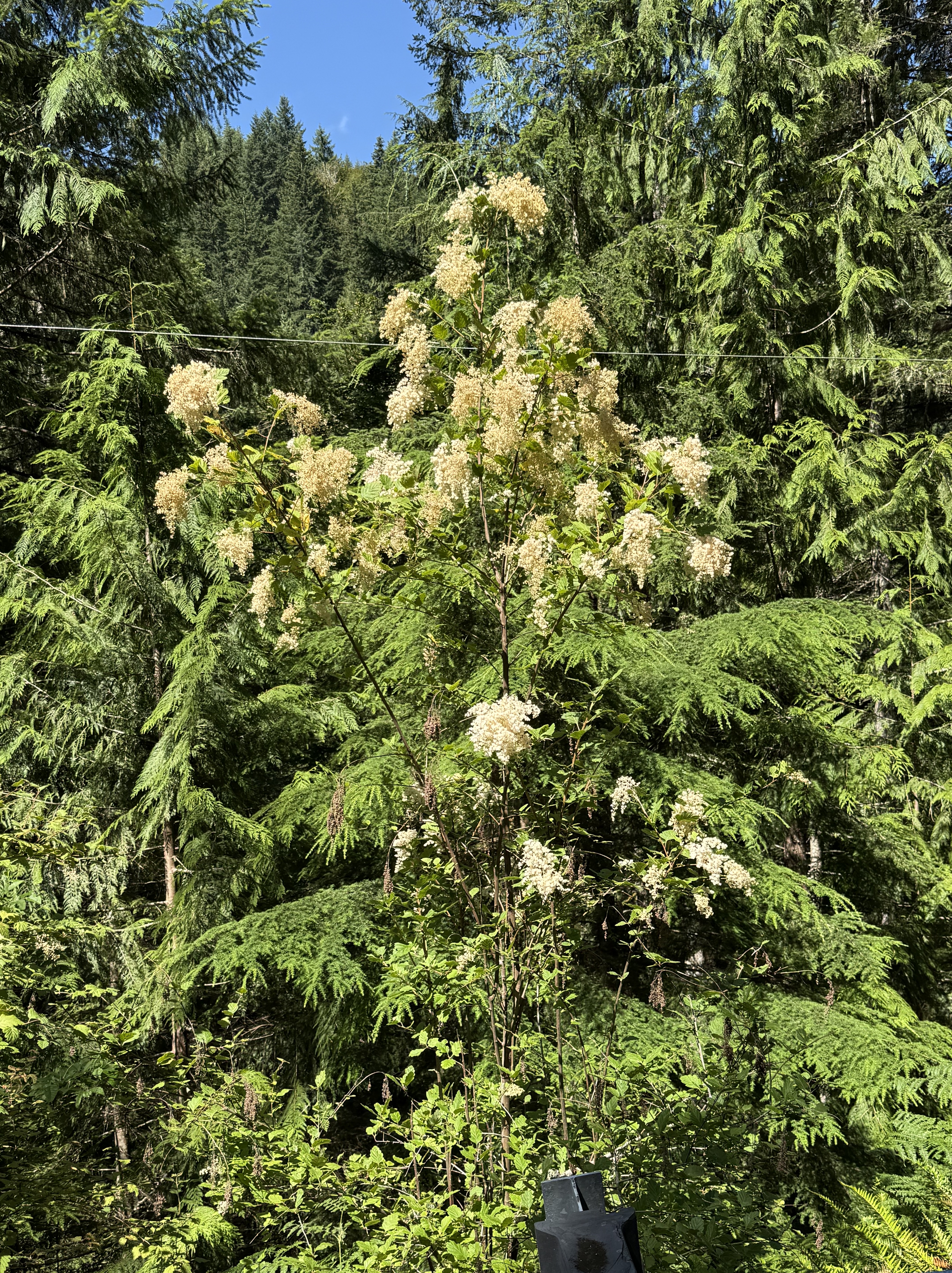
Plate 14. I thought this was cow parsnip, but CoPilot identified it as ocean spray (Holodiscus discolor). The white flowers were all I needed to see, but this tall, woody shrub (6-12 feet) is completely different from the weed in Plate 4.
Final Thoughts
The only thing I can add to the photos is that Carbon River is part of a transitional ecosystem, not unlike Mima Mounds. I Imagine this borderland environment is also alternating between a lowland/prairie and an upland/conifer forest, depending on conditions. However, much to my disappointment, the plants here were different from those we saw before. Furthermore, there were far more species along the Carbon River corridor. We were fortunate to visit when many of the flowers were in bloom.
I enjoy taking pictures of flora and learning about the ecosystem, but this is too complex for me. I’m only a simple geologist.
Geology of Carbon River Canyon, Pierce County, Washington
Today’s post reports on a brief survey of various geological features and processes that are revealed in a river that originates on the NW flank of Mt. Rainier. We’ll look at the types of rock found along its course, morphologic features, and discuss the processes that have created this natural area. We’ll also see some unintended consequences of deforestation.
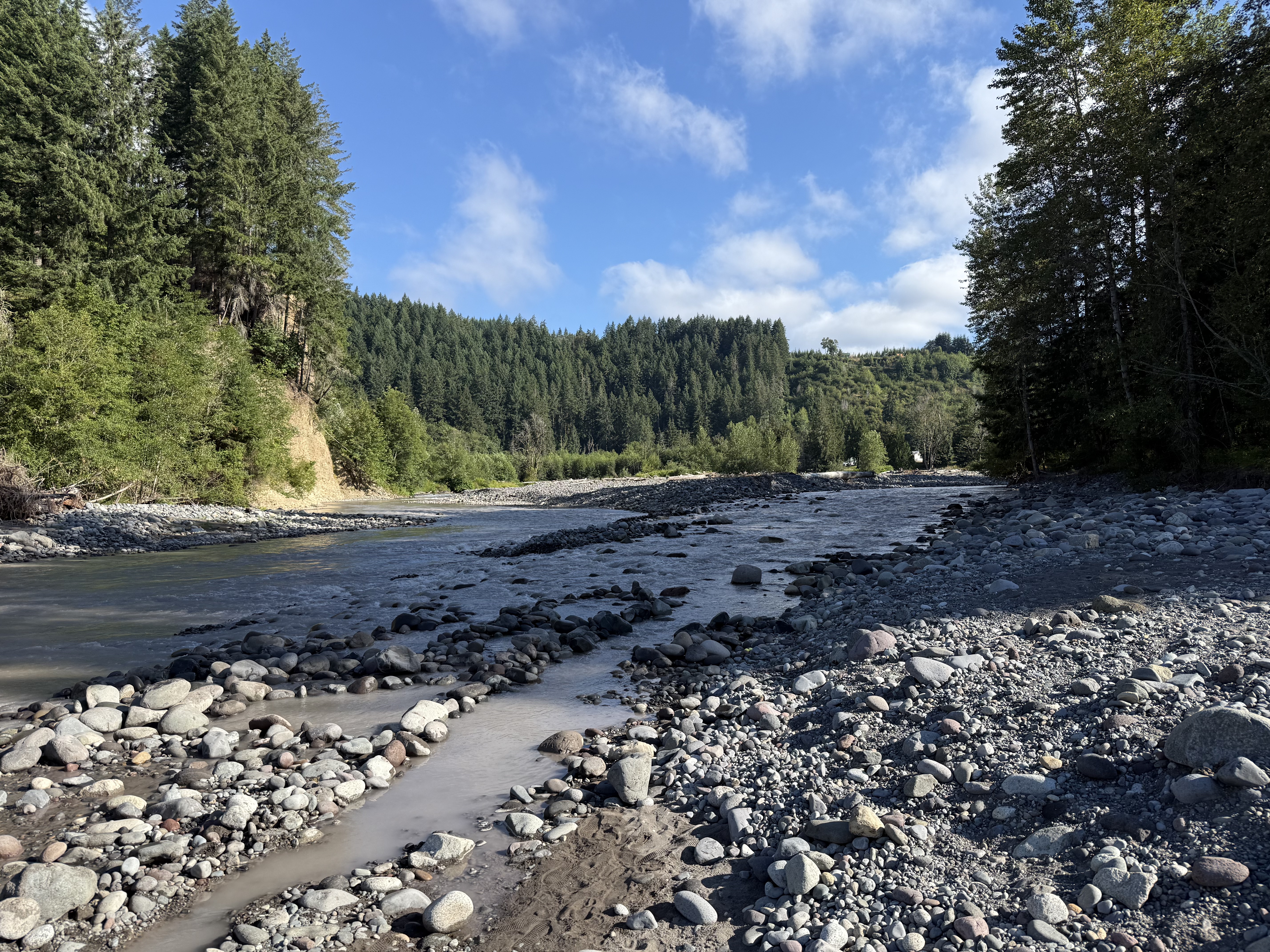
Figure 1. Carbon River flows northerly before joining the Puyallup River and emptying into Commencement Bay, in Tacoma. This stretch is dominated by boulders up to a foot in diameter. However, the water is unusually muddy; we’ll find out why during our walk three-miles up the canyon that contains the stream.
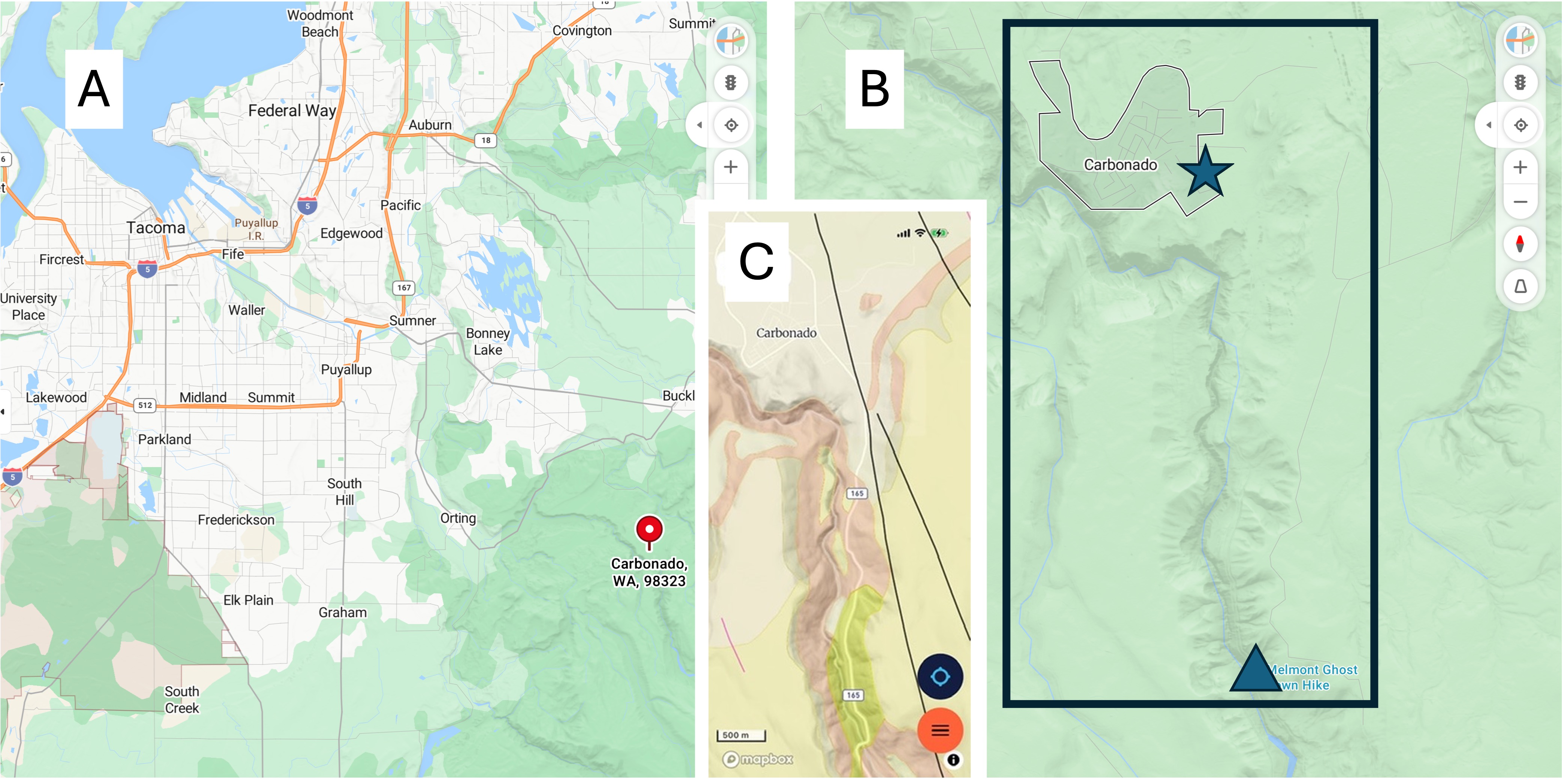
Figure 2. (A) Regional map, showing Carbonado (pinned), a forty-five minute drive from North Tacoma. (B) Local map showing the Carbon River, which we followed for three miles. The river has cut a gorge that begins at Carbonado (star) and deepens to 250-300 feet at Fairfax bridge (triangle). (C) The geologic map from RockD reveals four major rock formations: the tan, which dominates around Carbonado is glacial drift, mostly sand and gravel; The pink outlining the river is Eocene (56-33.9 Ma) sedimentary rocks of terrestrial origin – rivers, lakes, etc; the yellow is Miocene-Oligocene (~23 Ma) fine-grained andesite. Additionally, the yellowish unit on both sides of the river is Pleistocene (2.5 Ma to 12 Ka) glacial drift. We didn’t see any of that today.
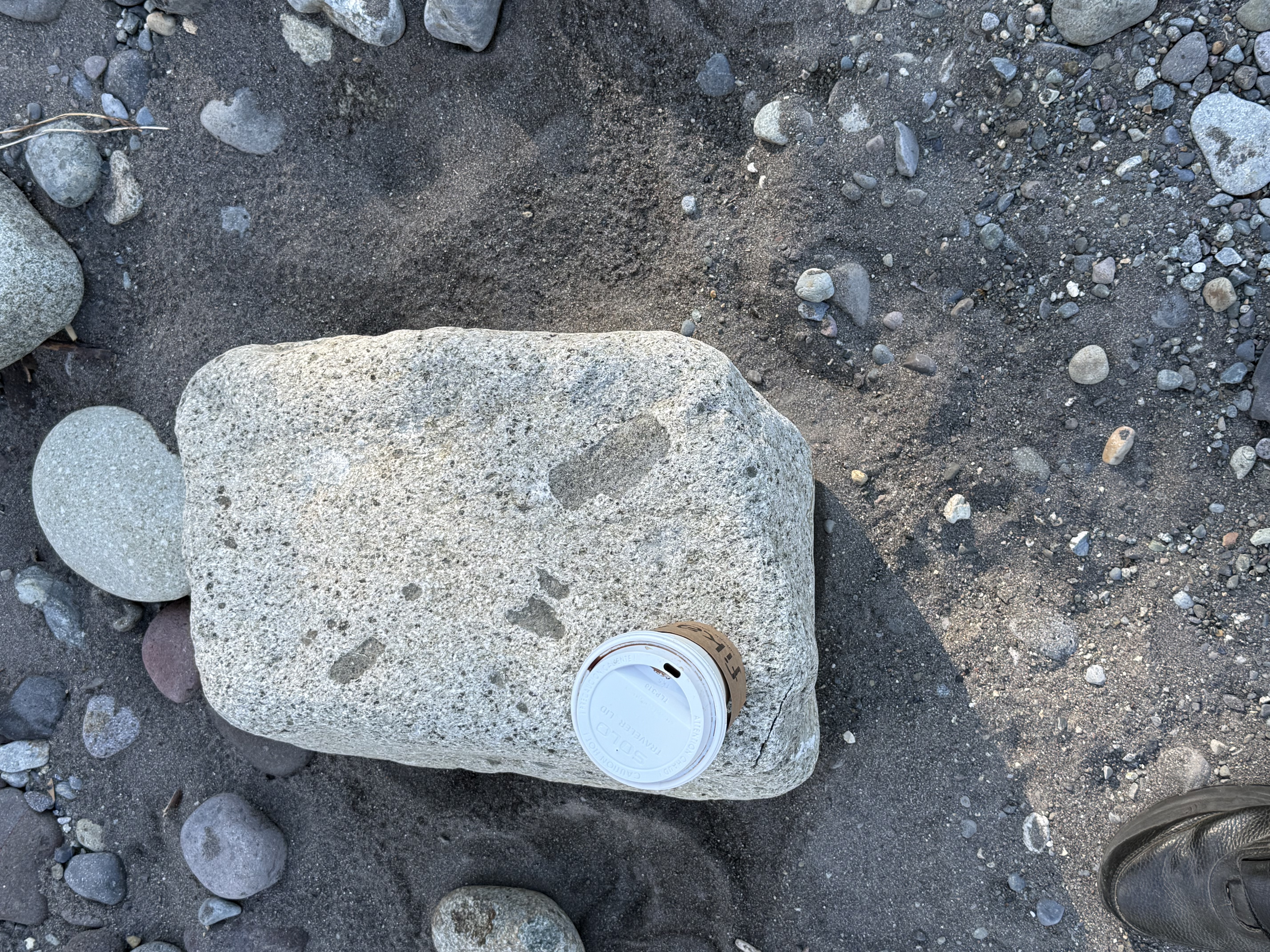
Figure 2. Our first stop was along the Carbon River near Orting (see Fig. 1A for location). River beds can be an excellent source of regional geology if they contain cobbles or boulders, which are good samples of source rock that may not be exposed.
This sample is of an intrusive igneous rock that contains lithic fragments (xenocrysts) of what looks like a darker, fine-grained rock. As magma moves upward through the crust, pieces of country rock are entrained, sometimes partially melting, but more often simple being captured by the cooling magma. This sample contains pieces of what I think is andesite. The host rock itself is probably also andesite, but its surface has been chemically weathered to form a white layer; this is a chemical process that involves the alteration of dark minerals like pyroxene and plagioclase into clays like kaolinite, which are light colored. Surface weathering also leeches out iron and magnesium, which darken a rock. This surface layer is usually only a few millimeters thick.
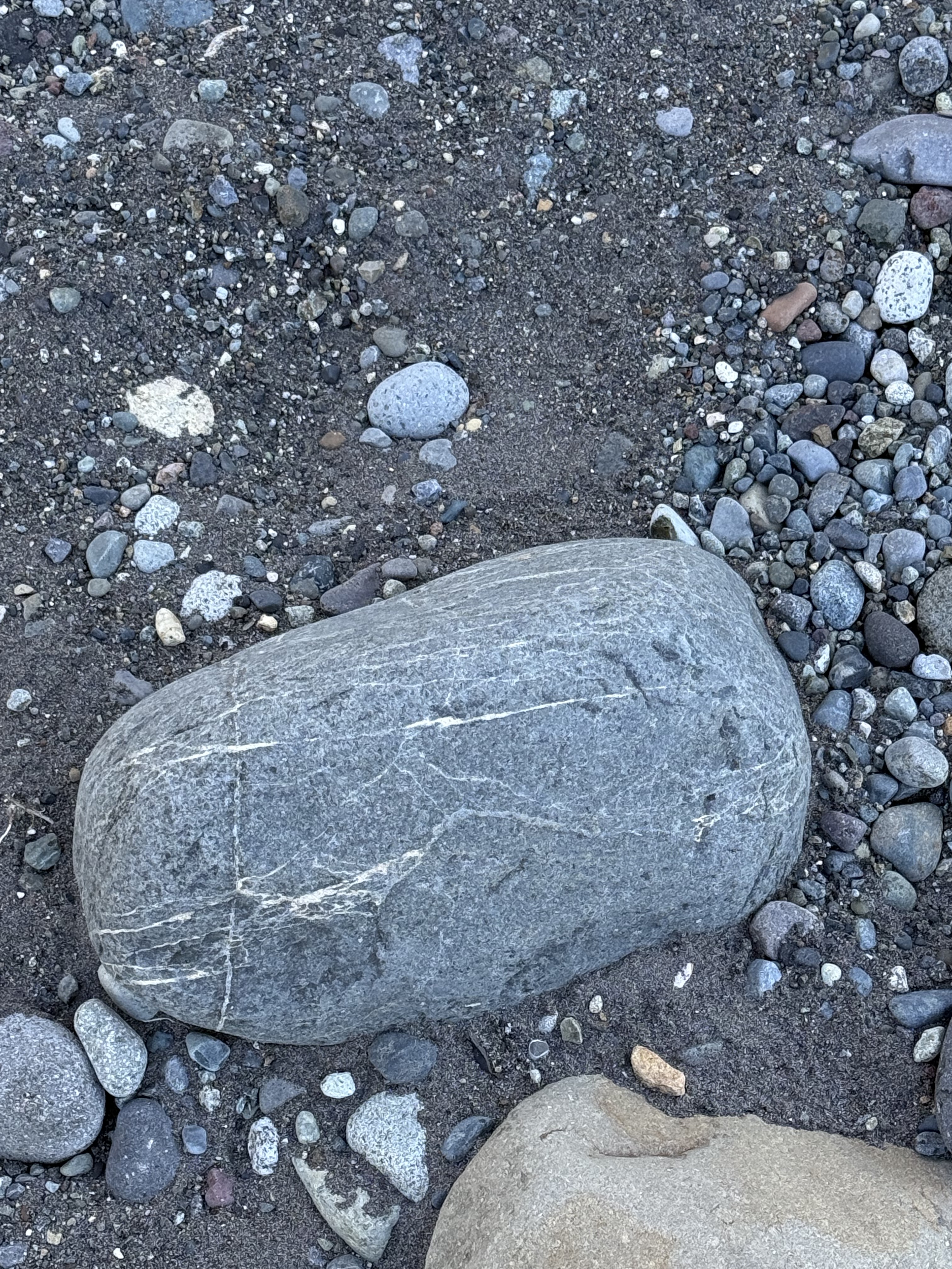
Figure 3. This sample tells a complex story. This is andesite (extrusive rock common to subduction zones), but any fractures within it were filled with magmatic fluids rich in Na, Ca and silica, by a later eruption. The result of this hydrothermal circulation is rocks that are neither extrusive nor intrusive; they are chemically altered by subsequent injections of magma at depths less than 1 mile, often even shallower.
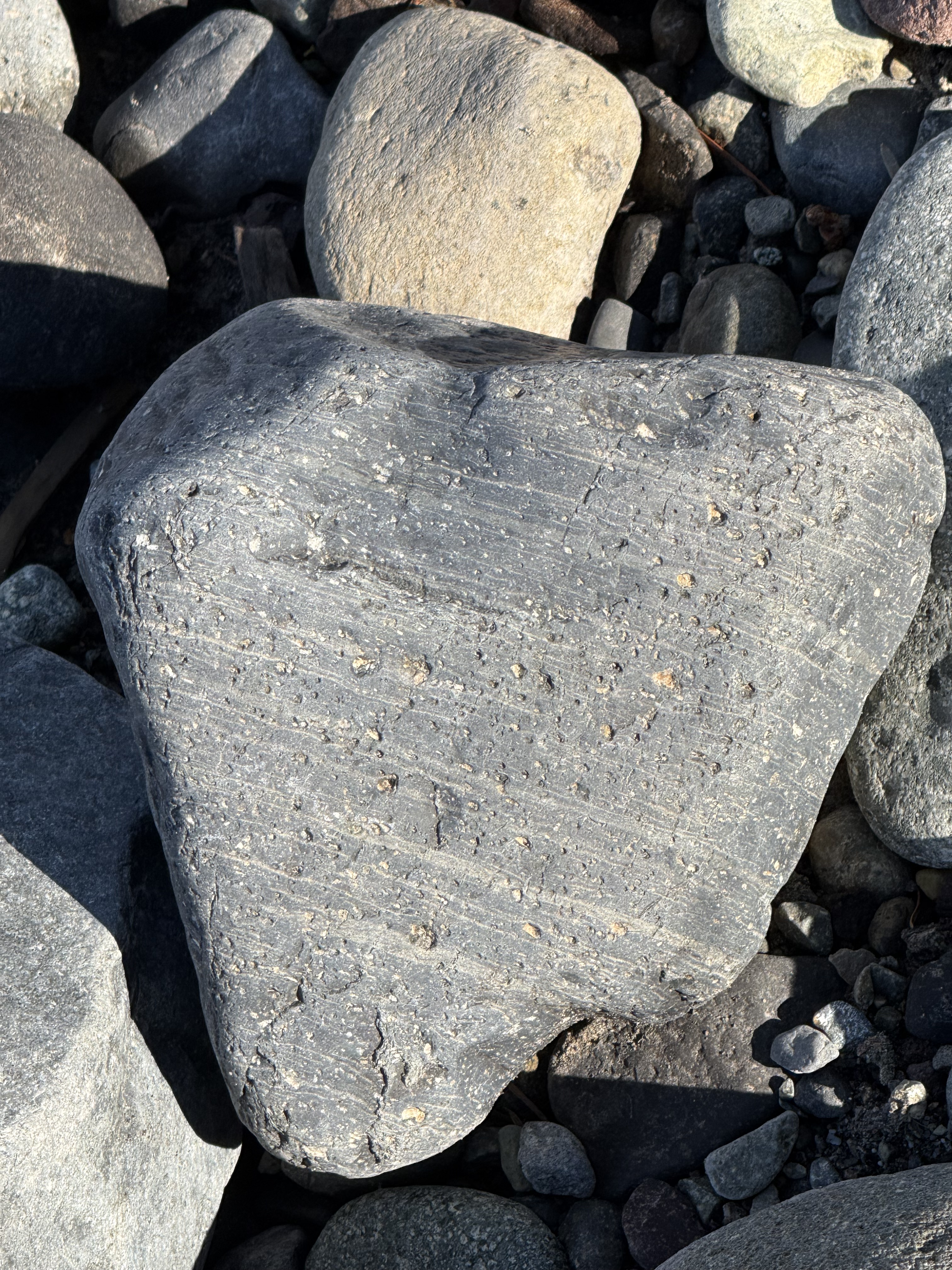
Figure 4. Another fascinating example, which tells a different tale. This andesite block wasn’t injected with magmatic fluids beneath the surface; this sample is the result of gaseous magma erupting within a few hundred yards of a vent. The laminae tell us that the composition was changing subtly on short time scales; this was the top of the boiling magma, and thus there was a lot of trapped gas (e.g. CO2, H2S) that formed the vesicles after the lava had settled–but not yet solidified.
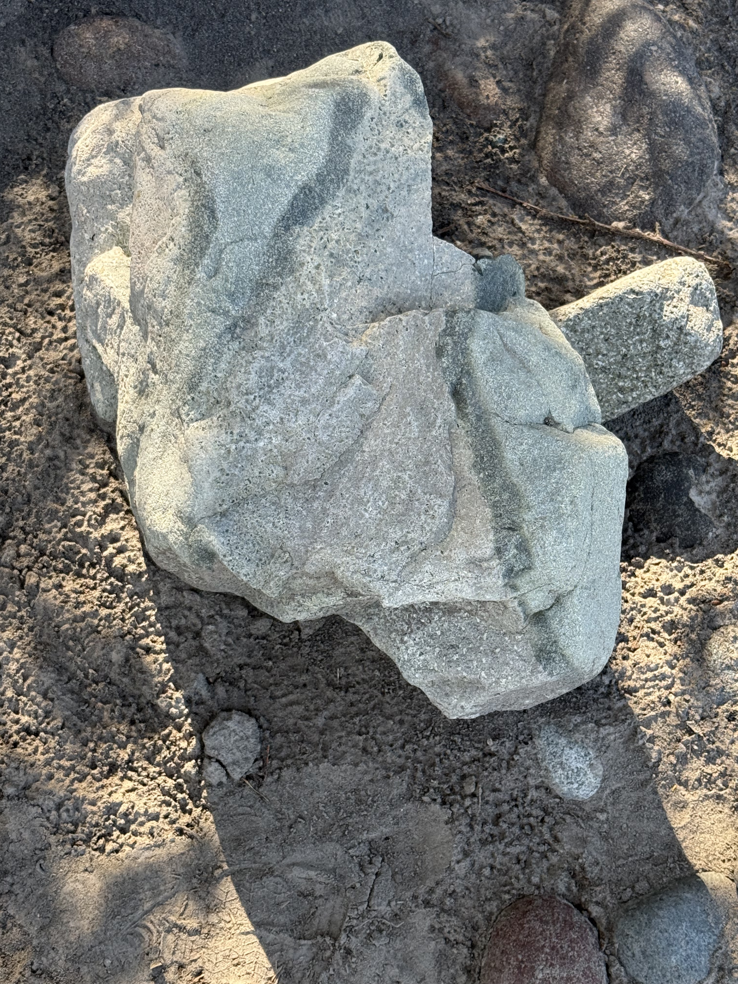
Figure 5. This irregular sample of andesite tells two stories: 1) The presence of phenocrysts (small white blebs at the bottom of the sample) implies slow cooling whereas the dark streaks imply a later stage of fast cooling, so that magmatic fluids with slightly different composition intermingled with the already hardening earlier stage. Imagine making taffy. 2) This sample wasn’t transported in the Carbon River more than a few miles. It would have broken along internal planes of weakness and become more like those we saw above. We aren’t far from the source.
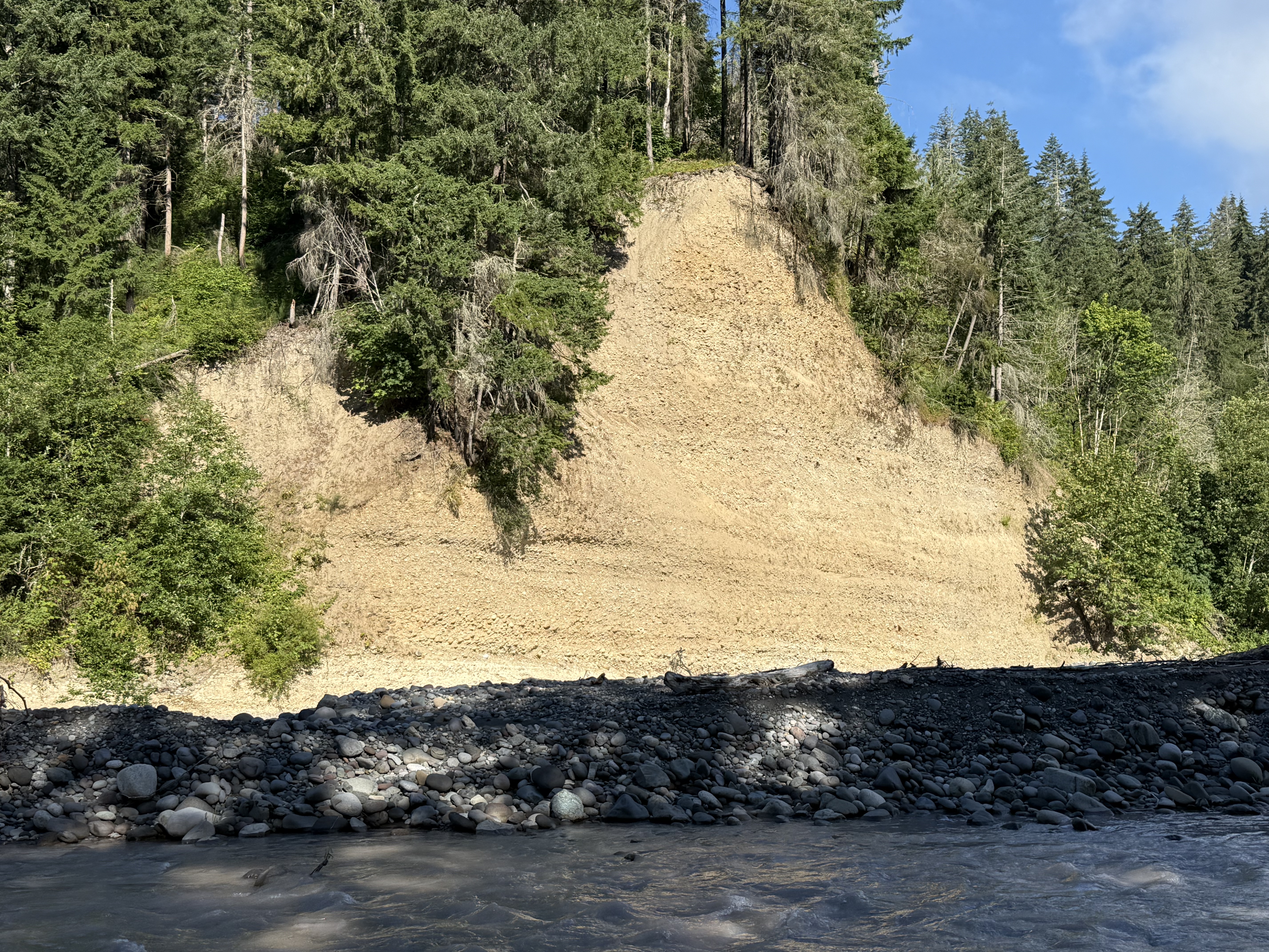
Figure 6. This is an excellent exposure in a cliff cut by the Carbon River. It could be dismissed as undifferentiated glacial till, but I’d like to give it a second thought: What if this location records the movement of continental glaciers through Puget Sound (i.e. the Vashon till), in addition to alpine glaciers moving down from the Cascades? Could we even tell the difference?
The bottom of this section contains cobbles in a sandy matrix deposited horizontally. The middle part is finer, as seen in the absence of large cobbles, but a channel containing larger clasts is visible in the center of the photo, forming a “V” that points towards the bright spot in the modern channel, slightly right of the center of the photo. The depositional environment must have changed quickly to produce such a contrast in lithology.
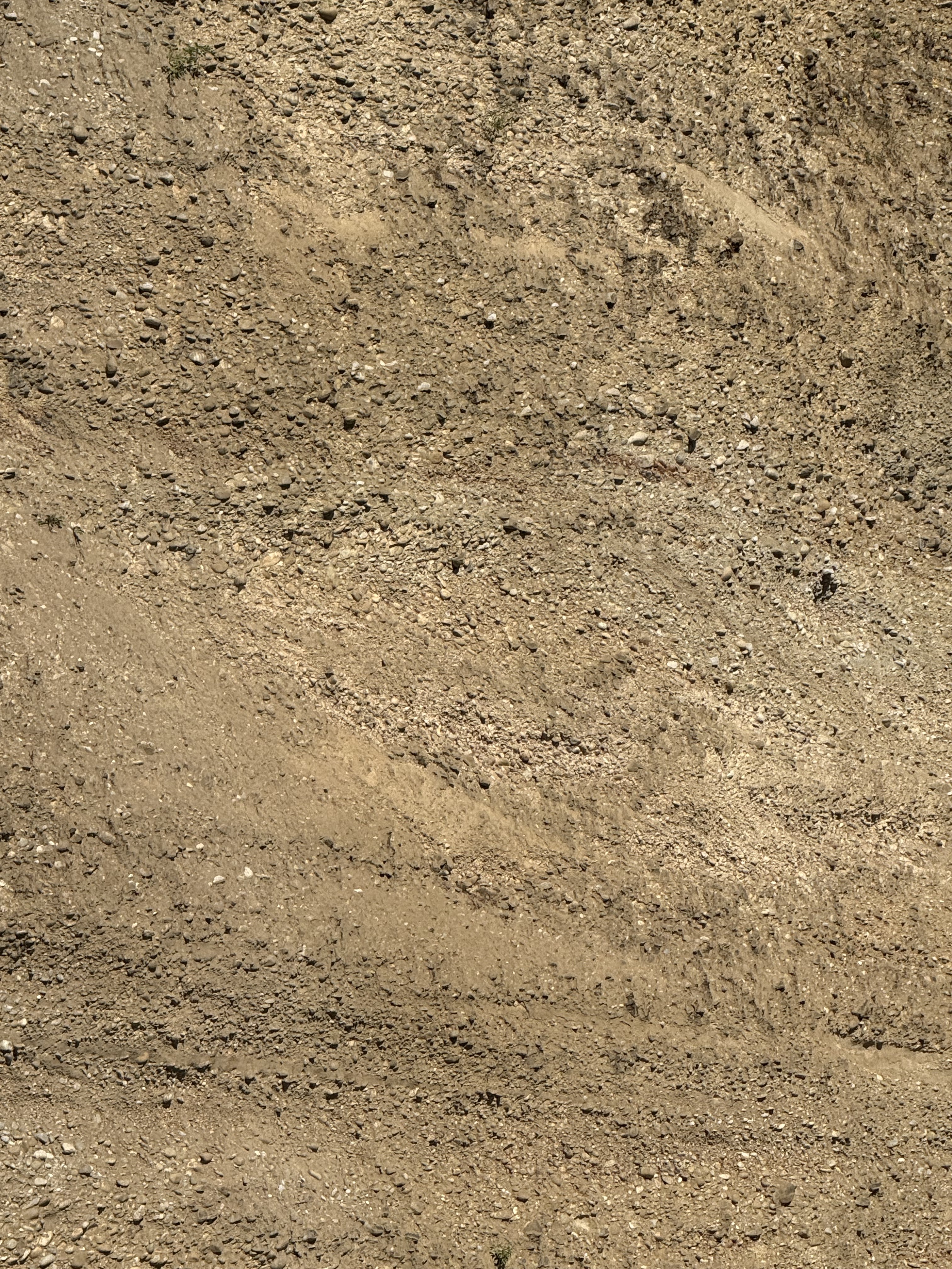
Figure 7. This is a close-up of the center of the cliff in Fig. 6, focusing on the contact between finer, sandier sediment to the left, and coarse material in the upper right. The unconformity contact between them was created by erosion, either by a glacier or a river like the modern Carbon River. Note the change in bedding between the lower part of the exposure and the irregular layers above the unconformity. The lower section reveals a fining-upward sequence; but this was partially removed and the entire upper part of the section is dominated by conglomerate.
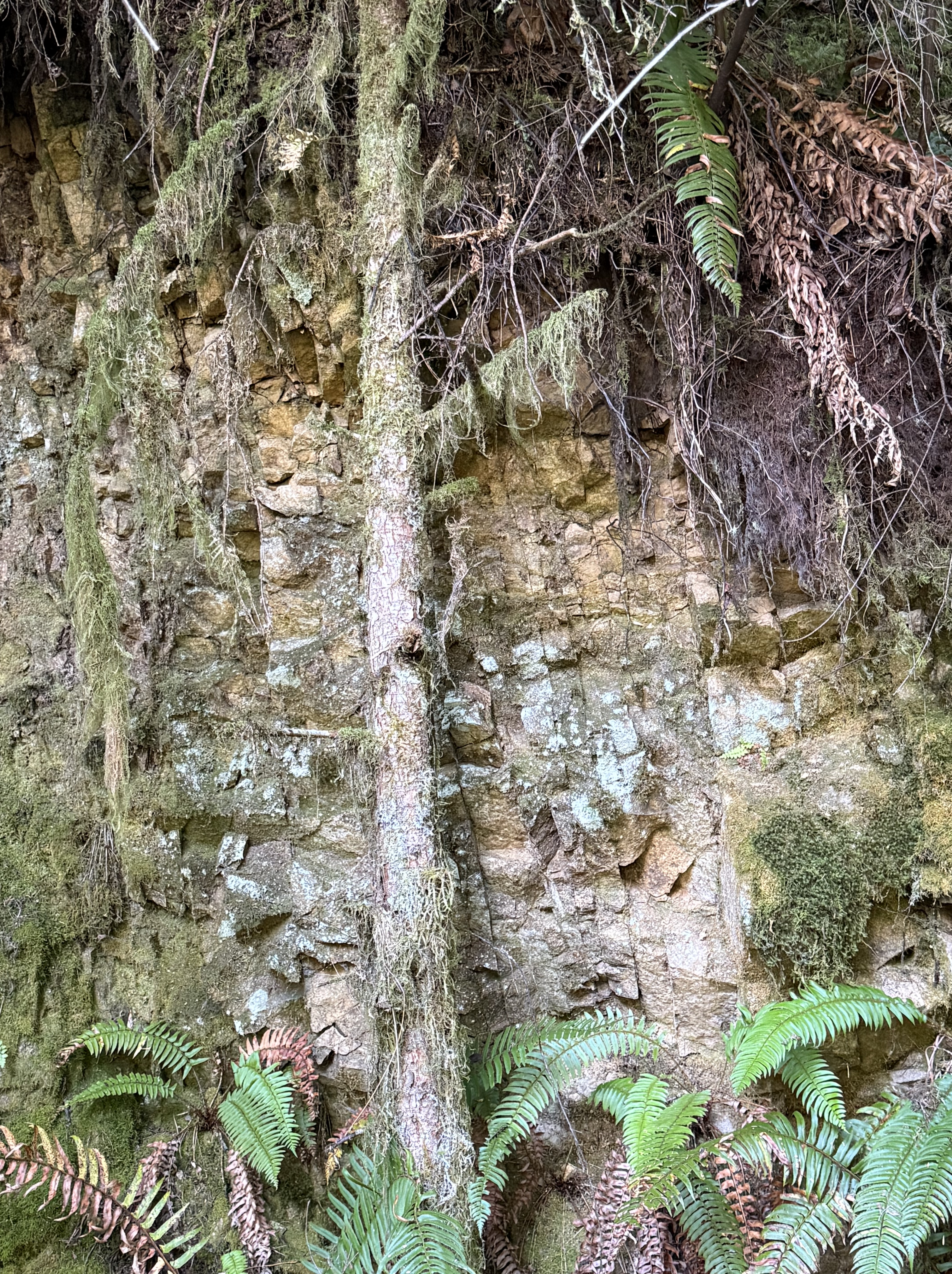
Figure 8. This photo was taken about halfway between Carbonado and the bridge (the star and triangle in Fig. 2B, respectively). The river was about 100 feet lower than the trail at this point. These bedded rocks are nearly vertical, as indicated by the dark, nearly vertical lines. They are Eocene terrestrial sediments that have been faulted and folded into their current orientation. They were probably deformed when the faults seen in Fig. 2C (thin lines on the geological map) were active.
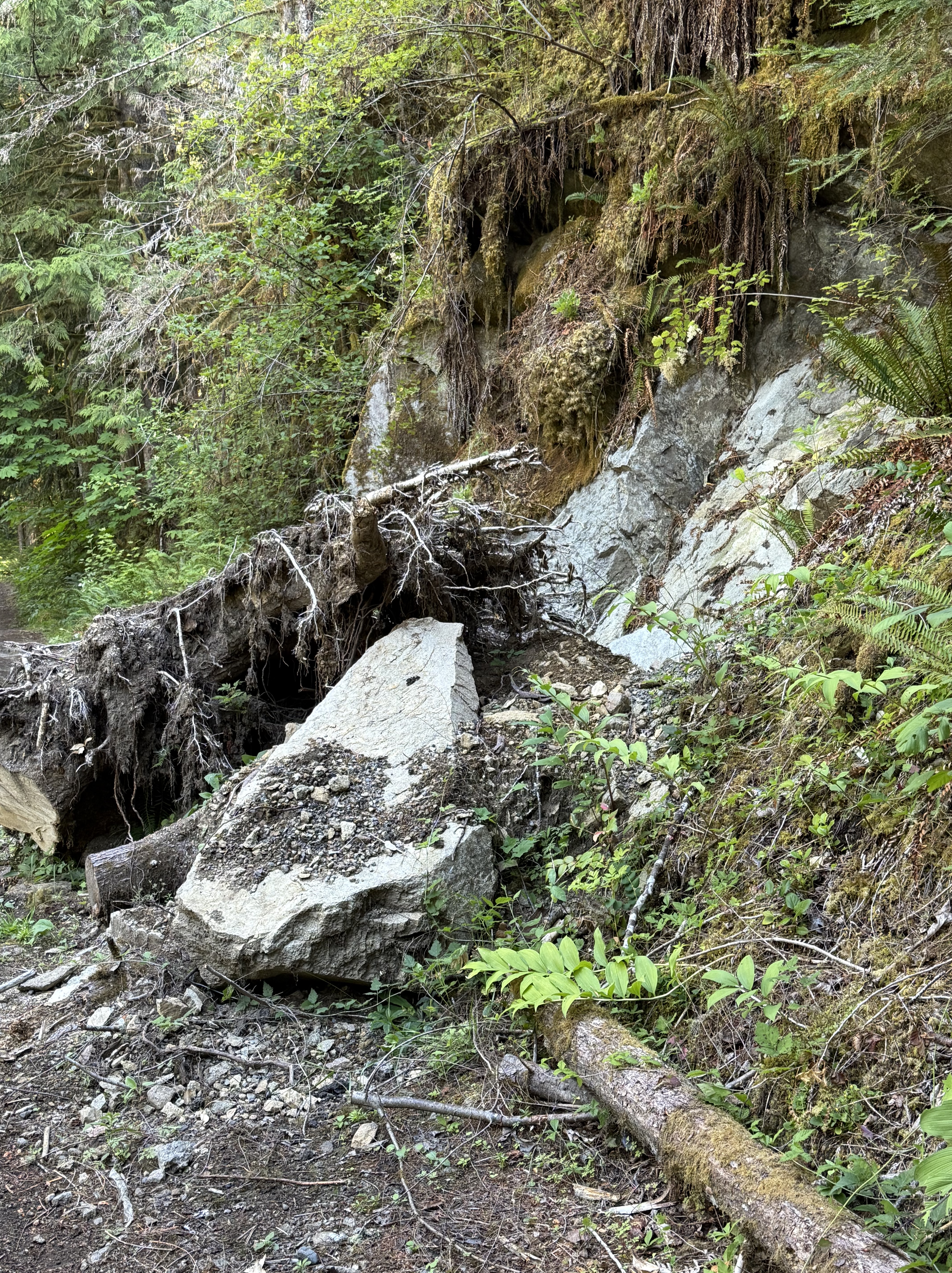
Figure 9. Further along the trail we encountered this small landslide. A tree that had rooted in cracks within the sedimentary rocks fell along with a piece (about 10 feet long) of rock. This is a great example of how erosion is a continuous process that never rests, inexorably removing mountains and transporting them to the sea.
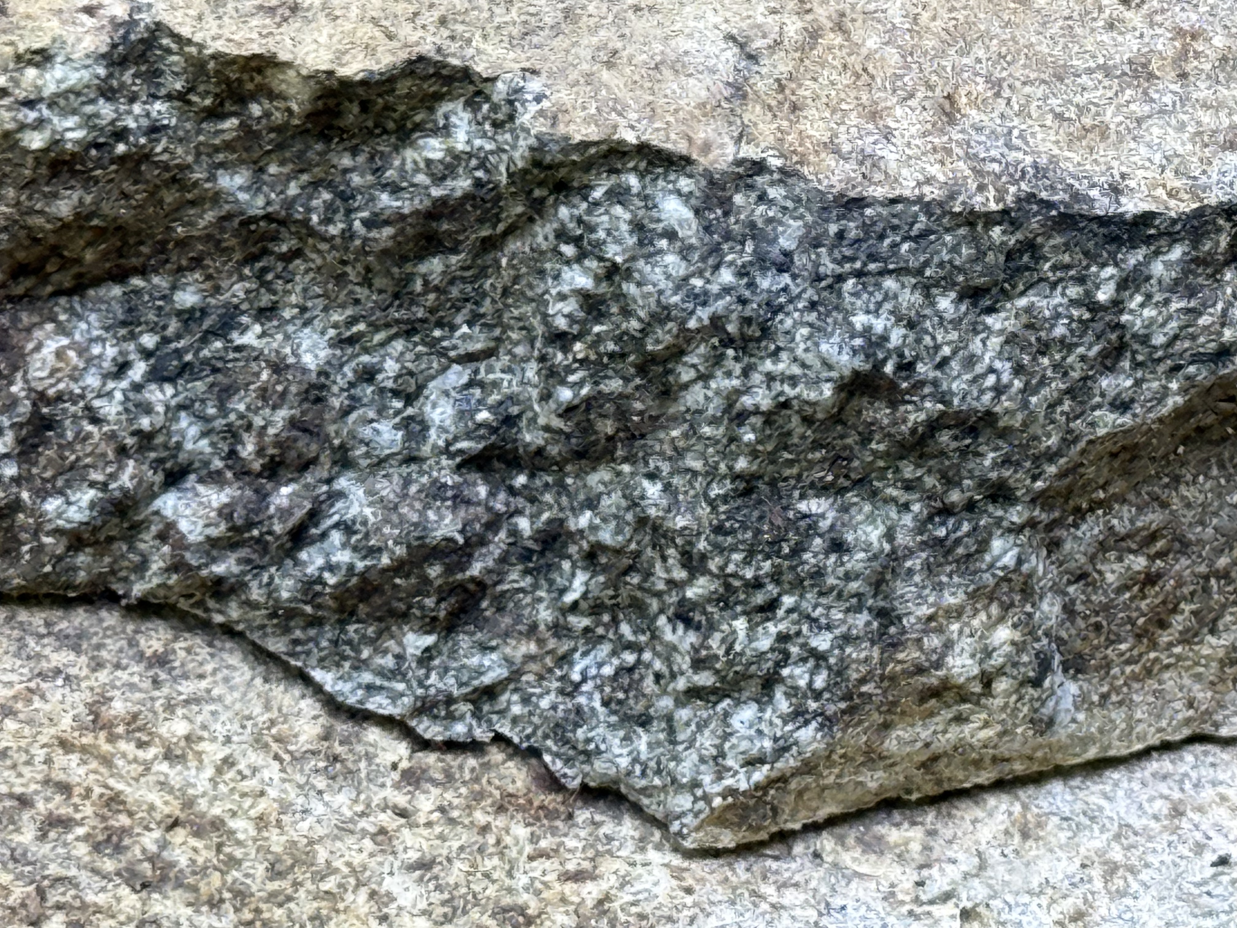
Figure 10. To the naked eye, this close-up of a recently broken piece of the slab in Fig. 9 looks like an intrusive, igneous rock, but it absolutely is not! Ignoring the dark coloration, which is either an organic stain or weathering product, I would say this is probably a coarse sandstone, possibly even a breccia or conglomerate. Breaking it with a rock hammer, to produce a fresh surface, would make identification easy; but we don’t do that in Rocks and (no) Roads. We use the geologic map instead.
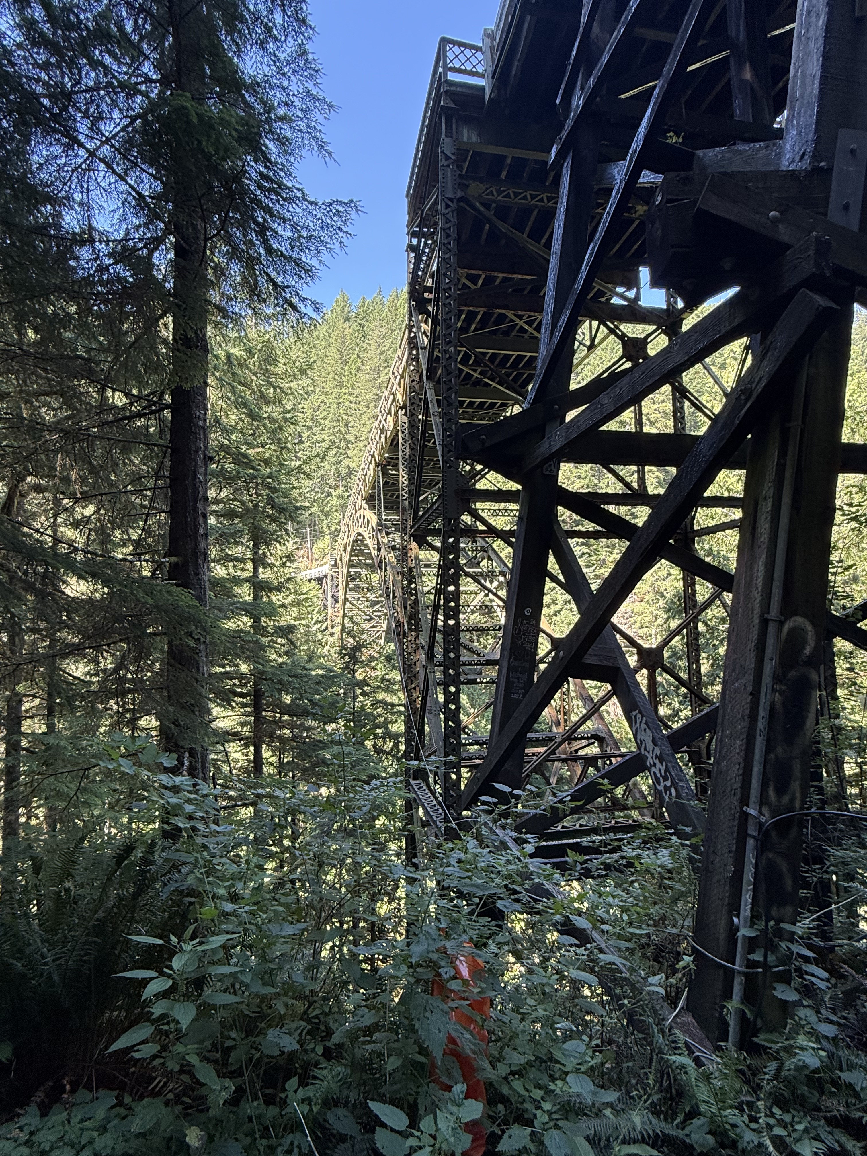
Figure 11. This is the end of the trail, where the road crosses Carbon River across the condemned Fairfax Bridge — closed even to pedestrian traffic. The canyon is 250-300 feet deep here. We climbed a trail to the bridge before we saw the signs on the highway declaring it unsafe for men or beasts.
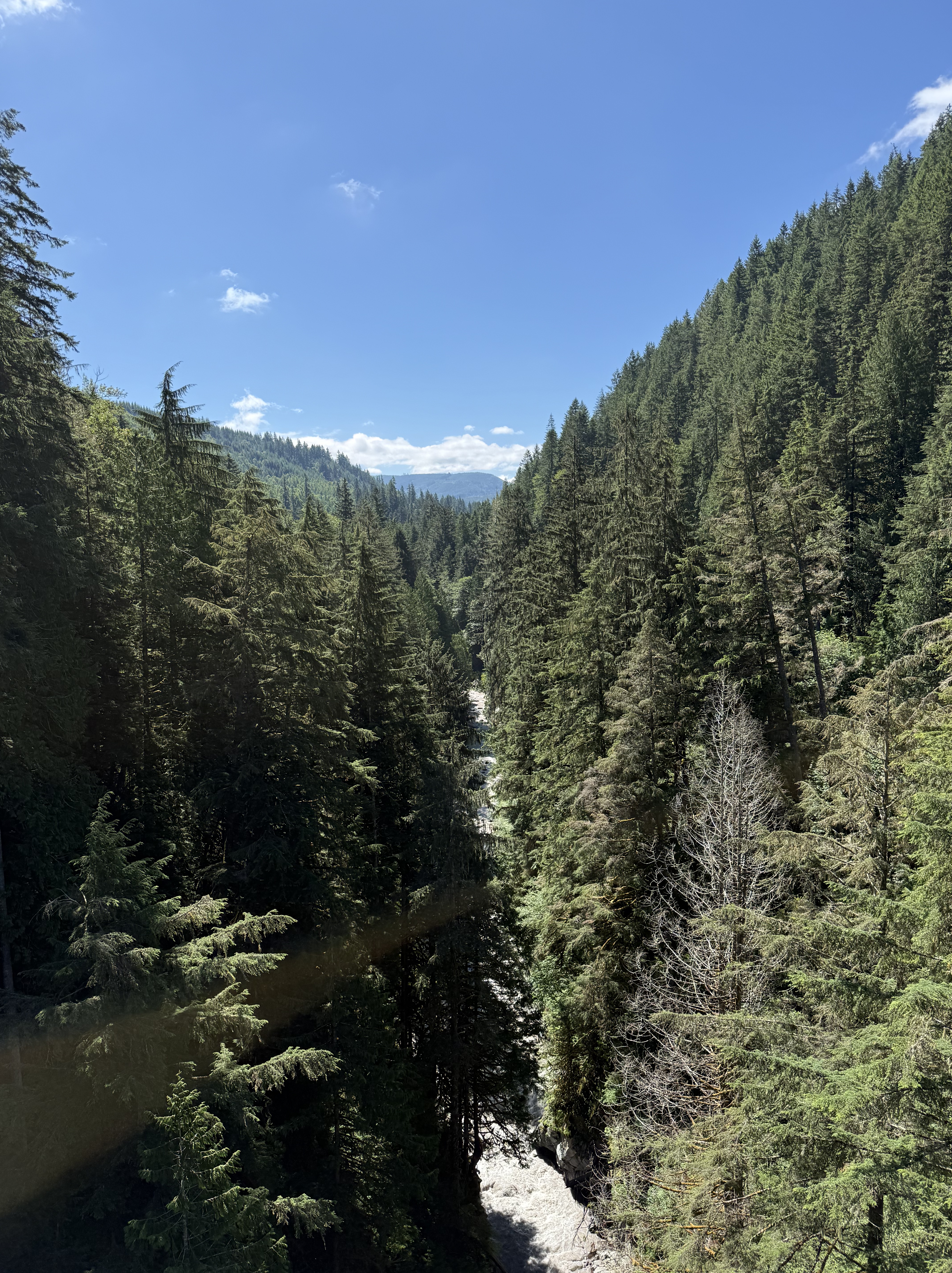
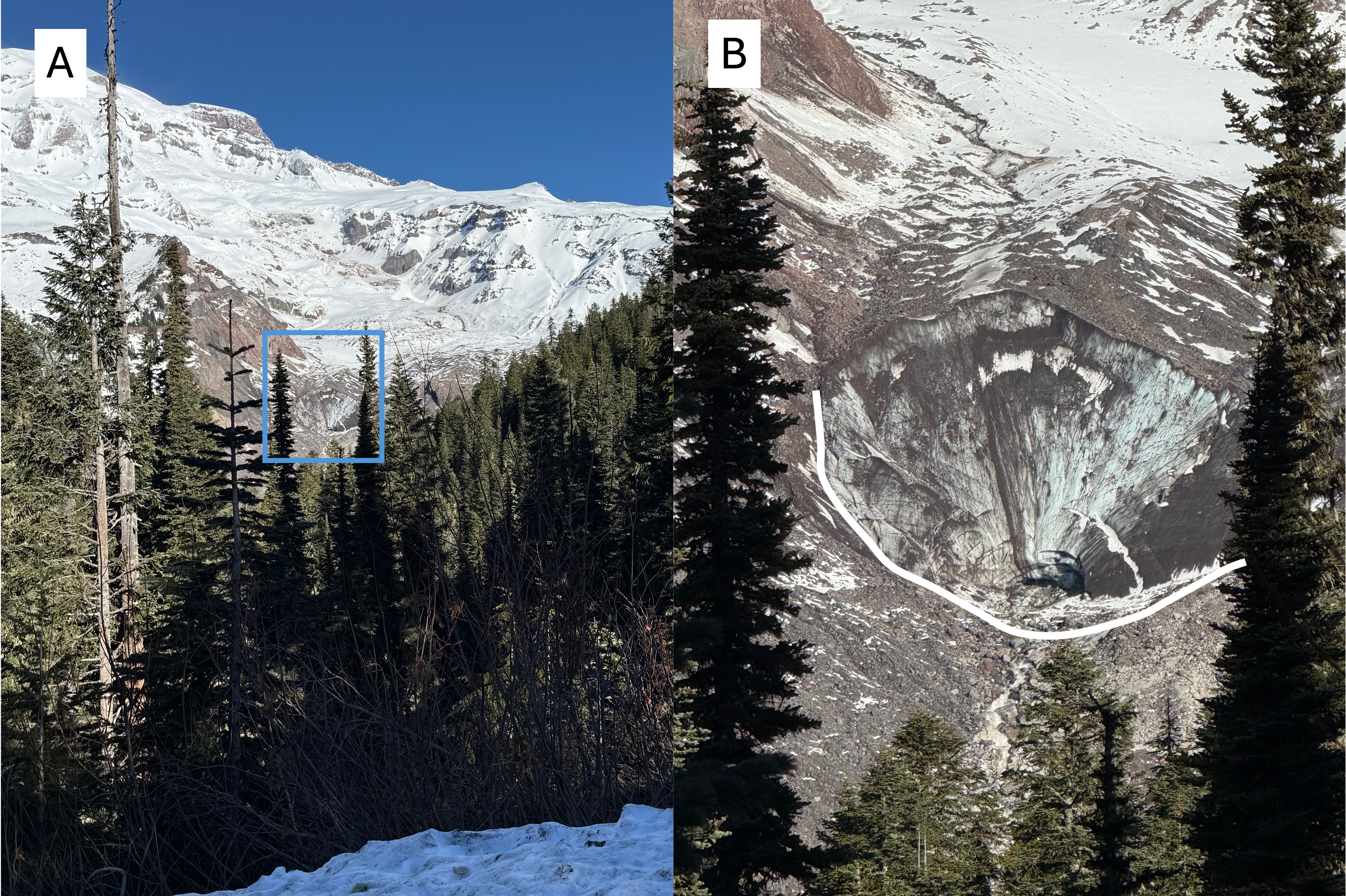
Figure 12. The canyon is very narrow at Fairfax Bridge, and Carbon River is forced into a bottleneck where it drops precipitously from the core of the Cascades. This entire canyon would have been filled with ice during the most recent glacial period. Compare this image, looking upstream, to those from the Nisqually glacier on Mount Rainier. That ice would have melted and advanced, pushing its way downstream, where it would have met the continental glacier covering Puget Sound.
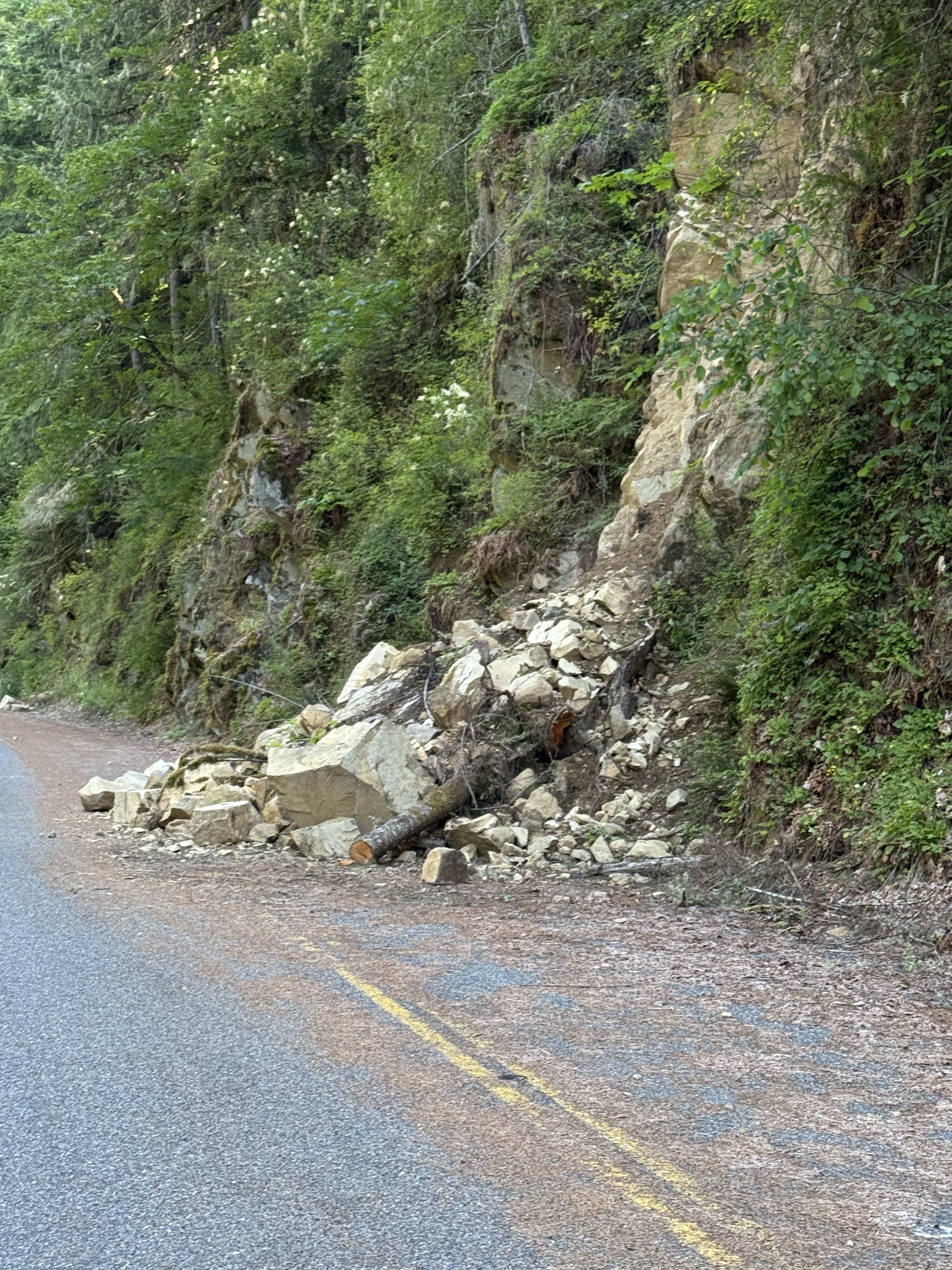
Figure 13. We took the highway back to Carbondale. However, Route 165 is closed and the highway department isn’t maintaining it, so slides like this one are left for geologists to examine. This block is, according to RockD’s geologic map, sedimentary; it looks like sandstone and I didn’t examine it at the time. Note the reddish face on the large block facing the camera; red means this rock was deposited with a lot of oxygen, which means it was in a river and not the ocean, which has a much lower concentration of oxygen.
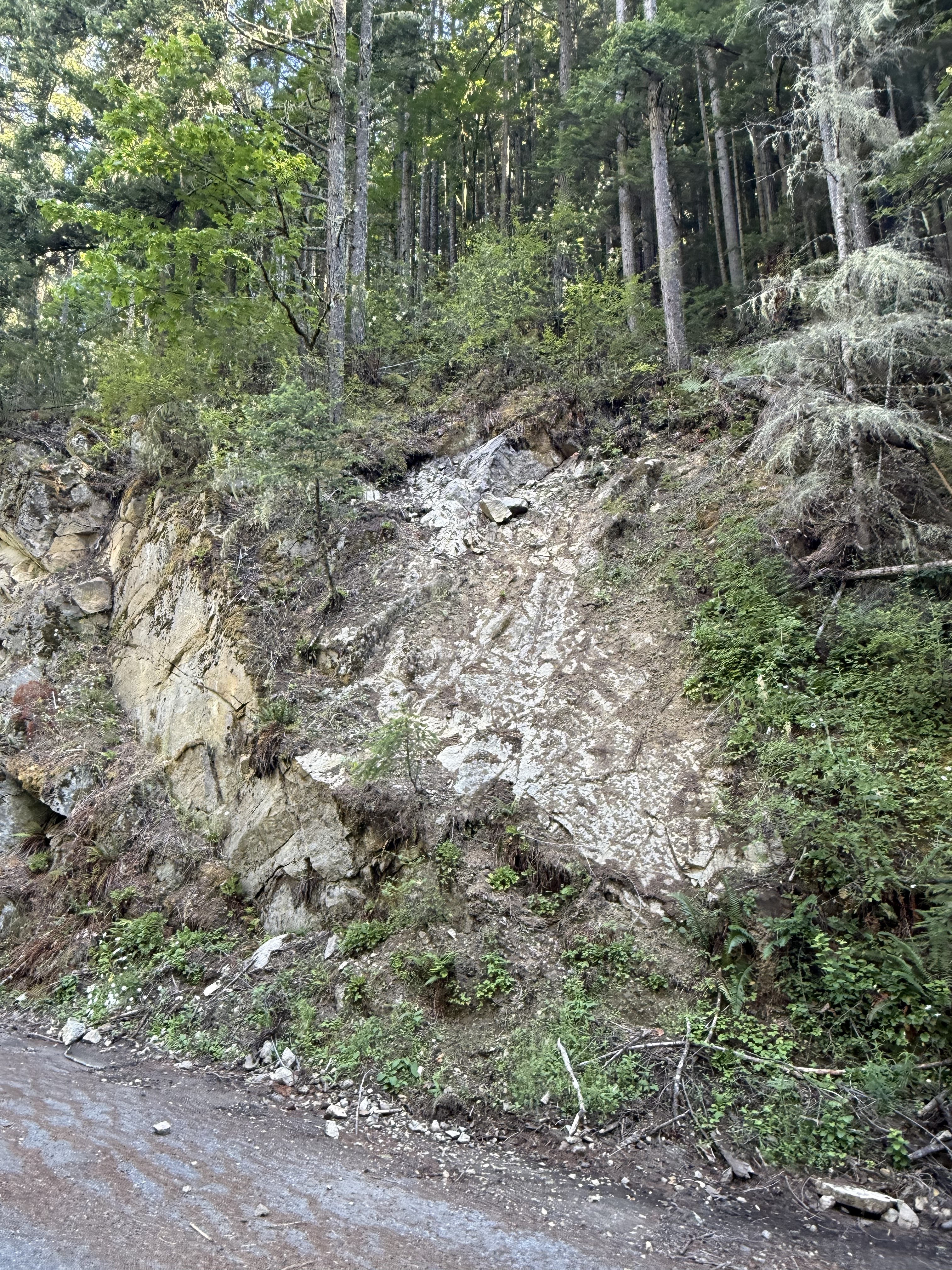
Figure 14. This photo presents a bizarre juxtaposition of geologic features. It was taken a few hundred yards downstream of Fairfax Bridge. The thick layer of sandstone to the left represents the unaltered strata, which has been tilted towards the NE, but not as much as the strata seen in Fig. 8. Such a sudden (spatially) change in orientation is probably why the geologic map (Fig. 2C) shows a fault along the river canyon.
Another interesting feature is the white patch in the center of the photo. I had several hypotheses about this but, after discussing it with CoPilot (aka ChatGPT), I’m going to go with the most plausible scenario: I think this is a layer of shale within the Carbonado Formation, which is both more easily weathered than sandstone, and a surface that can accommodate slippage on a fault more readily. The apparent bedding plane (i.e. the white surface) is an illusion, created by uneven weathering and the constant flow of water down an established channel.
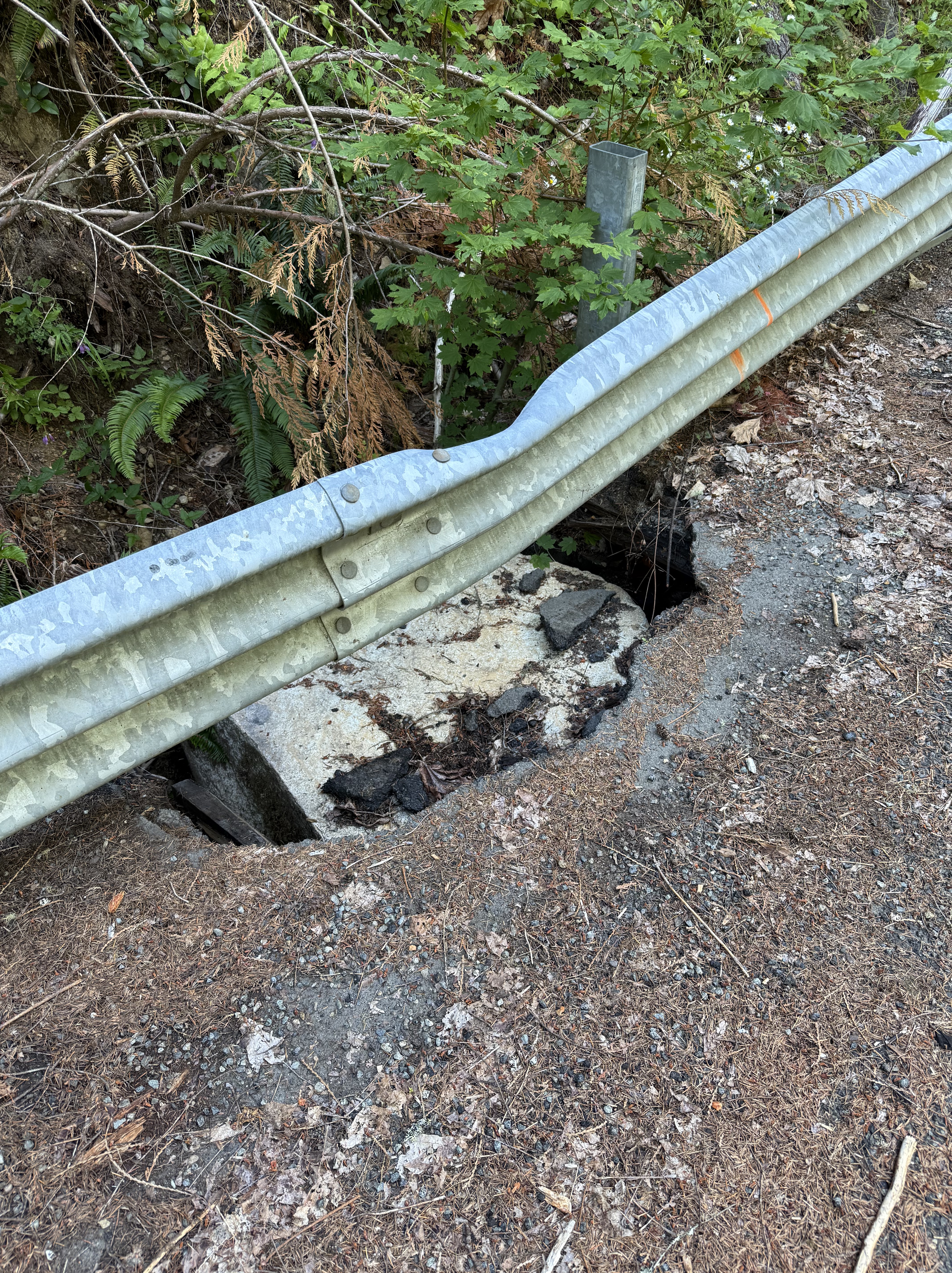
Figure 15. I had to include this image. A block of sandstone, weighing more than a ton, rolled down the steep slope, hit the guardrail, bending it, before slamming into the asphalt road that was weakened by erosion, and smashing into the underlying, water-saturated ground. We noticed several spots where the culverts draining the road were insufficient, allowing water to collect and weaken the roadbed.
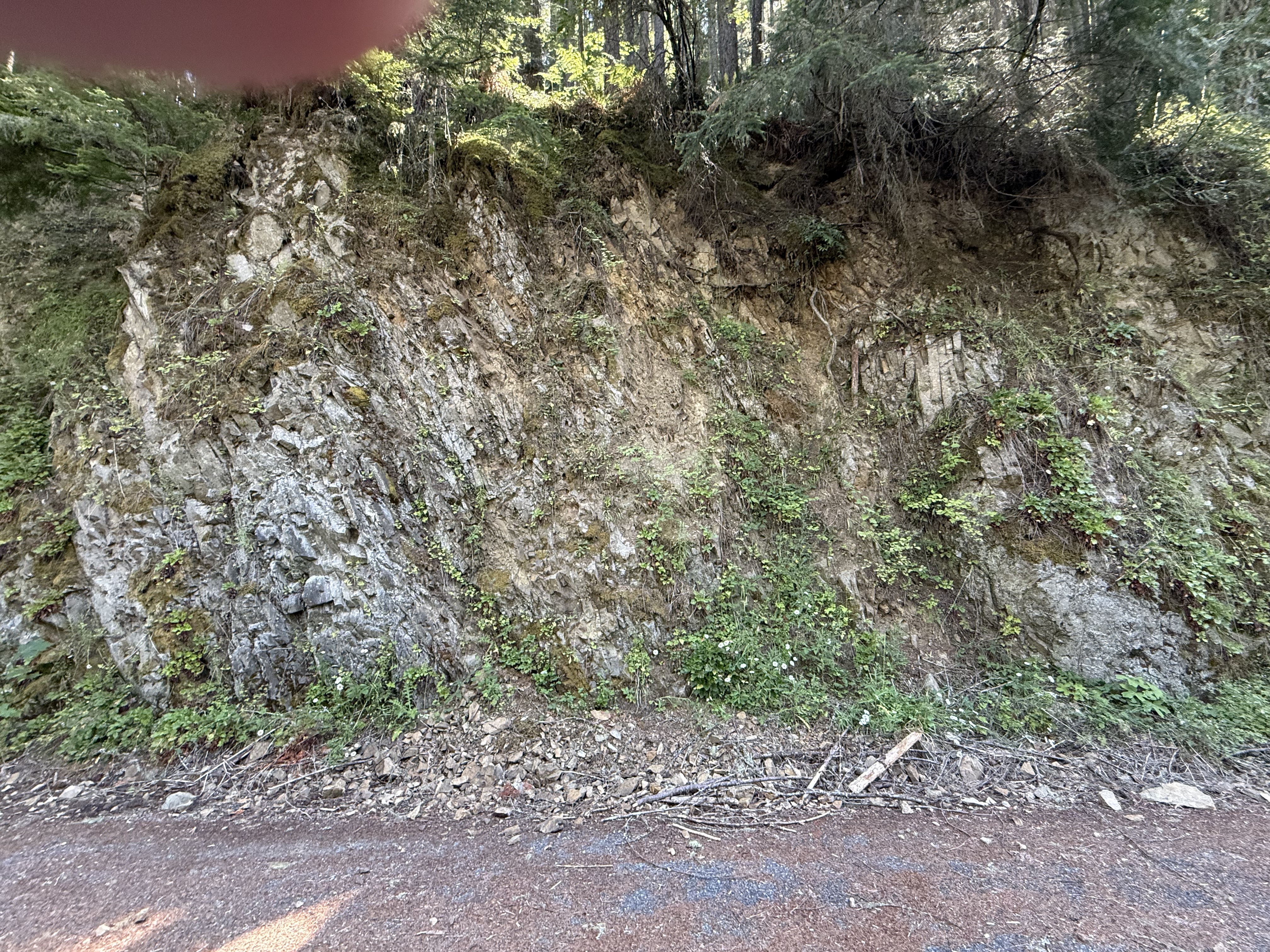
Figure 16. Another couple hundred yards further downstream (towards Carbonado in Fig. 2B), and we find thin layers of shale/sandstone nearly vertical, just like in Fig. 8. I didn’t measure my location precisely, but I wouldn’t be surprised if this is just above (uphill) the earlier observation. Note the layers of mud that resulted from differential weathering of clay layers within the Carbonado Formation.
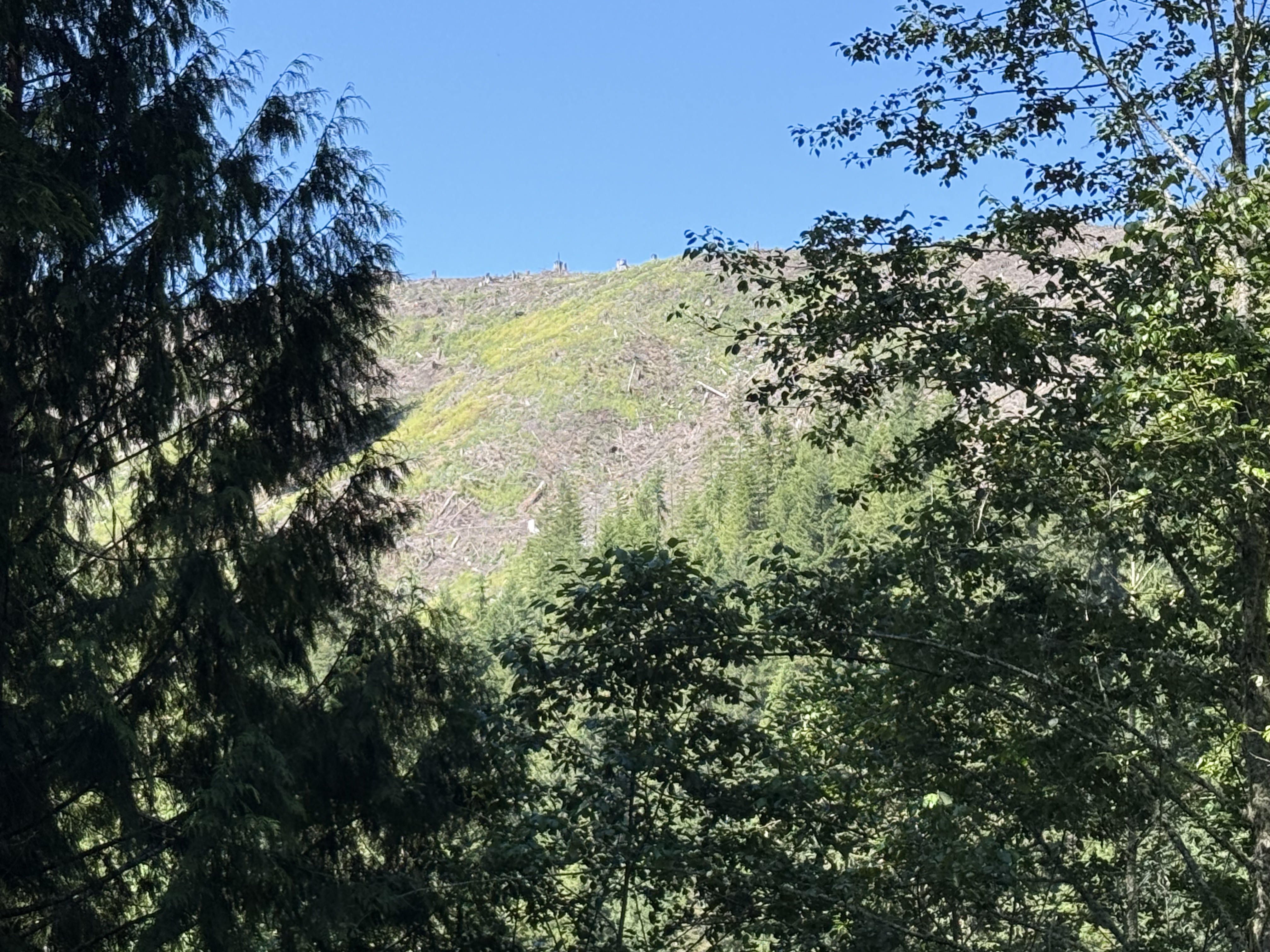
Figure 17. I included this image to explain why the Carbon River was so muddy a few miles downstream (Fig. 1). The canyon wall to the west has been clear cut recently, allowing massive erosion of soil into the Carbon River. This is an ongoing practice in Washington with no attempts to rein in such destructive deforestation — all for the sake of profits. It just pisses me off!
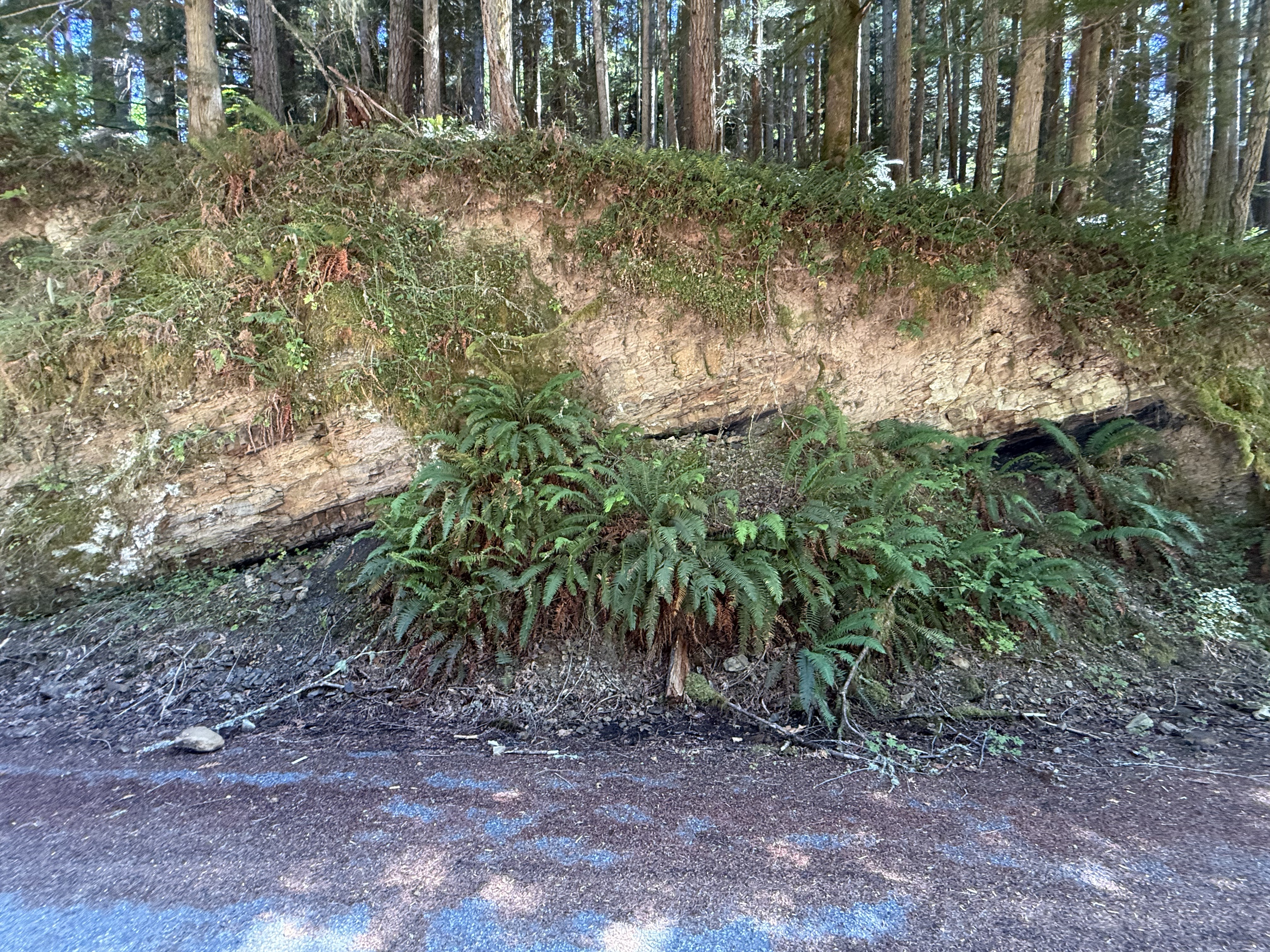
Figure 18. The main point of interest in this photo is that the Eocene sedimentary rocks are oriented differently from those in Figs. 14 and 16; these rock strata are dipping WNW(I didn’t measure strike and dip), rather than vertical or ENE. Faults don’t occur at the surface, but only shallow enough for the rock layers to break rather than bend. Identifying and mapping crustal faults is as much an art as a science because we don’t have the remote-sensing tools to see what lies beneath the surface, whether it is glacial till or bedrock.
Summary
We saw a lot more on this trip than I’d imagined during the 45 minute drive to Carbonado. I’ll put it all together into a chronology and try to relate it to other nearby locations we’ve visited. Let’s start as far back as the rocks will take us.
During the Eocene epoch, about 50 million-years ago, this area was covered with streams, lakes, and, presumably, forests. There were no rivers like the Carbon back then — the sediment consisted primarily of sand and silt, with a smattering of clay. These sediments were eroded from an active volcanic complex. Further west, along the Pacific coast of the Olympic Peninsula, contemporary rocks include turbidites deposited in deep water, probably submarine fans, and tectonic breccias. This tectonic environment has persisted to the present day. We examined one of these volcanoes, from the Miocene (~23-5 Ma), at Pinnacle Peak. We didn’t see any evidence of a nearby volcano today; instead, we saw several boulders that revealed what was going on within the magma chambers beneath the Cascades volcanoes.
Subduction didn’t end during the ensuing millions of years, but the earth changed. Ice sheets appeared during the Pleistocene (~2.4 Ma), covering the PNW while alpine glaciers formed in the valleys dissecting the volcanoes. Finally, about 500 thousand years ago, a really big magma chamber constructed Mt. Rainier; and Carbon River began to wind its way from the flanks of this monstrous volcano to the Puget Sound trough during interglacial periods. This entire canyon would have been filled with ice during cold periods. It was during this period that Carbon River would have emerged from the eroding, ice-covered terrain. It didn’t cut its canyon but inherited it, and transported the remnants of a permanently altered terrain.
During glacial retreat, thick blankets of sediment were deposited by rapidly flowing rivers fed by the glaciers. This occurred repeatedly for two million years, culminating in the most recent glacial deposits seen in Fig. 6. However, this process of glacial advance and retreat occurred within both the vast continental glacier and the alpine glaciers, resulting in overlapping layers of poorly sorted sediment.
One final word: the muddy water we saw in the Carbon River is probably caused by the clear-cutting of the steep slopes defining its canyon; however, glacial melt during the summer transports a lot of fine material from beneath the glaciers covering Mt. Rainier. When we visited the Nisqually glacier and viewed the headwaters of Nisqually River in December, the water was crystal clear. Maybe the water turns opaque every summer.
It has been a wild ride through the last 50 million years along the modern Carbon River.
The Flora of Point Defiance Park
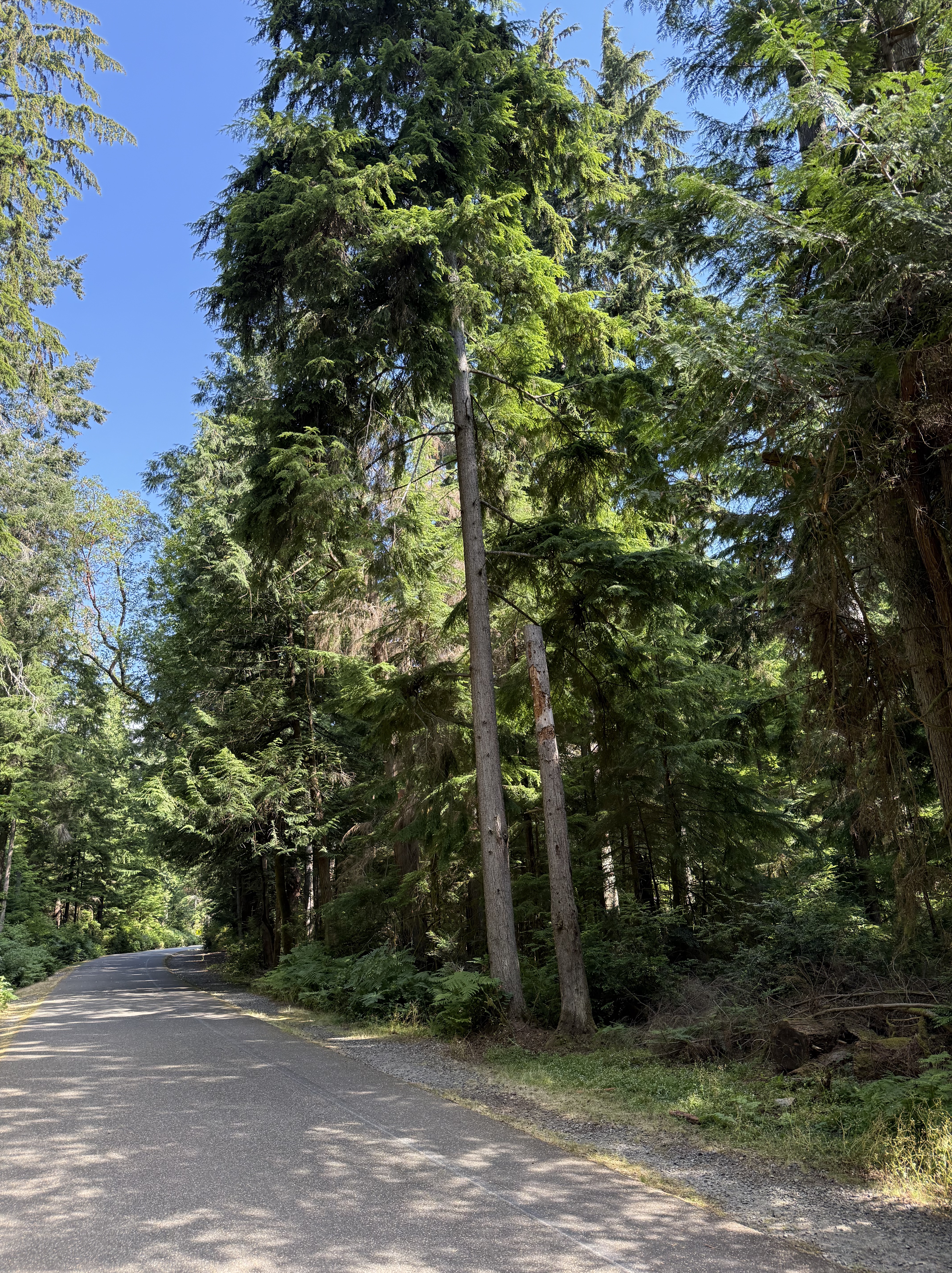
This beautiful, mature second‑growth coastal temperate rainforest is only ten minutes from my house. I should get there more often, and perhaps I will after taking an interest in ecosystems in addition to geology. Today’s outing was an opportunity to begin acquainting myself with the ecosystem I inhabit, so I made an effort to identify several plants along Five Mile Drive, a road that circumnavigates the forest and is permanently closed to auto traffic. When I started walking along this path, this forest was nothing but a lot of green trees and stuff. My perspective changed over an hour or so, and about 2.5 miles.
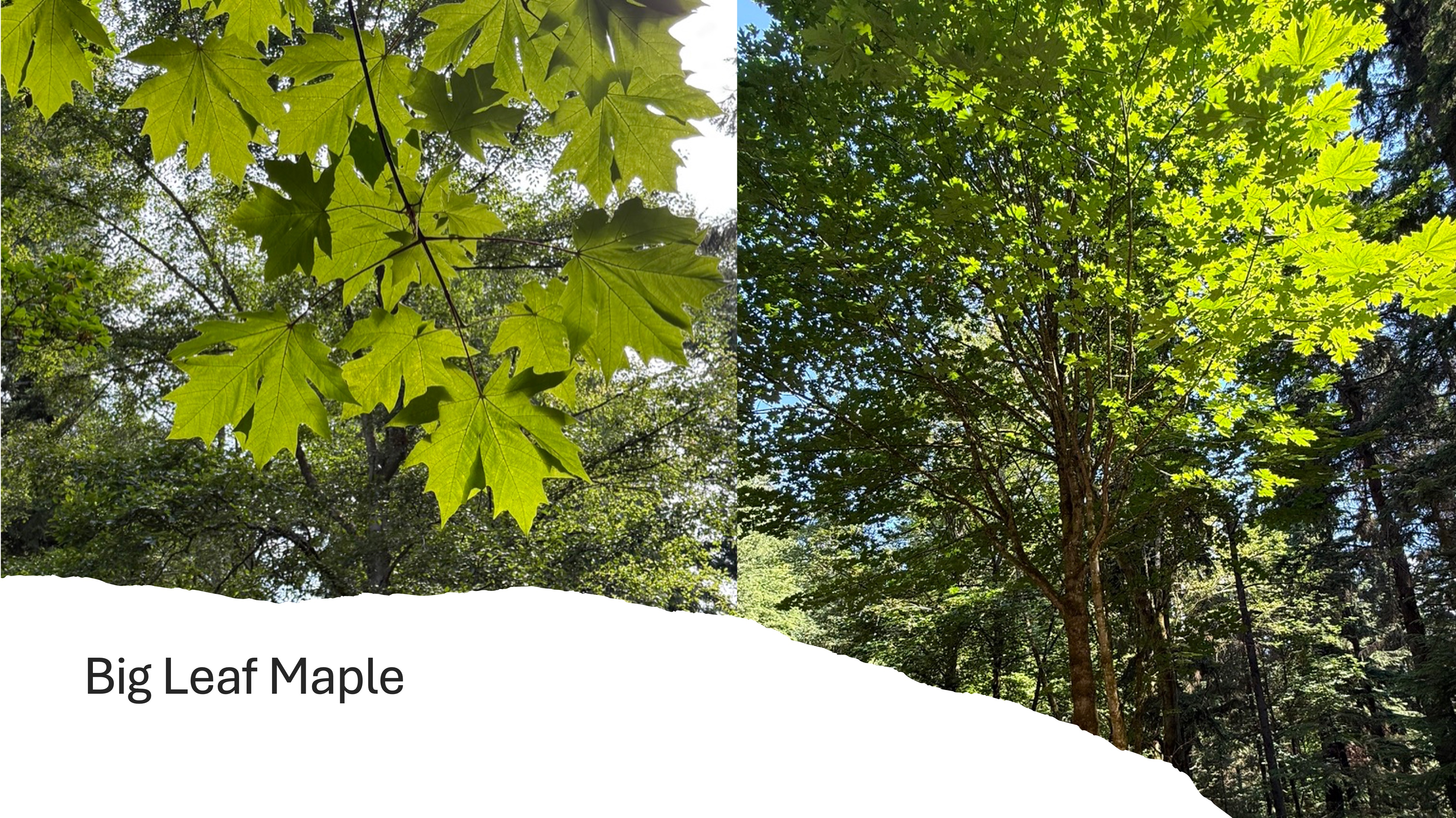
This colorful maple tree is a native to Puget Sound. It earns its name because those deeply lobed leaves are up to a foot across. But what are its roles in this forest? CoPilot had a lot to say about that. The Big Leaf Maple is fundamental to this ecosystem because it creates a huge amount of leaf litter that contributes to the forest floor and thus supports a vast microbiome, as well as a nurturing environment for conifer seedlings. This large tree (50-150 feet) fills in gaps in the forest canopy, supplying shade and catching rainwater, as well as dew. Its dappled shade creates a diverse understory for new growth. It is important in the success of birds, insects, bats, squirrels, and deer. They all hang around it and depend on its large mass for homes and meals. Its large root system contributes to hydrologic stability by stabilizing slopes, slowing runoff (and erosion), retaining moisture, improving soil infiltration.
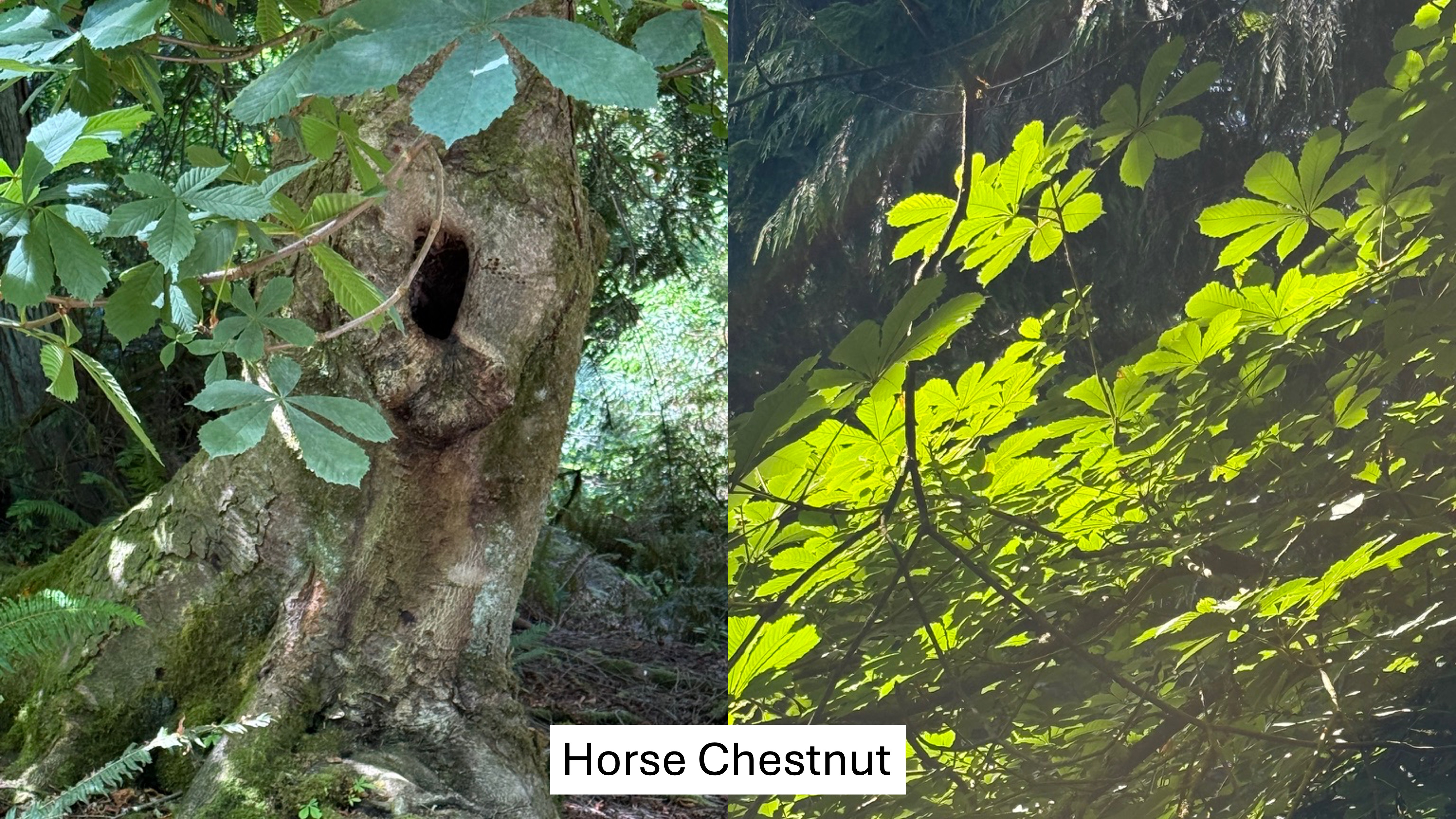
This large tree is native to SE Europe and they were introduced after the logging boom led to immigration. However, it is not an aggressive invader; this lovely tree does not form thickets, outcompete conifers, spread wildly, alter soil chemistry, suppress understory diversity, or create monocultures. In CoPilot’s words, “It’s a polite non-native.”
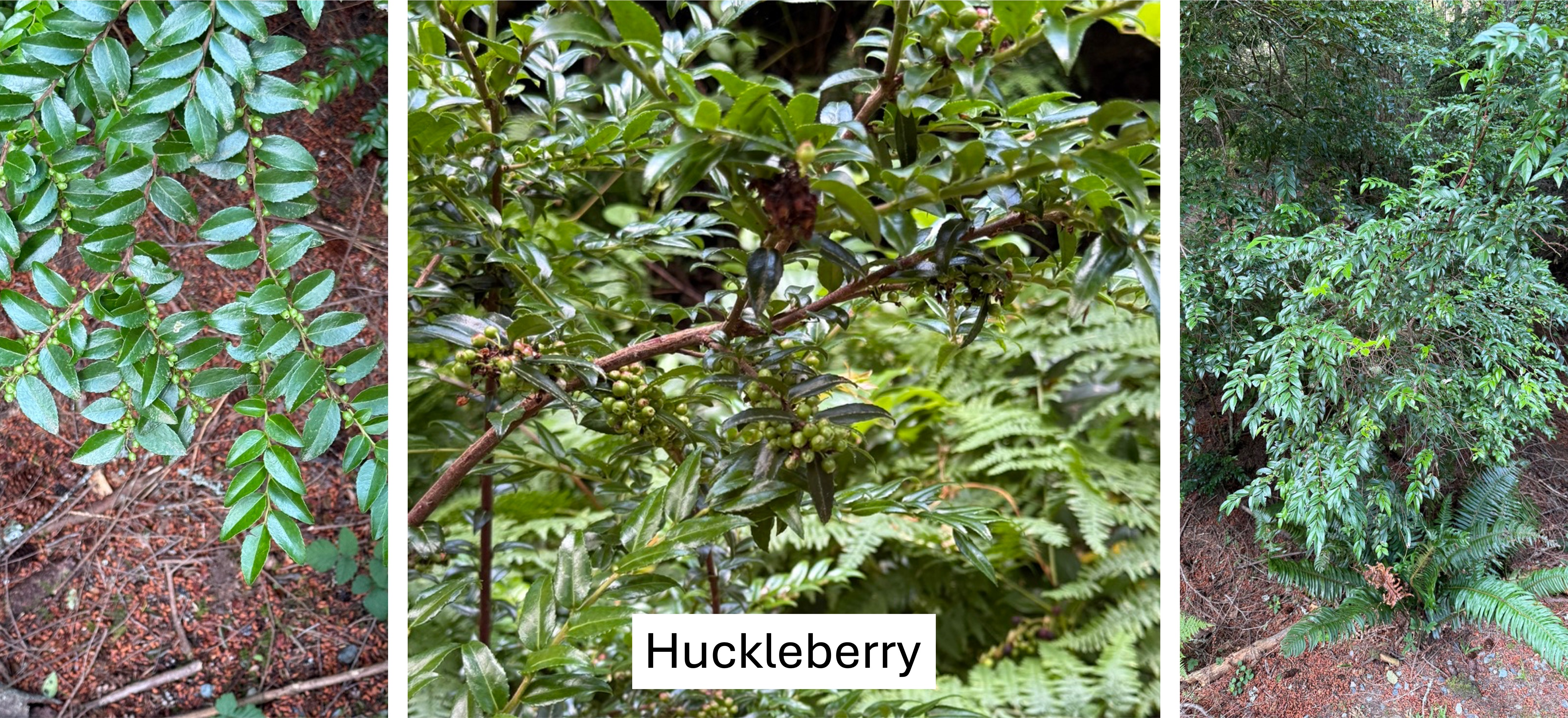
This nondescript shrub gives the forest its lush, evergreen understory identity. It is one of the top berry producers in the Puget Sound lowland forest but, more importantly, its berries ripen later in the season, extending the berry window into early fall. It also thrives in the acidic soils Douglas fir and hemlock create, in turn moderating soil conditions. It bridges the gap between ecological disturbance (i.e. logging) and late-successional forest. One could say that it serves as a node in the forest’s ecological web. This is an unrecognized keystone species in the understory.
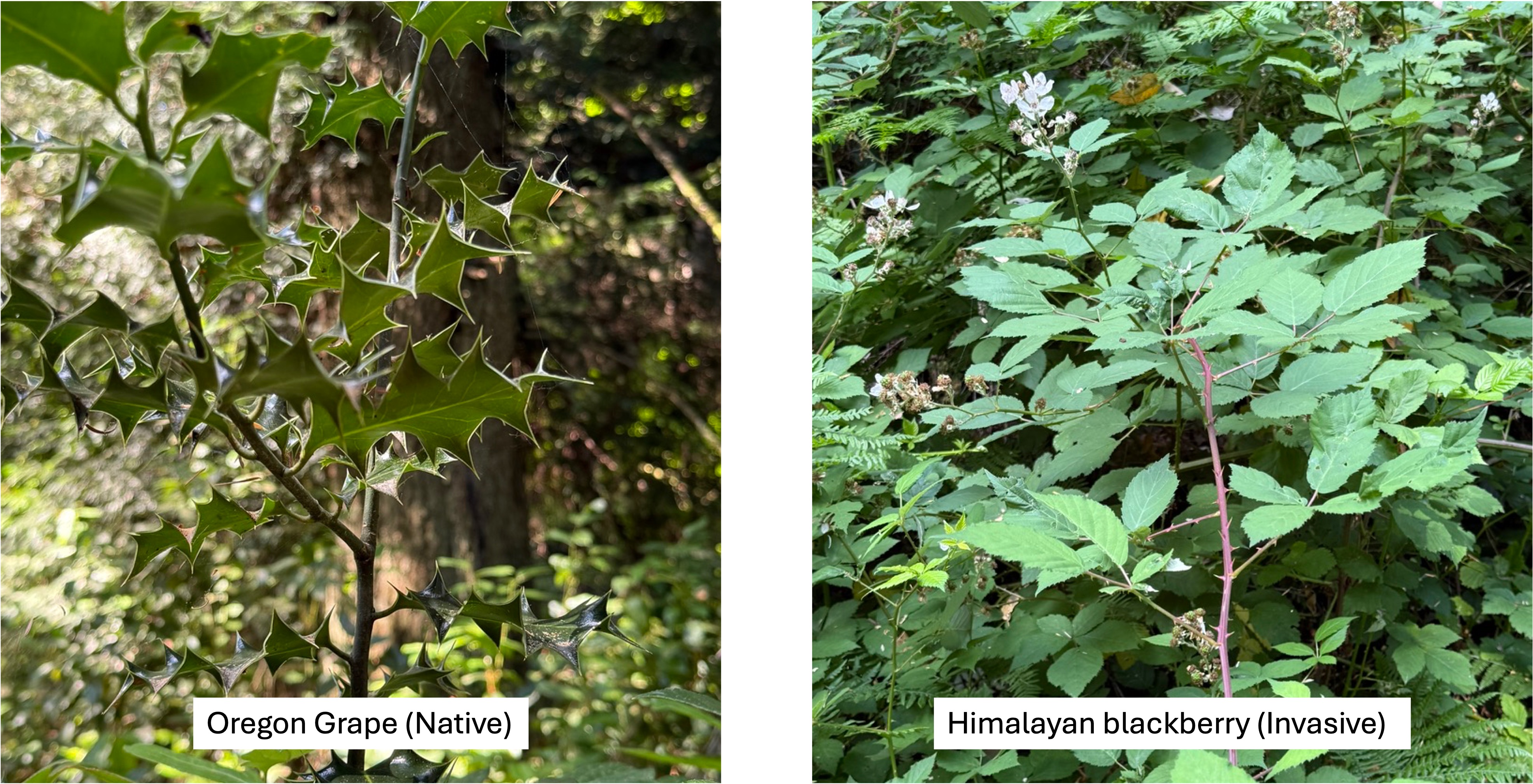
Oregon grape is the huckleberry’s silent partner in keeping the understory secure because it is also an evergreen shrub. In addition, it supplements the food web by blooming in March-April, providing nectar when few other shrubs are in bloom. Its berries ripen by mid-summer, bridging the gap between early berry producers like salad and late huckleberries. It precedes huckleberry in forest succession but persists as the canopy creates a shadier understory.
Himalayan blackberry is less like the fruit-bearing huckleberry and Oregon grape, and more like the Trojan Horse. The fruit are abundant and sweet, produced for a long season, and loved by all the denizens of the forest; thus, they are spread like wildfire, colonizing the entire forest–without predators in Pt. Defiance. The result of this invasion includes impenetrable thickets, root masses that choke other species, spreading by long, arching canes, and monocultures. It kills all the other stabilizing shrubs and creates a single mass of Himalayan blackberry. If left unchecked it can destroy an entire ecosystem, including the conifers. Holy shit!
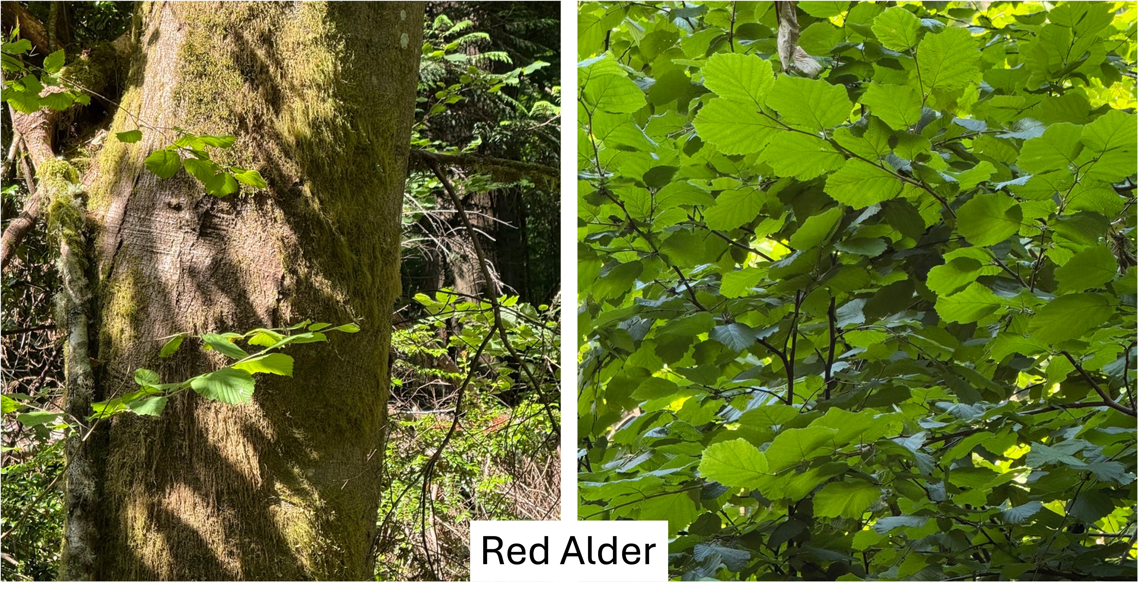
This nitrogen-fixing tree is the first responder when the forest is disturbed. As such it enriches soil, accelerates forest recovery, feeds the next generation of conifers, increases understory diversity, boosts fungal activity, and generally improves growth rates of proximal plants. Alder is the first tree to reoccupy damaged land, preparing the site for the conifers that will come later. Wherever alder stands exist, the biodiversity of the forest is increased. Because it gives so much to the forest, alders only live 40-60 years, thus acting as a continuous healing agent as a forest recovers from an environmental shock. This is the pioneer tree of the lowland forest. I hope it can defeat the Himalayan blackberry.
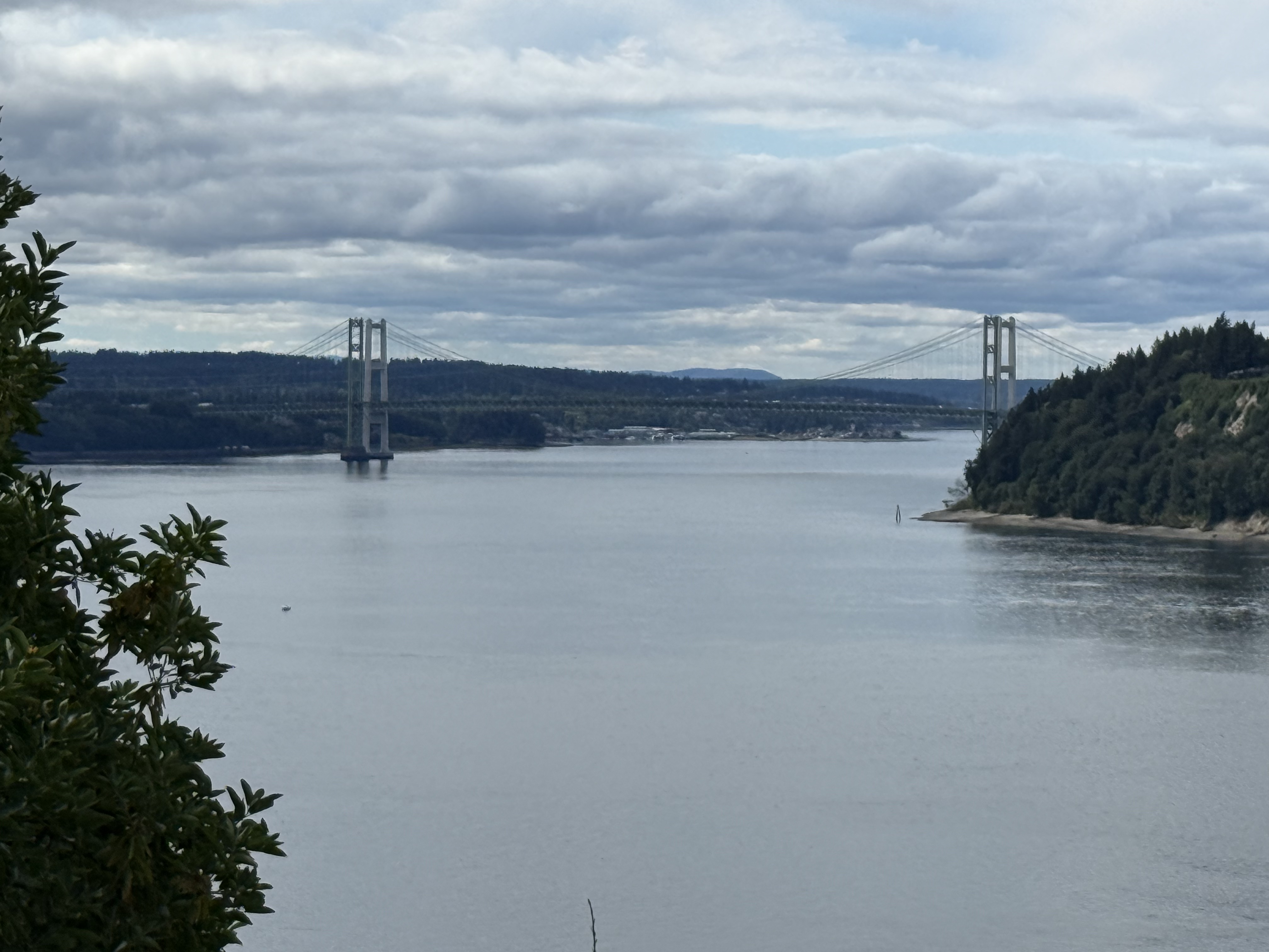
This view of the Tacoma Narrows bridge through the thick forest reveals a green landscape perched atop high bluffs overlooking Puget Sound. As far as the eye can see, from this vantage point, the forests were clear-cut to make profits and fuel the economic development of the Pacific Northwest.
But at what cost?
Mima Mounds Natural Area Preserve
It was unbelievably gorgeous weather here in the Pacific Northwest (PNW), with a high of 74 F, so we took a look at a couple of nearby natural areas.
Mima Mounds
This exceptional area isn’t unique but it is an unsolved geological problem. It is also peculiar in being a transition zone between active prairie and forest ecosystems. I’ll try to explain this with photos, and some help from CoPilot, Microsoft’s version of ChatGPT. However, I won’t solve the geological conundrum, which may never be fully explained.
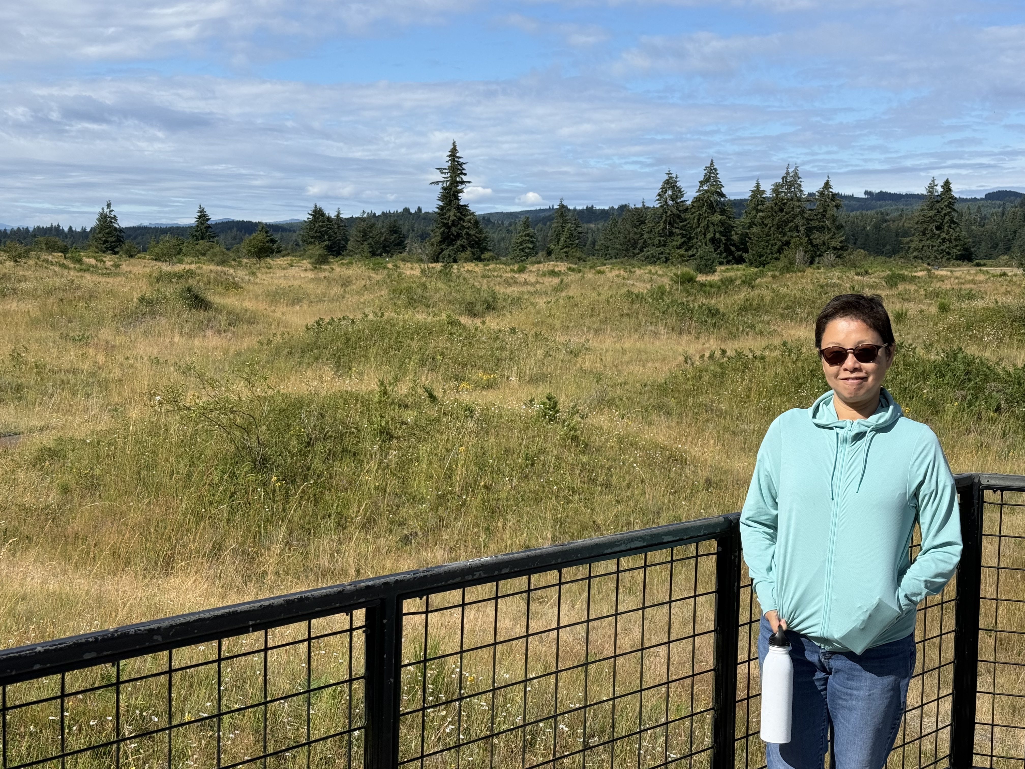
The Mima Mounds are about 16500 years old. They formed as the last continental ice sheet retreated from Washington. The mounds you see in this photo sit atop a gravel surface created at the southern extremity of this glacier. People, including the native Americans who have lived here for tens of thousands of years, have been perplexed by this bizarre topography.

There is a 1.9 mile trail that goes through the area; however, when European Americans first came here, this topography extended for more than twenty miles. Most of it has been demolished.
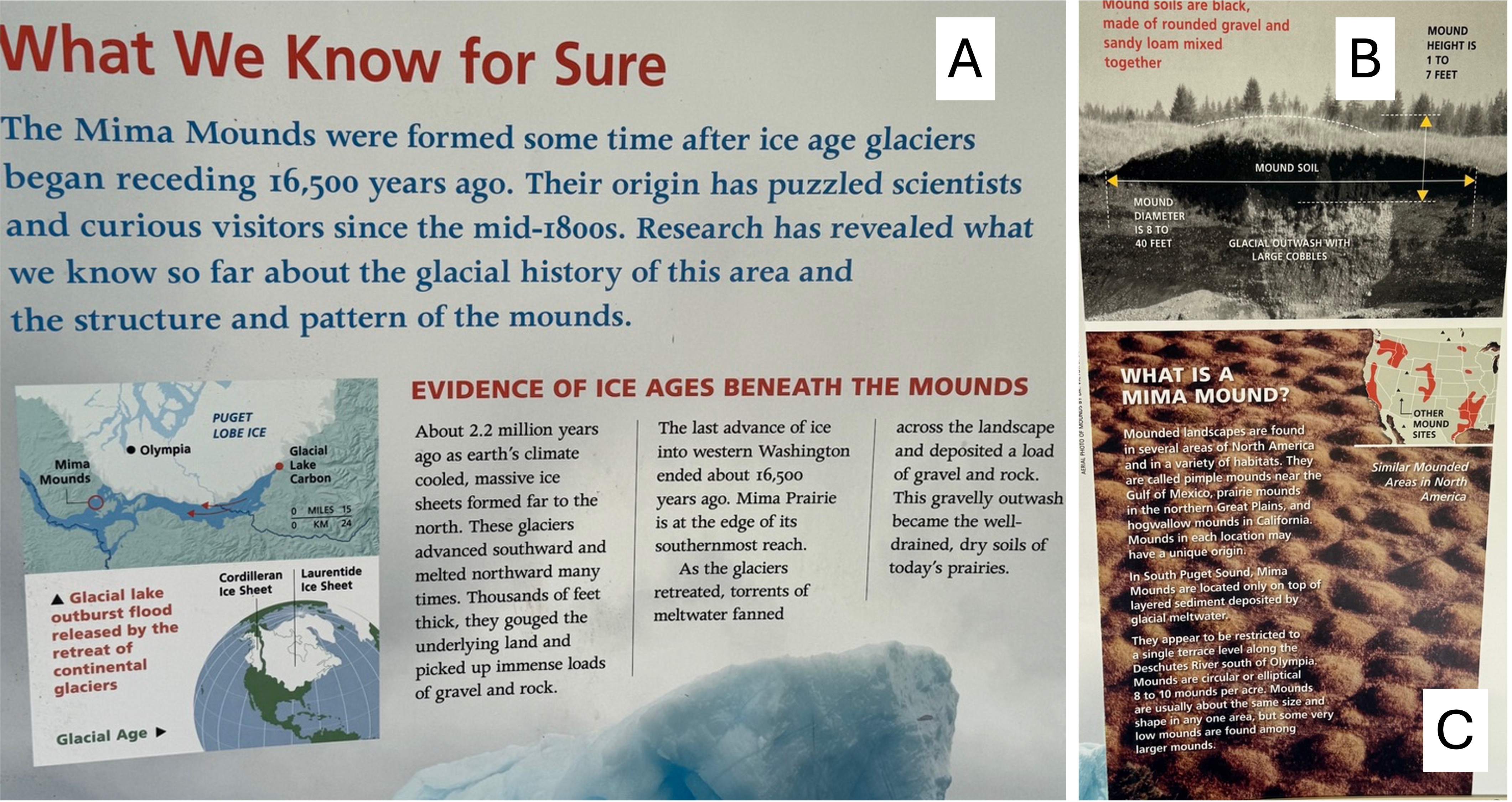
This is a portion of the information board at the interpretive center. (A) The Mima Mounds were constructed after the ice sheets began to retreat for the last time. The inset map shows the location of the NAP relative to the glacier and modern cities. This was the absolute furthest south of thick ice, but that doesn’t mean it was warm. (B) This is a rare photo of a cross-section through a mound. The dark soil is organic-rich and excellent potting soil. The subjacent glacial outwash is gravel. (C) This is a photo from the air, which shows their regular spacing. This is the geological problem. How could they have formed over about 400 square miles?
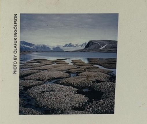
There are many theories for the origin of the Mima Mounds, and other mounds found in N. America and elsewhere. These are summarized on the Wikipedia page. I included this photo because it was on the poster; and the size/shape of these blocks of permafrost from Scandinavia are a good match to the mounds we saw. And they are in a similar, post-glacial environment.
Prairie Ecosystem
I’m discussing both the geology and ecology of Mima Mounds together in this post because they are inextricably connected. There are two ecosystems competing for space in this lumpy prairie environment. The result is there for anyone to see, if they ask the right questions.
This low shrub was identified by CoPilot as snowberry, which is a staple of the prairie. I only saw them on the mounds, their roots in good soil, but apparently they also do well in the sandy glacial soil. From my perusal of the internet, I can’t disagree.
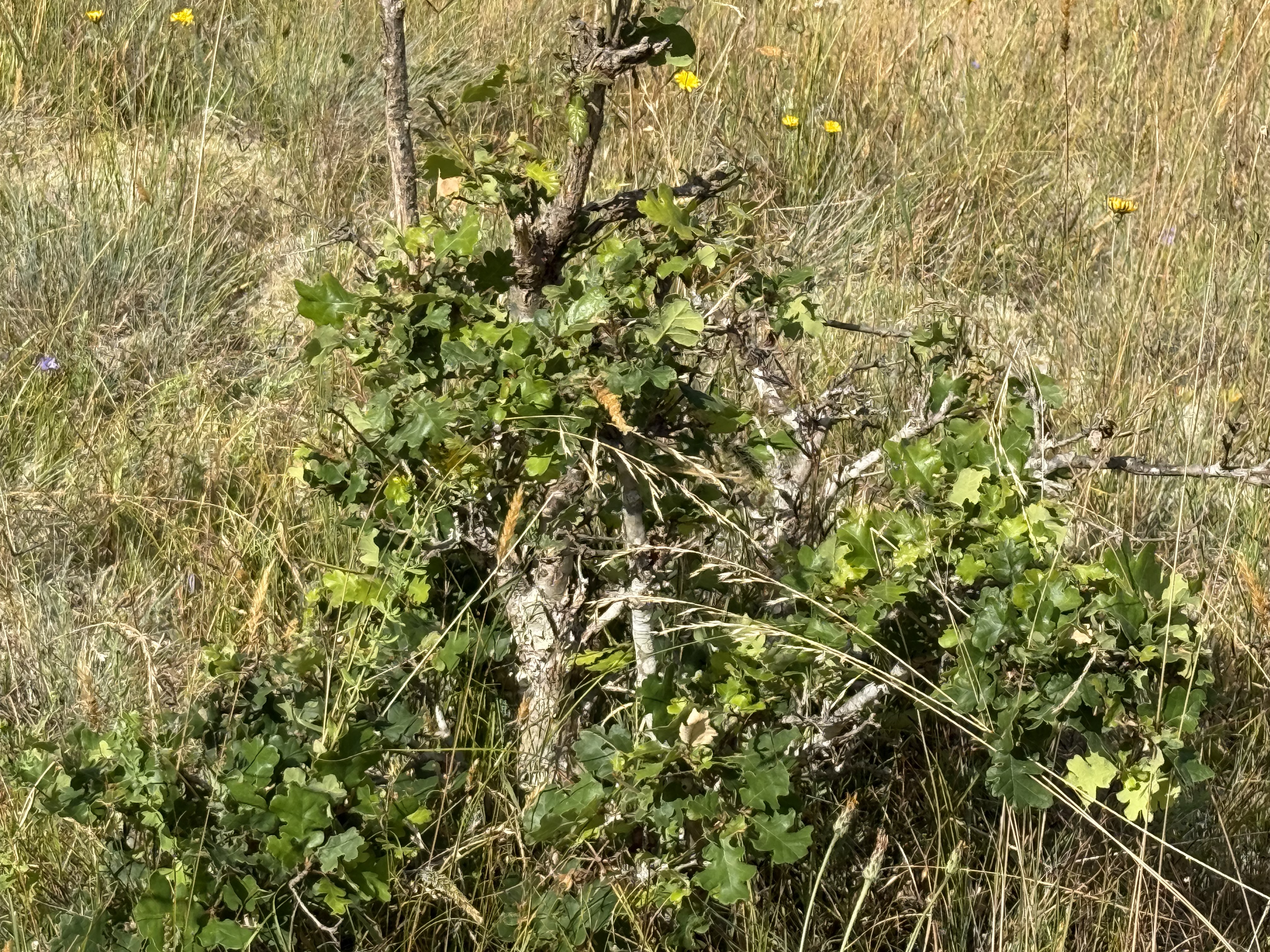
My ignorance is hilarious. I thought this was some kind of wildflower … but CoPilot identified it as a Douglas fir seedling. They were growing only on the mounds, sometimes in clusters. This is evidence (to me and CoPilot) that this is a dynamic transitional environment where forest species coexist with prairie flora.
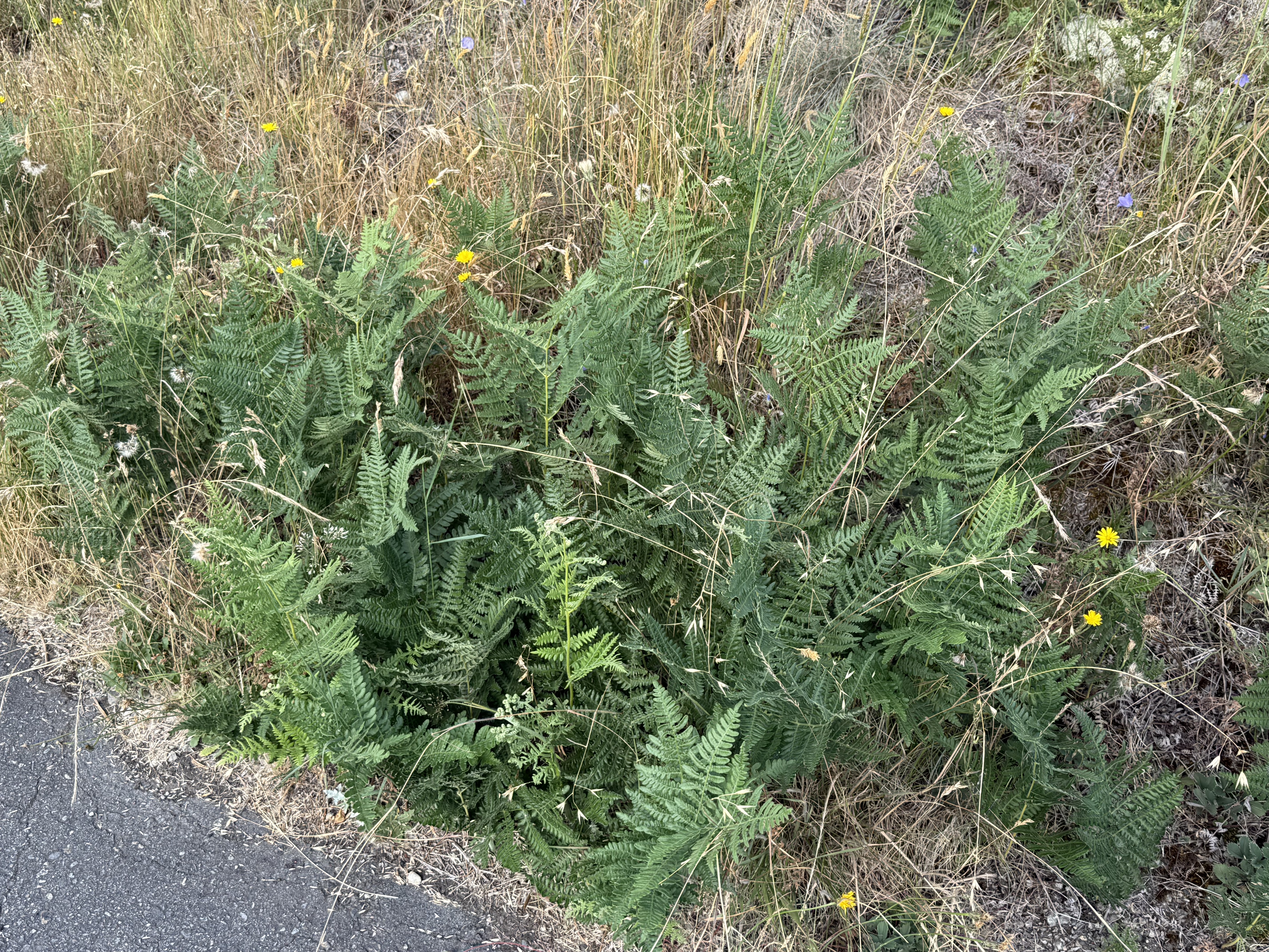
This fern caught my eye because it is not a natural inhabitant of a prairie ecosystem. However, the mounds are near a forest, so … CoPilot thinks it is a bracken fern, which is native to the area but not a prairie environment. It often behaves as an aggressive colonizer in disturbed edge habitats. That last phrase gets my attention because this preserve is at the edge of a mature forest.
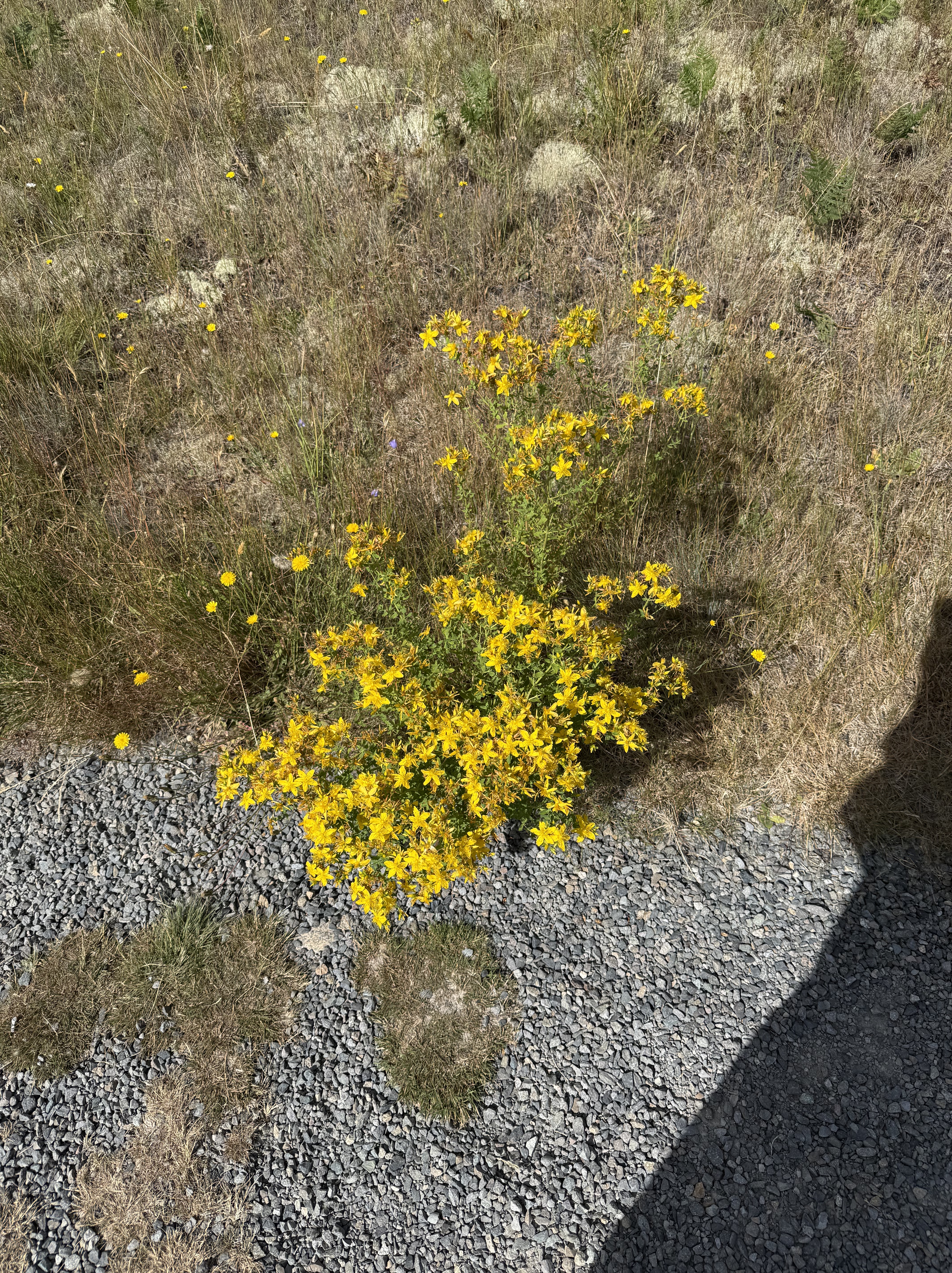
This lovely flowering shrub was identified by CoPilot as a species of Lotus, commonly called Spanish Clover, deervetch, or trefoil. It grew in the sandy areas between the mounds. My quick check can neither confirm nor deny this identification, but this common variety of clover is native to the PNW.
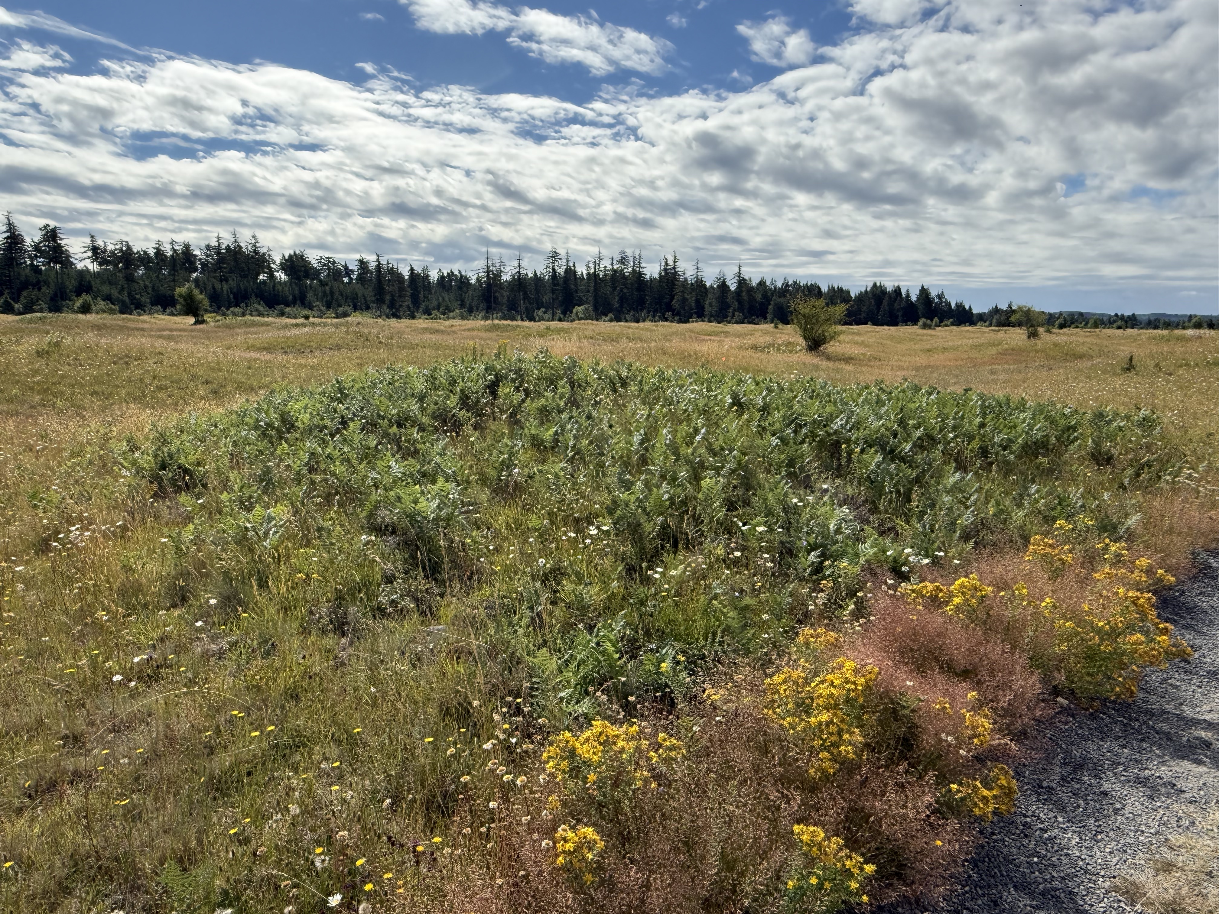
This mound is populated by bracken ferns, crowding onto the area with good soil.
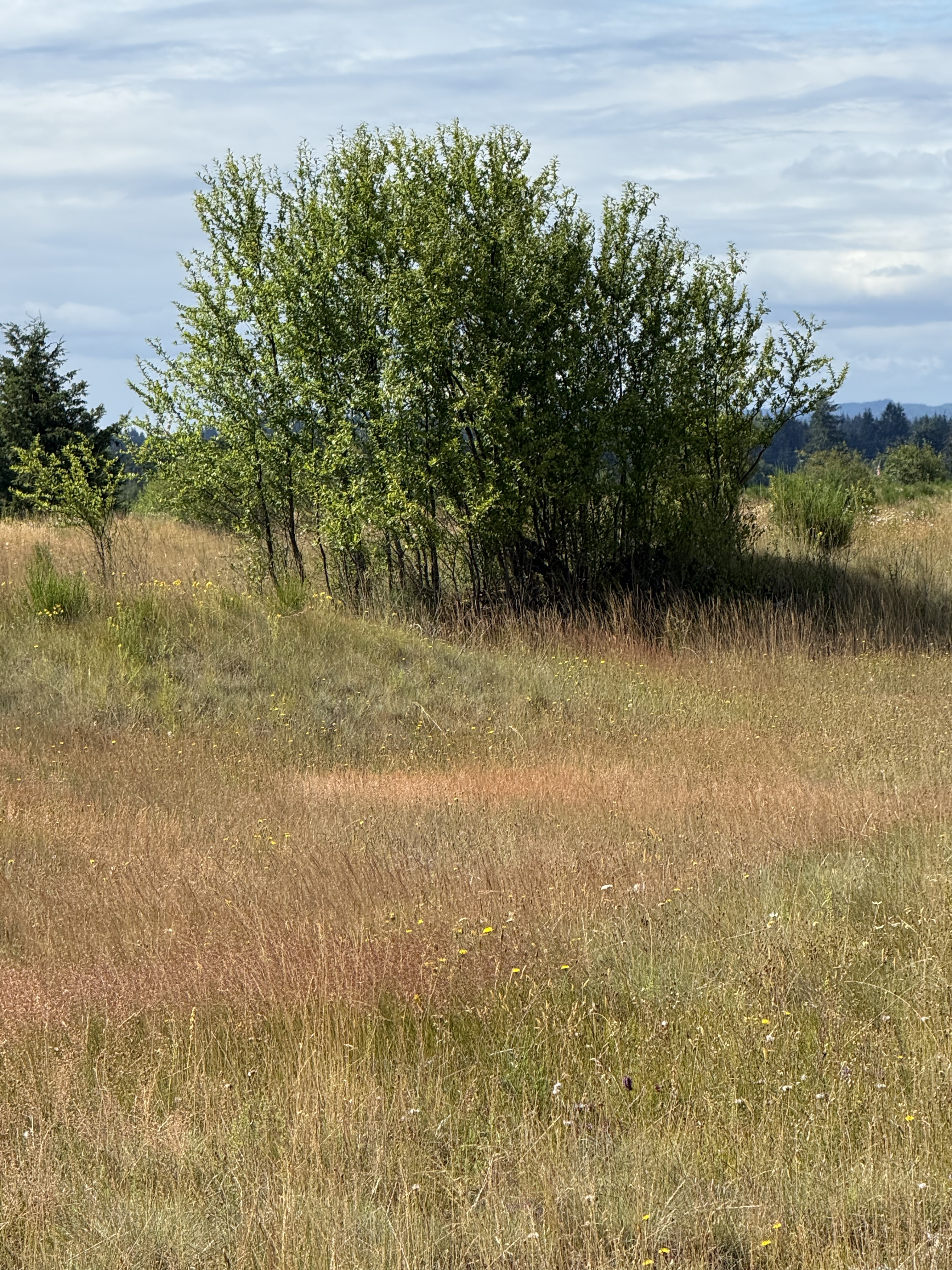
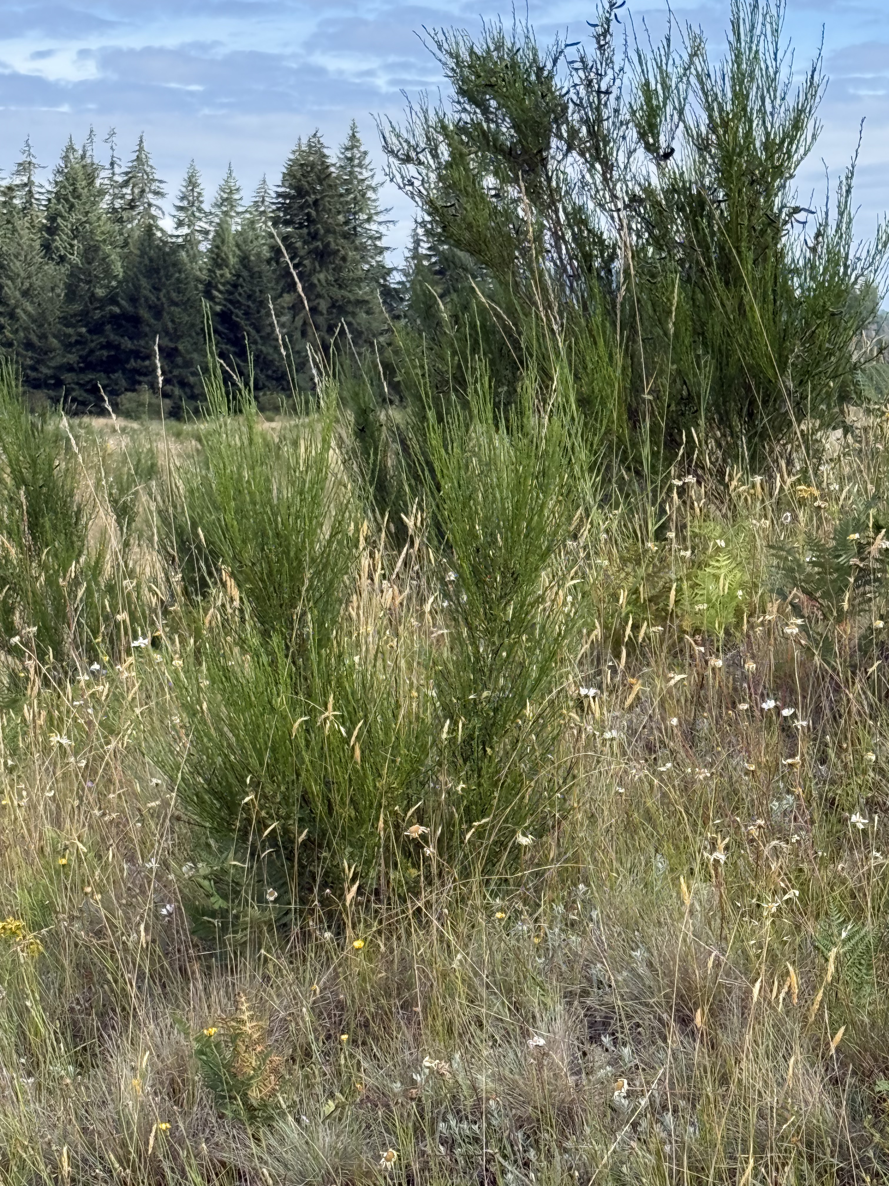
I don’t know what species this copse of young trees is, but it is obviously encroaching on the prairie ecosystem.
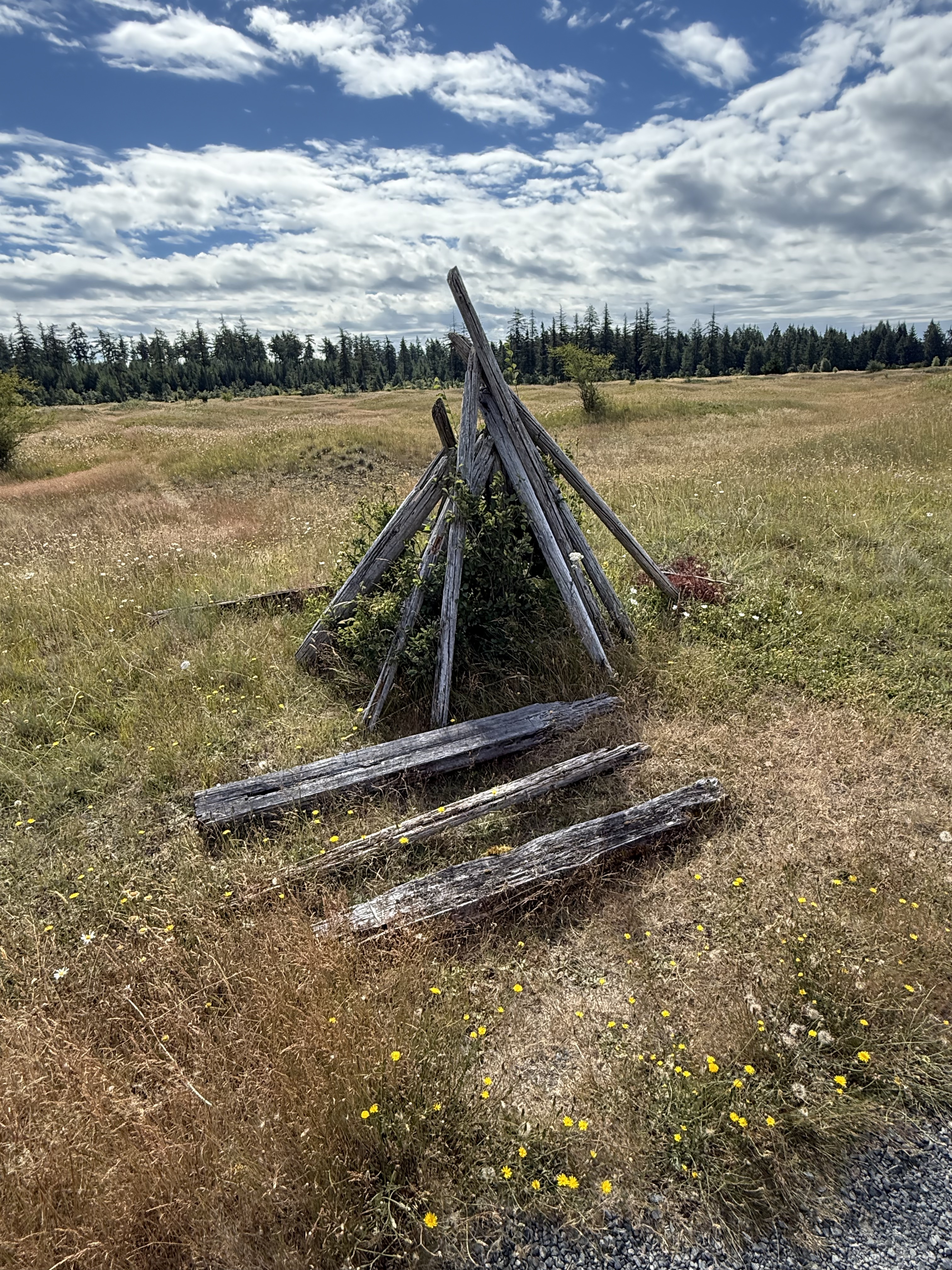
You never know what you’re going to find when you go outdoors. According to CoPilot, this is probably the result of NAP’s policy of not removing human artifacts that don’t interfere with the environment. Manpower shortages, policy priorities, etc. Mima Mounds was established in 1976, so it’s fair to say that this structure is at least that old. I guess NAP hasn’t gotten around to it yet, which fits my nascent sense of priorities in the PNW.
Bill Frank Jr. Nisqually National Wildlife Refuge
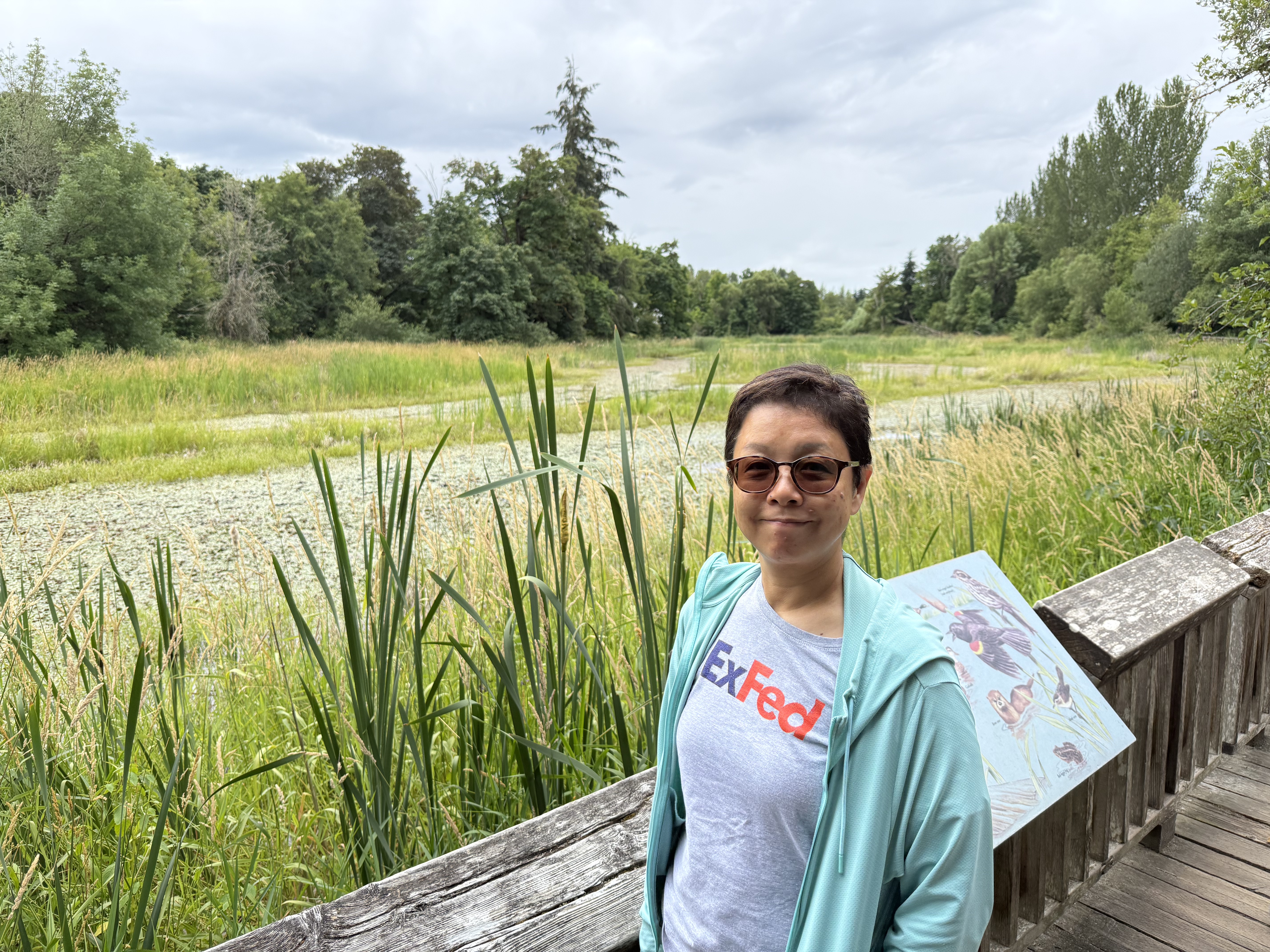
We stopped for a quick visit, which turned into a one-mile death march (for me, after walking 4 miles on uneven ground), to see where the Nisqually River empties into Puget Sound. It originates from the face of an alpine glacier above 6000 feet on Mt. Rainier. This is a tributary stream that forms a series of algae-covered ponds.
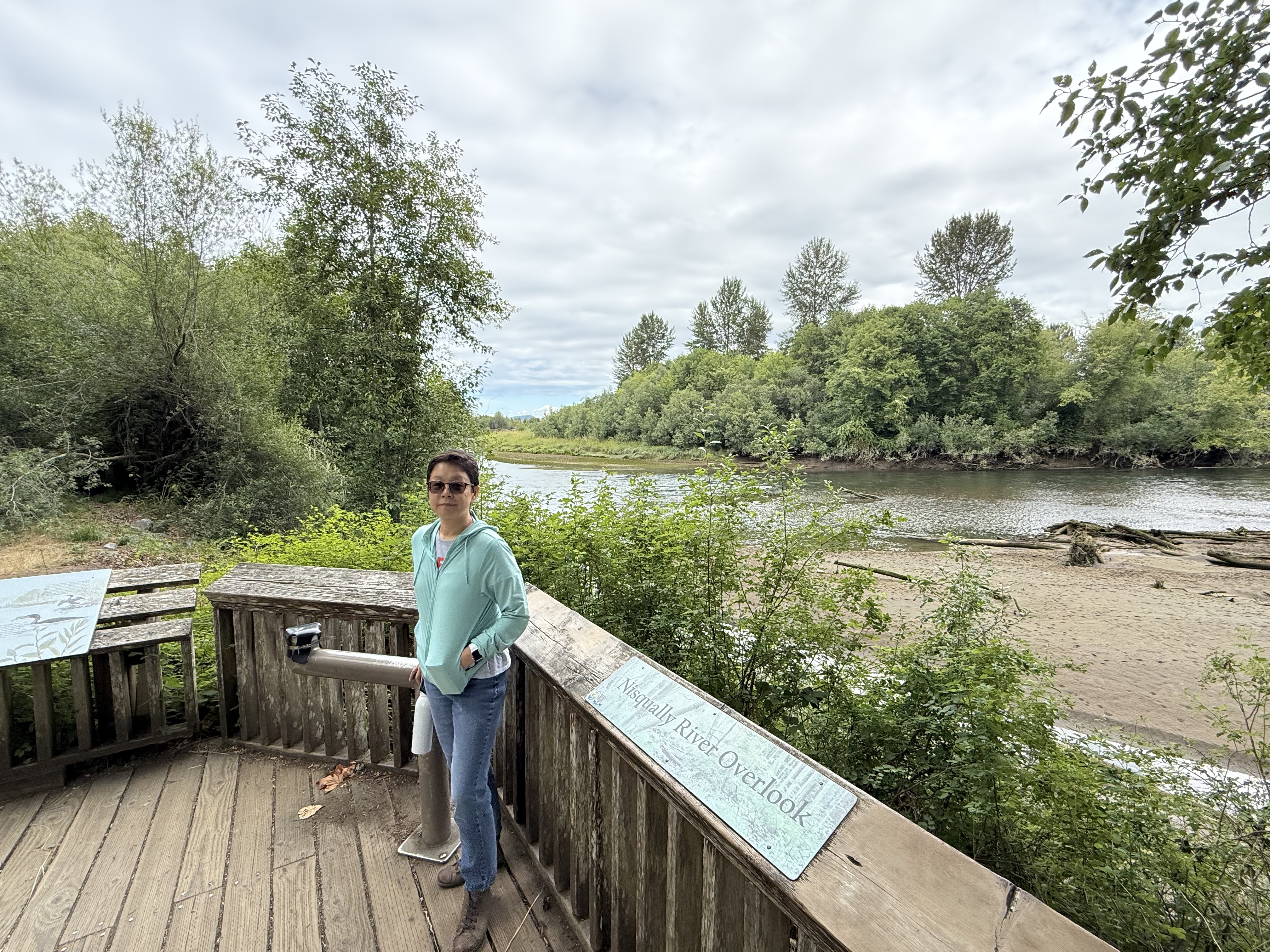
Here we are, less than a mile from the Nisqually River’s delta in Puget Sound. There is a lot of downcutting and the creation of sand bars, but no boulders or even cobbles. This glacial river has been tamed by nature over a distance of about eighty miles, but it is still flowing pretty fast. We didn’t make it to the delta … maybe next time.
Summary
This was a great day trip to a fascinating and beautiful area, where the prairie and the forest compete for space on the top of mounds of top soil whose origin is a mystery. This back-and-forth movement of plants on timescales of years to decades suggests that the PNW is alive and well, the flora responding to minute changes in soil and air temperature/moisture, precipitation, wind, etc. Let’s hope these two thriving ecosystems can continue their dance without further human interference.
I have my own hypothesis about the formation of the Mima Mounds, which is consistent with the facts. 1) As the glacier melted and retreated, over thousands of years, shallow lakes developed in local depressions. These lakes were shallow, perhaps twenty feet deep, and limited in extent. 2) Fine-grained sediment (i.e. mud) and organic debris settled in them to depths of no more than ten feet. They were ice covered for part of the year. 3) As the glacier retreated further, streams began to superimpose their beds onto this landscape, but they weren’t like a glacial river (e.g. Nisqually River). These were weak streams flowing over a post-glacial landscape, meandering and not cutting new channels. 4) This mild erosion was superimposed on a landscape dominated (in this area) by an antecedent pattern like that seen in the Arctic (see above photo). Fine-grained sediment was removed, following a suture pattern until only irregular bumps remained. 5) This process of sheet-flow erosion continued to the present day, leaving us with these paradoxical mounds.
I am a sedimentologist, so I think in terms of turbulence and flow as interconnected processes that alter a landscape slowly, one grain of sand at a time. There wasn’t enough turbulence to strip away the veneer of clay over this basin in the time allowed, so it chipped away at the weak edges of lumps of soil that were probably held together by the roots of plants.
In other words, the thawing of permafrost created the pattern, and turbulent flow polished it to what we see today.
Prove me wrong…
Review of “Across the Sand” by Hugh Howey

After seeing all the series of books written by the author, I was worried this was going to be a piece of a larger puzzle. I was glad to see that this is a standalone novel, albeit it occurs in the same world featured in his other books. Nevertheless, there were plenty of clues that this is one story from an entire world Howey has created.
The story takes place sometime in the future, mostly in eastern Colorado. However, the landscape is so drastically altered that it reads more like a fantasy, e.g. the Dune series by Frank Herbert. I think the author wrote a fantasy/sci-fi story and added some distorted, but familiar, place names to make it read like a postapocalyptic story. The world is so altered that it would take thousands of years, and that isn’t postapocalyptic–that’s the inevitable fate of all civilizations.
The central characters are children who take matters into their own hands to find their destinies. Overall it reads like a story for teenagers because the prose slows down and accelerates with the action; short, punchy sentences when something’s happening, and more refined writing for less dramatic scenes. Keeping that in mind, the writing is okay if uninspired. The erratic writing style is intentional because the story is told through multiple perspectives; however, the author keeps slipping up and reading everyone’s mind in several scenes. Another annoying habit the narrator had was referring to parents as “her father” and such, then using their name in unexpected situations. This dichotomy led to several passages I had to reread several times, and finally interpret it to what I thought the author meant.
It isn’t nice to confuse your readers.
The plot is well crafted, telling two stories through several perspectives (mostly children and young adults), eventually merging them in a climactic ending. The reason for the main conflict is never explained or even mentioned, so I was left feeling like this was a clever story written around a neat idea with no consideration of plausibility or realism. I’ve read enough science fiction to suspend disbelief for a few hundred pages.
As modern science fiction goes, this is a good story–but it shows signs of being rushed and not carefully edited. The premise is great but it was removed from the oven before it was finished.


Recent Comments